


In the fast-paced digital landscape, where milliseconds can make or break user engagement, Content Delivery Networks (CDNs) stand as the unsung heroes of web development. CDNs revolutionise the way content is delivered to users worldwide, optimising page speed and enhancing customer retention across diverse markets. Let’s delve into the intricacies of CDNs and understand how they propel digital experiences to new heights.
Understanding CDNs: The Backbone of Global Content Delivery
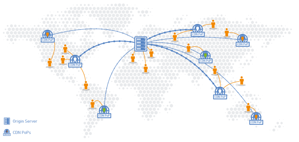
Content Delivery Networks, commonly known as CDNs, are distributed networks of servers strategically positioned across various geographical locations. These servers host cached versions of website content, including images, videos, scripts, and other static assets. By storing copies of content closer to end-users, CDNs drastically reduce latency and accelerate content delivery.

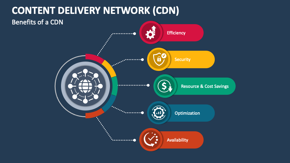
Moreover, CDNs employ sophisticated caching algorithms and intelligent routing systems to ensure optimal content delivery. These systems dynamically determine the most efficient server to fulfil user requests based on factors such as network proximity, server load, and content popularity. Additionally, CDNs offer robust scalability, seamlessly handling surges in traffic and fluctuations in demand without compromising performance. Furthermore, CDNs play a crucial role in mitigating the impact of network congestion and bottlenecks by distributing content across multiple servers, thereby enhancing reliability and resilience. Ultimately, the strategic deployment of CDNs not only enhances user experience but also yields significant cost savings for businesses by reducing bandwidth consumption and infrastructure overhead.
How CDNs Work Their Magic: An Insight into Content Distribution
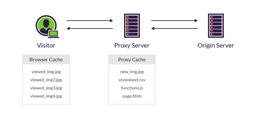
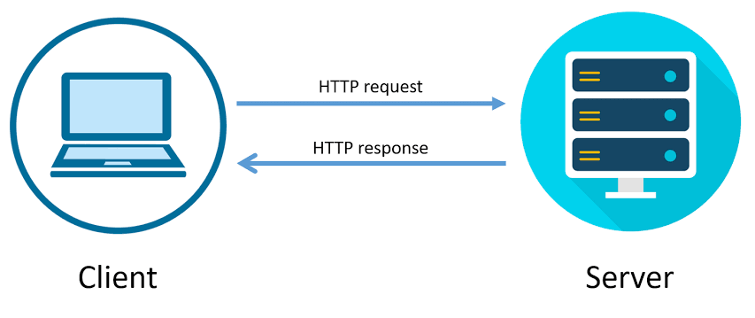
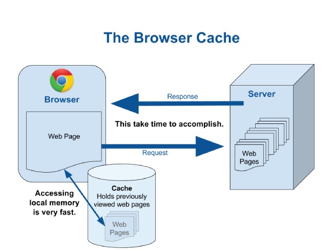
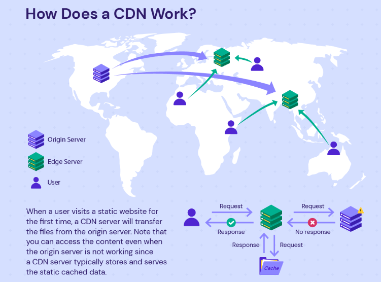
Content Delivery Networks (CDNs) wield their influence through a sophisticated infrastructure designed to expedite content delivery. When a user initiates a request for content from a website, the CDN’s intricate routing system quickly identifies the nearest server within its network. This server acts as a proxy, intercepting the request and efficiently retrieving the desired content from the origin server. Once obtained, the content is temporarily cached within the server’s local storage, primed for rapid dissemination to the user’s device. By strategically caching content closer to end-users, CDNs optimise bandwidth utilisation, diminish latency, and ensure swift content delivery regardless of the user’s geographical location.
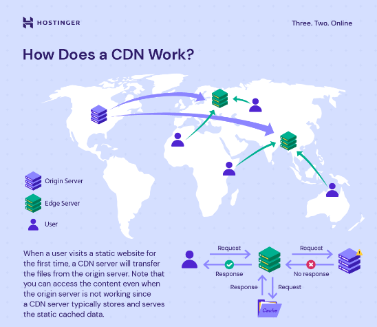
This not only streamlines content distribution but also mitigates the challenges posed by different network conditions. By strategically distributing cached content across a network of servers worldwide, CDNs minimise the distance data needs to travel, thereby reducing latency and enhancing user experiences. Additionally, CDNs dynamically adjust their routing protocols based on real-time data, ensuring efficient content delivery even amidst fluctuations in internet traffic and network congestion. Through these mechanisms, CDNs elevate the efficiency and reliability of content delivery, fostering seamless digital experiences for users across the globe.
Enhancing Page Speed: The Key to Superior User Experience
Page speed is not merely a technical metric; it’s a cornerstone of user satisfaction and digital success. Today, where attention spans are fleeting and competition is fierce, every fraction of a second counts. CDNs emerge as pivotal allies in the quest for faster page load times and superior user experiences. By strategically positioning edge servers in proximity to users, CDNs ensure that content is delivered swiftly, minimising latency and eliminating the frustrating wait times that can drive users away.
CDNs achieve this feat by caching content at the edge, closer to the end-users’ geographical locations. When a user requests a web page, the CDN efficiently serves the cached content from the nearest edge server, slashing the time required to fetch data from the origin server.

The result? Blazing-fast page load times, seamless interactions, and delighted users. With CDN-enabled websites, businesses can deliver snappy page transitions and fluid browsing experiences, fostering higher engagement levels and retaining users for longer durations.
Global Reach, Local Impact: Tailoring Content Delivery to Diverse Markets
In an era marked by unprecedented connectivity, businesses aiming for global expansion must navigate the intricacies of diverse markets to stay relevant and competitive. Content Delivery Networks (CDNs) play a pivotal role in this endeavour by facilitating the seamless delivery of localised content tailored to the preferences and cultural nuances of specific regions. By leveraging CDNs, businesses can transcend geographical boundaries and connect with audiences on a more personal level.
One of the key advantages offered by CDNs is their ability to dynamically adjust content delivery based on user location, language preferences, and device types. This adaptive approach ensures that users receive content optimised for their unique needs and preferences, thereby enhancing engagement and fostering a deeper connection with the brand. Whether it’s serving translated versions of web pages, region-specific promotions, or culturally relevant imagery, CDNs empower businesses to deliver a tailored experience that resonates with audiences worldwide.
Moreover, CDNs enable businesses to overcome the challenges associated with latency and network congestion, particularly in regions with limited infrastructure or unreliable internet connectivity. By caching content on edge servers located closer to end-users, CDNs minimise the distance data must travel, resulting in faster load times and smoother user experiences. This not only improves customer satisfaction but also strengthens brand loyalty and retention by ensuring that users can access content reliably regardless of their location or network conditions. In essence, CDNs empower businesses to navigate the complexities of global markets with agility and precision, delivering personalised experiences that drive long-term success.
CDN Security: Fortifying Digital Assets Against Cyber Threats
CDNs serve as more than just accelerators of content delivery; they also function as guardians of digital assets against a multitude of cyber threats. CDNs provide a layered approach to security, offering a range of robust features designed to thwart malicious attacks and safeguard online platforms. One such feature is Distributed Denial of Service (DDoS) protection, which shields websites from overwhelming traffic floods orchestrated by malicious actors. By strategically distributing incoming traffic across multiple servers, CDNs can absorb and mitigate the impact of DDoS attacks, ensuring uninterrupted access to content for legitimate users.
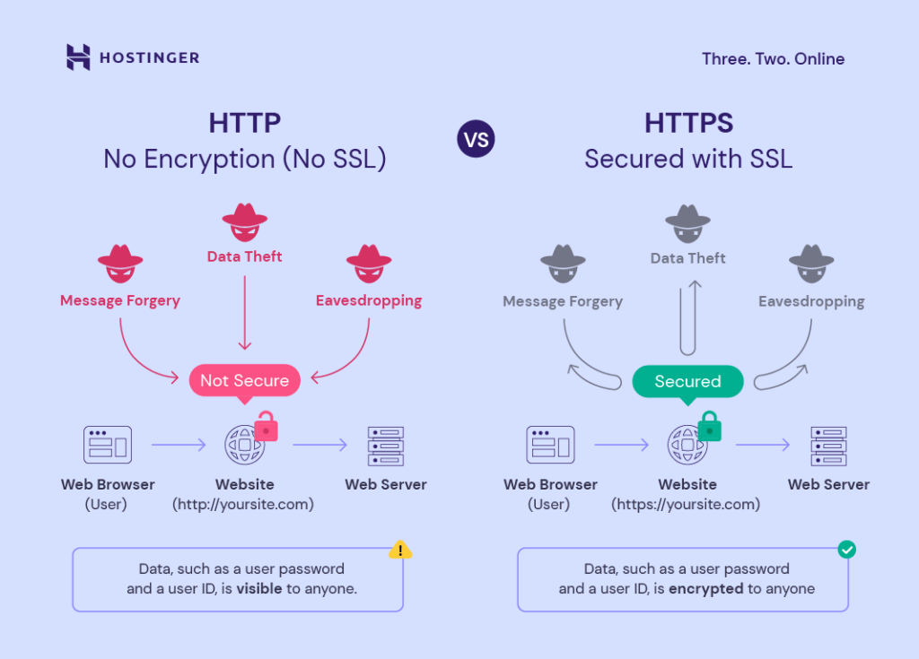
Furthermore, CDNs bolster security through the implementation of Web Application Firewalls (WAFs), which act as a protective barrier against common web application vulnerabilities and attacks. WAFs analyse incoming HTTP traffic, inspecting requests and responses to detect and filter out malicious payloads or suspicious activity. Additionally, CDNs leverage Secure Sockets Layer (SSL) encryption to encrypt data transmitted between users and web servers, safeguarding sensitive information from interception or tampering by unauthorised parties. Through these comprehensive security measures, CDNs not only optimise content delivery but also fortify digital assets, instilling confidence in users and maintaining the integrity of online platforms.
The Future of CDNs: Innovations Shaping Tomorrow’s Digital Landscape
The future of Content Delivery Networks (CDNs) holds promise for transformative innovations that will reshape tomorrow’s digital landscape. One such innovation is the integration of edge computing capabilities within CDN networks. Edge computing involves processing data closer to the point of generation, reducing latency and enhancing real-time processing capabilities. By deploying edge computing nodes within their networks, CDNs can deliver dynamic content and personalised experiences with unparalleled speed and efficiency. This integration not only improves content delivery but also opens doors to a wide array of emerging technologies such as augmented reality (AR), virtual reality (VR), and Internet of Things (IoT) applications, which rely heavily on low-latency data processing.
Furthermore, machine learning-driven optimisation represents another frontier in the evolution of CDNs. By leveraging machine learning algorithms, CDNs can intelligently predict user behaviour, optimise content delivery strategies, and dynamically adjust caching policies in real-time. This predictive capability enables CDNs to anticipate traffic spikes, adapt to changing user demands, and deliver highly personalised content tailored to individual preferences. As machine learning algorithms continue to evolve and become more sophisticated, CDNs will be able to provide increasingly intelligent and context-aware content delivery solutions, further enhancing user experiences and driving innovation in the digital realm.

In conclusion, Content Delivery Networks (CDNs) stand as indispensable assets in the arsenal of web developers committed to optimise page speed and enhancing customer retention on a global scale. Harnessing the robust capabilities of CDNs, businesses can seamlessly deliver lightning-fast, personalised content to users across the globe, thereby fostering heightened engagement, enduring loyalty, and, ultimately, driving business success in the digital era. As CDNs continue to evolve and innovate, their role in shaping superior digital experiences will remain paramount, ensuring that businesses stay at the forefront of technological advancements and maintain a competitive edge in today’s dynamic marketplace.


Recent Comments