


Lazy loading and resource prioritisation are complementary strategies that work together to optimise web performance and enhance user experience. While they address different aspects of performance optimisation, they share the common goal of improving page speed and efficiency.
1. Sequential Loading: Lazy loading and resource prioritisation both involve the concept of sequential loading, albeit in different contexts. Lazy loading focuses on deferring the loading of non-critical resources until they are needed, typically triggered by user interactions such as scrolling or clicking. On the other hand, resource prioritisation involves determining the order in which resources are loaded based on their importance to the initial rendering of the page. By strategically combining these approaches, developers can ensure that critical resources are prioritised for immediate loading, while non-essential resources are lazily loaded as needed, optimising both initial page load times and subsequent interactions.
2. Enhancing User Experience: Both lazy loading and resource prioritisation contribute to a smoother and more seamless user experience. Resource prioritisation ensures that vital assets, such as CSS, JavaScript, and above-the-fold content, are loaded quickly, minimising render-blocking and speeding up the initial rendering of the page. Meanwhile, lazy loading further enhances user experience by deferring the loading of non-critical resources, such as images and videos, until they come into view or are otherwise required. This approach reduces unnecessary bandwidth usage and accelerates page rendering, resulting in faster load times and improved usability for users.

3. Optimising Performance: By combining lazy loading and resource prioritisation, developers can achieve optimal performance across various dimensions. Resource prioritisation focuses on optimising the critical rendering path, ensuring that essential resources are delivered quickly to facilitate the initial rendering of the page. This approach minimises the time to first meaningful paint (TTMP) and improves overall page speed, leading to better performance metrics and user satisfaction. Meanwhile, lazy loading complements resource prioritisation by further reducing page load times and enhancing perceived performance through on-demand loading of non-critical resources. Together, these strategies result in a highly optimised and responsive web experience that delights users and drives engagement.
4. Balancing Efficiency and Functionality: A key challenge in web development is striking the right balance between efficiency and functionality. Resource prioritisation helps developers prioritise critical resources for immediate loading, ensuring that essential functionality is available to users as quickly as possible. However, loading all resources upfront may not always be feasible or desirable, especially for content-rich websites with extensive media assets. Lazy loading addresses this challenge by deferring the loading of non-essential resources, allowing developers to maintain a balance between performance and functionality. By selectively loading resources based on user interactions and viewport visibility, lazy loading minimises unnecessary overhead and maximises efficiency without compromising functionality.

In summary, lazy loading and resource prioritisation are complementary strategies that work together to optimise web performance, enhance user experience, and strike the right balance between efficiency and functionality. By leveraging these techniques in tandem, developers can create fast, responsive, and engaging web experiences that delight users and drive business results.
Lazy Loading: Boost Your Website’s Performance and SEO

In today’s digital arena, where online visibility is paramount, optimising your website for both performance and search engine rankings is crucial. Enter Lazy Loading—a powerful technique that not only enhances user experience but also improves SEO. In this comprehensive guide, we’ll delve into the world of Lazy Loading, uncovering its benefits, implementation strategies, and how it can propel your website to the top of search engine results pages (SERPs).
Understanding Lazy Loading: Improve Your Performance
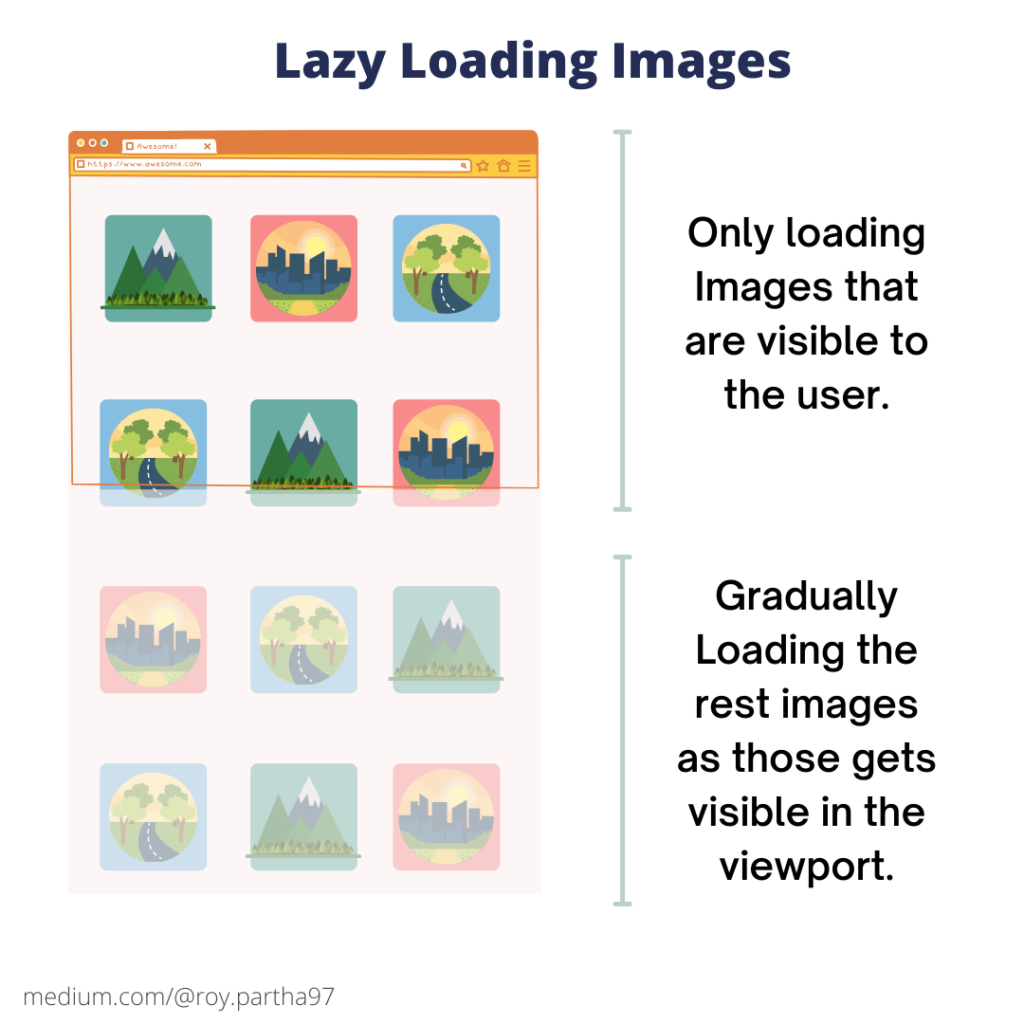
Lazy Loading isn’t just another technical jargon; it’s a game-changer for your website’s performance optimisation strategy. Essentially, Lazy Loading allows you to defer the loading of non-critical resources, like images and scripts, until they’re needed. By prioritising the loading of essential content and delaying the rest, Lazy Loading drastically reduces initial page load times, providing users with faster access to your site’s valuable content.
The Mechanics Behind Lazy Loading:
To truly grasp the power of Lazy Loading, it’s essential to understand its inner workings. Using JavaScript magic, Lazy Loading detects user interactions, such as scrolling or clicking, and intelligently loads content on the fly. By overriding the browser’s default loading behaviour, Lazy Loading ensures that only vital content is loaded upfront, optimising bandwidth usage and expediting page rendering for a seamless user experience.
Implementing Lazy Loading Strategies: Proven Tips and Techniques
Ready to harness the full potential of Lazy Loading? From leveraging specialised libraries and frameworks to implementing placeholder elements and setting explicit dimensions for lazy-loaded content, there’s a myriad of proven strategies to optimise Lazy Loading implementations. By following these best practices, you can supercharge your website’s performance while improving user engagement and retention.
1. Utilize Specialized Libraries and Frameworks: Leverage established lazy loading libraries and frameworks such as Intersection Observer API or LazyLoad.js. These tools streamline the implementation process and ensure cross-browser compatibility, saving you time and effort.
2. Implement Placeholder Elements: To prevent content shift and improve user experience, implement placeholder elements for lazy-loaded content. These placeholders mimic the dimensions of the lazy-loaded content, ensuring that the page layout remains stable while the content loads asynchronously.

3. Set Explicit Dimensions: Specify explicit dimensions (width and height) for lazy-loaded images and other media assets. This helps the browser allocate space for the content before it loads, preventing layout shifts and optimizing rendering performance.
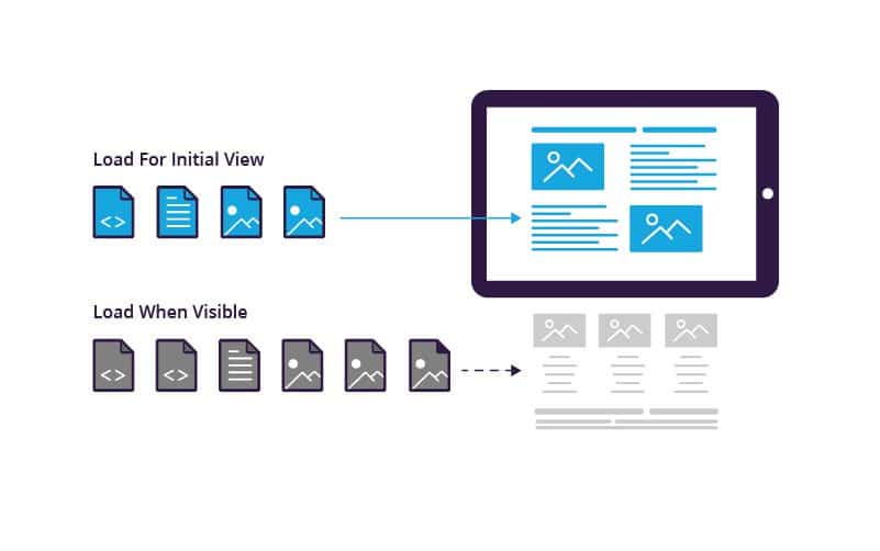
4. Prioritize Above-the-Fold Content: Identify and prioritize above-the-fold content for lazy loading. By loading critical content first, you can improve the perceived performance of your website and enhance user engagement.
5. Optimize Loading Triggers: Fine-tune lazy loading triggers based on user interactions and viewport visibility. Implement scroll-based or click-based triggers to load content as users navigate the page, ensuring that resources are loaded only when needed.
6. Lazy Load Images and Videos: Images and videos are often the largest contributors to page bloat. Implement lazy loading for these assets to defer their loading until they come into view, reducing initial page load times and conserving bandwidth.
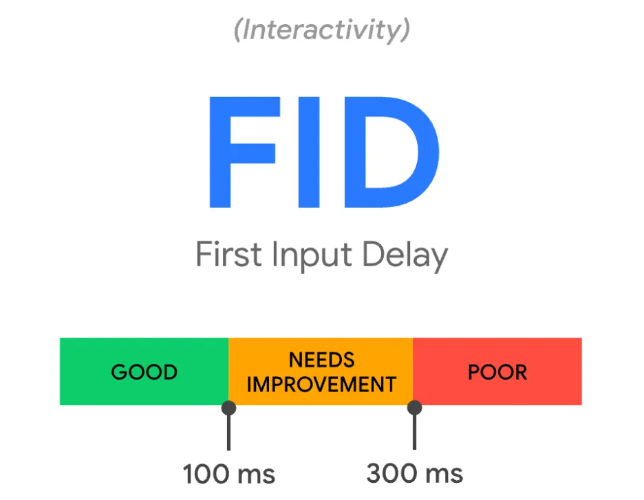
7. Monitor Performance Metrics: Regularly monitor performance metrics such as page load times, time to interactive, and user engagement metrics. Use tools like Google PageSpeed Insights or Lighthouse to identify opportunities for optimization and fine-tune your lazy loading implementation accordingly.
8. Test Across Devices and Browsers: Test your lazy loading implementation across different devices, screen sizes, and browsers to ensure consistent performance and user experience. Address any compatibility issues or performance bottlenecks that may arise during testing.

Benefits of Lazy Loading: Skyrocket your SEO and User Satisfaction
The perks of Lazy Loading extend beyond speed improvements- they directly impact your website’s SEO performance. With faster load times and improved user experience, Lazy Loading helps reduce bounce rates and increase user dwell time, signalling to search engines that your site is valuable and worthy of higher rankings. Additionally, Lazy Loading can lead to significant bandwidth savings, translating to lower hosting costs and enhanced scalability—a win-win for both users and search engines alike.
Overcoming Challenges: Navigate Common Pitfalls with Ease
While Lazy Loading offers a host of benefits, it’s not without its challenges. Content shifting, where the page layout changes as resources load dynamically, is a common concern. However, with strategic implementation techniques like placeholder elements and careful monitoring of performance metrics, you can overcome these obstacles and ensure a smooth Lazy Loading experience for your users.
Conclusion
In the competitive world of online business, optimising your website for performance and SEO is non-negotiable. With Lazy Loading as your secret weapon, you can deliver lightning-fast experiences that not only delight users but also propel your site to the top of SERPs. By implementing Lazy Loading best practices and staying ahead of the curve, you’ll unlock the full potential of your website, driving higher rankings, increased traffic, and ultimately, greater success in the digital landscape.
Resource Prioritisation
Optimising page speed isn’t just about delivering a faster user experience—it’s about maximising long-term value (LTV) potential. Enter resource prioritisation, a strategic approach that ensures critical assets load swiftly, driving engagement, conversion, and ultimately, revenue. In this article, we’ll dive into the intricacies of resource prioritisation, exploring its significance, implementation strategies, and its profound impact on page speed and LTV.
Understanding Resource Prioritisation: The Foundation of Performance Optimisation
Resource prioritisation is the art of strategically determining the order in which assets are loaded to optimise page speed and user experience. It involves identifying critical resources—such as CSS, JavaScript, and above-the-fold content—and prioritising their delivery to minimise render-blocking and speed up initial page load times. By intelligently allocating network resources, developers can ensure that vital content is delivered swiftly, laying the groundwork for a seamless user experience.
The Role of Critical Rendering Path: Streamlining Page Load for Maximum Efficiency
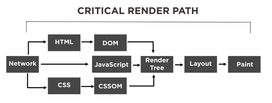
At the heart of resource prioritisation lies the critical rendering path—a sequence of steps browsers take to render web pages. By understanding and optimising this pathway, developers can streamline page load times and improve overall performance. Critical rendering path optimisation involves identifying and prioritising critical resources, minimising unnecessary requests, and leveraging techniques like asynchronous loading and deferred execution to expedite page rendering. Through meticulous optimisation of the critical rendering path, developers can achieve significant gains in page speed and user satisfaction.
Implementing Resource Prioritisation Strategies: Best Practices for Maximum Impact
Effective resource prioritisation requires a strategic approach and adherence to best practices. One key strategy is to prioritise above-the-fold content and critical resources to ensure swift initial rendering. This involves in lining critical CSS, deferring non-essential JavaScript, and asynchronously loading resources where possible. Additionally, leveraging browser caching, content delivery networks (CDNs), and server-side optimisations can further enhance resource delivery and improve page speed. By following these best practices, developers can unlock the full potential of resource prioritisation and deliver blazing-fast web experiences.

Impact on User Experience and Long-Term Value (LTV): Driving Engagement and Revenue
The significance of resource prioritisation extends far beyond mere performance gains—it directly impacts user experience and long-term value (LTV). Faster page load times lead to lower bounce rates, higher user engagement, and increased conversions, driving revenue and fostering customer loyalty. Moreover, by delivering a seamless user experience, resource prioritisation enhances brand perception and encourages repeat visits, maximising LTV potential over time. In essence, resource prioritisation isn’t just about speed—it’s about creating meaningful interactions that drive sustained business growth.
Overcoming Challenges: Navigating Common Pitfalls in Resource Prioritisation
While resource prioritisation offers substantial benefits, it’s not without its challenges. One common pitfall is the risk of over-optimisation, where excessive prioritisation of resources leads to suboptimal user experiences. To mitigate this risk, developers must strike a balance between speed and functionality, prioritising critical resources while ensuring essential functionality remains intact. Additionally, ongoing monitoring and optimisation are crucial to adapting to changing user behaviours and technological advancements, ensuring that resource prioritisation efforts continue to yield maximum results over time.
Conclusion:

In the dynamic landscape of web development, resource prioritisation emerges as a cornerstone of performance optimisation and long-term value (LTV) realisation. By strategically allocating network resources, streamlining the critical rendering path, and prioritising above-the-fold content, developers can deliver lightning-fast web experiences that drive engagement, conversion, and revenue. As businesses strive to stay ahead of the competition and maximise LTV potential, resource prioritisation remains a powerful tool for achieving sustained growth and success in the digital age.


Recent Comments