Category: visual design & experience

User Experience (UX) Principles and Conversion Rate Optimisation (CRO)

Competition is fierce and user attention spans are dwindling. So, mastering the art of conversion is paramount for any online business. Conversion Rate Optimisation (CRO) has emerged as the cornerstone of digital success, leveraging User Experience (UX) principles to create seamless journeys that guide users towards desired actions. Let’s delve into the intricate synergy between UX and CRO and explore how businesses can optimise their conversion strategies for maximum impact.

Understanding User Experience (UX)

User Experience encompasses the overall experience a user has while interacting with a product or service. It encompasses various elements such as usability, accessibility, design aesthetics, and overall satisfaction. At its core, UX aims to fulfil the user’s needs and expectations in the most efficient and enjoyable manner possible.

UX plays a pivotal role in shaping user behaviours and influencing conversion rates. A well-crafted UX design anticipates user needs, reduces friction points, and guides users seamlessly through the conversion funnel. Elements such as intuitive navigation, clear call-to-action (CTA) buttons, and responsive design are instrumental in enhancing user engagement and driving conversions.

UX-CRO Nexus

User satisfaction and conversion goals may seem like two distinct entities, but they are inherently intertwined. The user experience encompasses every touchpoint a user encounters, from the moment they land on a website to the point of conversion. By prioritising UX principles, businesses can create seamless, intuitive experiences that resonate with users, laying the foundation for successful conversion journeys.

However, optimising user experience alone may not suffice in driving conversions. This is where Conversion Rate Optimisation (CRO) enters the picture. CRO techniques are designed to systematically enhance a website’s performance, maximising the percentage of visitors who complete desired actions. By aligning UX principles with CRO goals, businesses can bridge the gap between user satisfaction and conversion objectives, thereby unlocking the full potential of their digital presence.

Key UX Principles for Conversion Optimisation

Simplify Navigation

Complex navigation structures can overwhelm users and impede their journey towards conversion. Streamlining navigation by organising content hierarchically and implementing intuitive menus enhances usability and keeps users focused on their conversion goals.

Optimise Page Load Speed

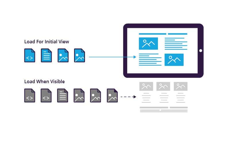
In the digital environment, every second counts. Slow-loading pages not only frustrate users but also adversely impact search engine rankings. Optimising page load speed through techniques such as image compression, minification of CSS and JavaScript files, and leveraging content delivery networks (CDNs) is crucial for reducing bounce rates and improving conversions.

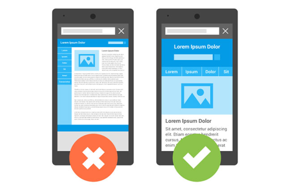
Enhance Mobile Responsiveness

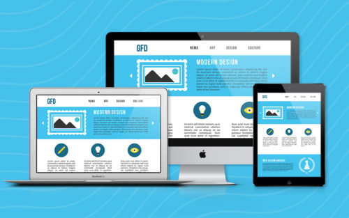
With the exponential rise in mobile usage, ensuring a seamless experience across all devices is non-negotiable. Responsive design principles enable websites to adapt fluidly to various screen sizes and resolutions, optimising the user experience irrespective of the device used. Mobile-friendly interfaces not only improve user satisfaction but also contribute significantly to conversion rates.

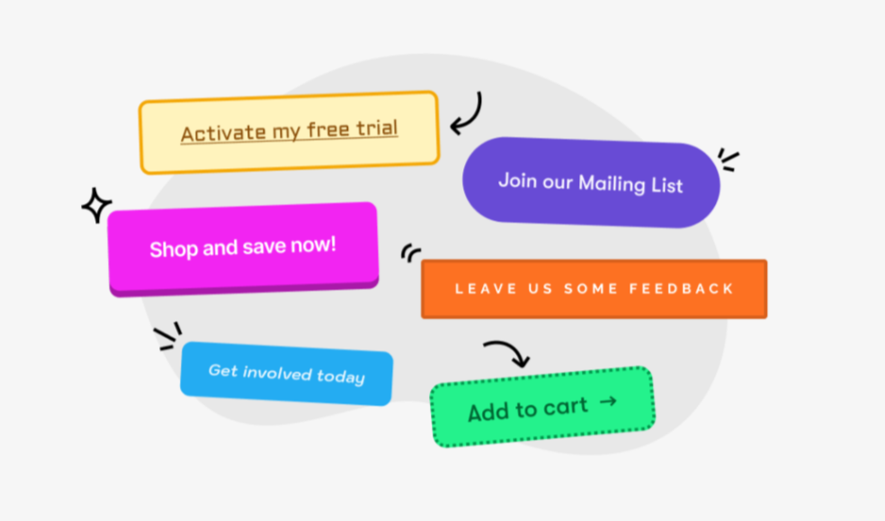
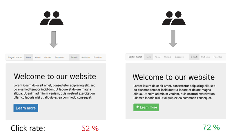
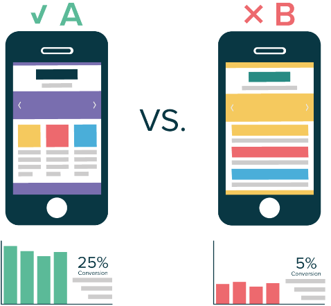
Craft Compelling CTAs

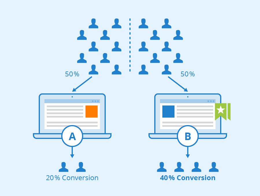
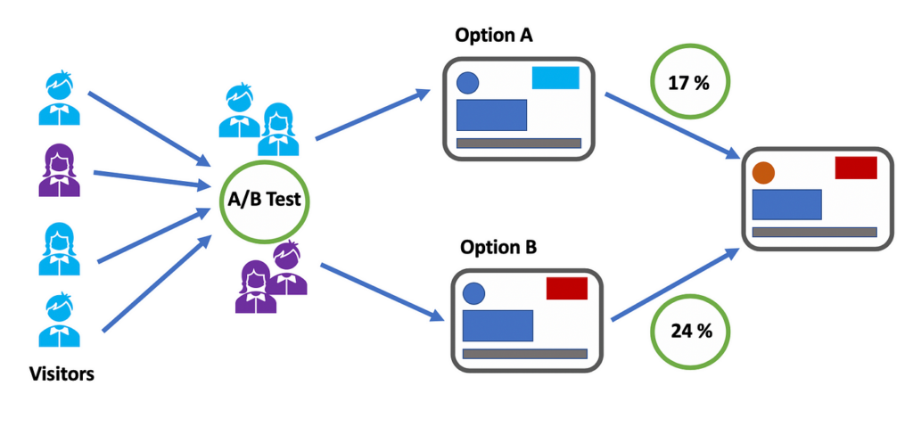
The effectiveness of Call-to-Action buttons cannot be overstated in conversion optimisation. CTAs should be visually prominent, action-oriented, and clearly communicate the desired action. A/B testing different CTA variations enables businesses to identify the most effective wording, colour schemes, and placement for maximum impact.

Optimising User Experience for Conversion: Key UX Strategies

To effectively drive conversions, businesses must implement key UX strategies tailored to optimise the user experience. These strategies encompass various facets of UX design, each playing a crucial role in guiding users seamlessly towards conversion points.

Usability Enhancements

Ensuring ease of use and navigation within a digital interface is paramount. By streamlining user interactions and minimising friction points, businesses can create a more intuitive experience that encourages users to take action.

Accessibility Considerations

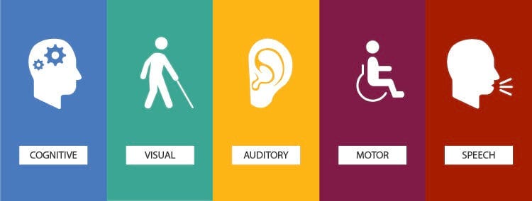
Catering to users with diverse needs is imperative for fostering inclusivity and accessibility. Implementing features such as alt text for images, keyboard navigation, and scalable fonts ensures that all users can engage with the website effectively.

Consistency in Design

Maintaining consistency across the interface fosters familiarity and reduces cognitive load. By adhering to consistent design elements such as colour schemes, typography, and interaction patterns, businesses can instil confidence in users and facilitate seamless navigation.

Importance of Feedback and Responsiveness

Providing timely feedback and responsiveness to user actions instils confidence and enhances engagement. Features such as progress indicators, error messages, and real-time updates keep users informed and engaged throughout their journey, ultimately leading to higher conversion rates.

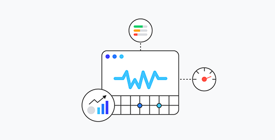
Key Metrics for Evaluating UX-CRO Performance

Effective measurement is the linchpin of success in any digital endeavour. By tracking and analysing key performance metrics, businesses can gain actionable insights into user behaviour, identify areas for improvement, and make data-driven decisions to optimise their strategies. When it comes to UX-CRO initiatives, measurement becomes even more critical, as it allows businesses to gauge the impact of their efforts on both user satisfaction and conversion rates.

Bounce Rate

Bounce rate refers to the percentage of visitors who navigate away from a website after viewing only one page. A high bounce rate may indicate that users are not finding what they’re looking for or that the website lacks engagement. By monitoring bounce rate, businesses can identify potential usability issues or mismatches between user expectations and website content, allowing them to make necessary adjustments to improve user engagement and retention.

Session Duration

Session duration measures the average amount of time users spend on a website during a single visit. A longer session duration generally indicates higher engagement and interest in the content or offerings. By tracking session duration, businesses can assess the effectiveness of their UX design in capturing and retaining user attention, as well as identify opportunities to enhance content relevance and engagement.

Conversion Rates

Conversion rates quantify the percentage of website visitors who complete a desired action, such as making a purchase, signing up for a newsletter, or filling out a contact form. Tracking conversion rates is essential for evaluating the effectiveness of CRO techniques in driving desired outcomes. By analysing conversion rates across different user segments or conversion pathways, businesses can identify areas of friction or opportunities for optimisation and refinement.
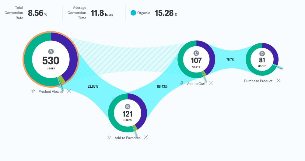
Funnel Analysis

Funnel analysis involves tracking user interactions and behaviours throughout the conversion process, from initial engagement to final conversion. By mapping out conversion funnels and identifying drop-off points or bottlenecks, businesses can pinpoint areas for improvement and optimise the user journey to maximise conversion rates. Funnel analysis provides valuable insights into user behaviour and preferences, allowing businesses to tailor their UX-CRO strategies for optimal performance.

Use of Analytics Tools

Utilising analytics tools such as Google Analytics, Hotjar, or Mixpanel is instrumental in tracking and optimising UX-CRO performance over time. These tools provide valuable data and insights into user behaviour, website performance, and conversion metrics, enabling businesses to make informed decisions to enhance their digital strategies.

The Intersection of UX and CRO

While UX focuses on creating delightful user experiences, CRO is concerned with maximising the conversion potential of those experiences. By integrating UX principles into CRO strategies, businesses can create a synergy that optimises both user satisfaction and conversion rates. A data-driven approach, leveraging analytics tools and user feedback, enables continuous refinement of UX elements to align with evolving user preferences.

User expectations are ever-evolving, mastering the interplay between UX and CRO is imperative for sustainable growth and success. By prioritising user needs, eliminating friction points, and continuously optimising conversion strategies, businesses can create compelling experiences that not only delight users but also drive tangible results. Remember, in the pursuit of conversion, the journey matters as much as the destination, and a seamless user experience is the bridge that connects them both.

A/B Testing Essentials: The Power of Experimentation in CRO

A/B testing stands as an indispensable tool for businesses striving to enhance their online performance. By systematically comparing two or more variants of a webpage or app element, A/B testing allows businesses to make data-driven decisions, optimising their digital assets for maximum conversions and user engagement. In this article, we delve into the essentials of A/B testing, uncovering its transformative power in CRO strategies.

Understanding A/B Testing:

A/B testing, also known as split testing, is a methodological approach used to compare two or more variations of a webpage or element to determine which one performs better in terms of predefined metrics, such as conversion rates, click-through rates, or bounce rates. By presenting different versions of a webpage to users randomly, A/B testing helps businesses identify the most effective design, content, or functionality to achieve their objectives.

Importance of A/B Testing in CRO:

1. Data-Driven Decision Making:

A/B testing provides invaluable insights into user behaviour and preferences by analysing quantitative data. Instead of relying on assumptions or guesswork, marketers can base their decisions on concrete evidence gathered through A/B tests. This data-driven approach ensures that optimisation efforts are targeted and effective, leading to tangible improvements in conversion rates.

2. Continuous Improvement:

CRO is an ongoing process aimed at refining and optimising various aspects of a website or app to maximise conversions. A/B testing facilitates this iterative approach by enabling marketers to continuously test and tweak different elements, such as headlines, calls-to-action, layouts, and visuals. By systematically refining these components based on test results, businesses can achieve incremental gains in conversion rates over time.

3. Enhanced User Experience:

Optimising for conversions often goes hand in hand with improving the overall user experience (UX). A/B testing allows marketers to experiment with different design elements, navigation paths, and content formats to identify the most user-friendly configurations. By prioritising user preferences and behaviours, businesses can create a seamless and intuitive experience that encourages visitors to take desired actions.

4. Mitigating Risk:

Launching major website or app changes without proper testing can carry significant risks, including potential decreases in conversion rates or user satisfaction. A/B testing mitigates these risks by allowing marketers to validate hypotheses and changes on a smaller scale before implementing them universally. This incremental approach minimises the likelihood of negative impacts while maximising the potential for positive outcomes.

Key Metrics for A/B Testing Success: Defining Objectives and KPIs

Before embarking on an A/B testing campaign, it’s crucial to establish clear objectives and key performance indicators (KPIs) that align with your conversion goals. Whether your aim is to increase purchases, newsletter sign-ups, or form submissions, defining measurable objectives provides focus and direction for your testing strategy.

Common metrics used to evaluate A/B test results include conversion rate, click-through rate, bounce rate, and revenue per visitor. By tracking these metrics meticulously and comparing them between variations A and B, marketers can gauge the effectiveness of their experiments and make informed optimisation decisions.

Essential Strategies for A/B Testing Success:

1. Clearly Define Objectives:

Before conducting A/B tests, it’s crucial to clearly define the objectives and key metrics that align with your conversion goals. Whether you’re aiming to increase purchases, newsletter sign-ups, or form submissions, establishing measurable objectives will guide your testing strategy and help you evaluate results effectively.

2. Focus on One Variable at a Time:

To isolate the impact of specific changes and draw accurate conclusions from A/B tests, it’s essential to focus on testing one variable at a time. Whether you’re testing headline variations, button colours, or pricing strategies, limiting the scope of each test ensures clarity and facilitates meaningful insights.

3. Prioritise High-Impact Elements:

While it’s tempting to test every conceivable element on a webpage or app screen, it’s more productive to prioritise high-impact elements that are likely to yield significant improvements in conversion rates. Start with elements that have the most direct influence on user behaviour, such as headlines, calls-to-action, and page layouts.

4. Implement Proper Testing Methodology:

Maintain rigour and consistency in your A/B testing methodology to ensure reliable results. This includes using statistically significant sample sizes, randomising traffic allocation, and adhering to best practices for experimental design. By following established testing protocols, you can trust the validity of your findings and make informed optimisation decisions.

5. Iterate and Iterate:

A/B testing is not a one-time endeavour but a continuous cycle of experimentation and optimisation. Embrace a culture of iteration within your organisation, where learnings from each test inform subsequent iterations and improvements. By consistently refining your approach based on data-driven insights, you can unlock the full potential of A/B testing to drive conversions.

Common Mistakes to Avoid:

Steering clear of common mistakes is vital for the success of any A/B testing campaign. Here are some crucial pitfalls to avoid:

1. Testing Too Many Variables at Once:

Testing multiple variables simultaneously can muddy the results, making it challenging to determine which changes drove the observed differences in performance. Focus on testing one variable at a time to isolate its impact accurately.

2. Ignoring Statistical Significance:

Drawing conclusions from A/B tests without achieving statistical significance can lead to erroneous decisions. Ensure that your sample size is sufficient to detect meaningful differences between variations and validate results accordingly.

3. Not Defining Clear Objectives:

Failing to establish clear objectives and key performance indicators (KPIs) can undermine the effectiveness of A/B testing efforts. Clearly define what you aim to achieve with each test and how you’ll measure success to guide experimentation and analysis.

4. Overlooking Segmentation:

Neglecting to segment your audience appropriately can obscure valuable insights and limit the relevance of your test results. Consider factors such as demographics, user behaviour, or traffic sources when designing experiments to ensure meaningful comparisons.

5. Confirmation Bias:

Succumbing to confirmation bias, where you interpret results to confirm preconceived notions or preferences, can skew your interpretation of A/B test outcomes. Approach experimentation with an open mind and let data guide your decisions, even if it challenges assumptions.

6. Stopping Tests Prematurely:

Ending tests prematurely, either due to impatience or prematurely declaring a winner based on early results, can lead to inaccurate conclusions. Allow tests to run for a sufficient duration to collect robust data and achieve statistical significance before drawing conclusions.

7. Ignoring User Feedback:

Disregarding qualitative feedback from users or relying solely on quantitative metrics can overlook valuable insights into user preferences and behaviour. Incorporate user feedback and insights into your testing strategy to complement quantitative analysis effectively.

8. Not Documenting Learnings:

Failing to document learnings and insights from A/B tests can hinder knowledge sharing and future optimisation efforts. Maintain detailed records of experiment designs, results, and conclusions to inform future testing iterations and organisational learning.

By avoiding these common mistakes and adhering to best practices, marketers can maximise the effectiveness of their A/B testing campaigns and drive meaningful improvements in conversion rates and user experiences.

Optimising UI for B2B Website Speed and Success

The speed at which your website loads can make or break your success. With an astounding 82% of B2B pages loading in 5 seconds or less, as a business, you need to pay careful attention to this critical aspect of their online presence. 

Did you know that a B2B site loading in just 1 second can enjoy a conversion rate three times higher than its 5-second counterpart? Let’s talk about the relationship between ecommerce success and page speed, exploring the reasons behind these statistics and offering actionable insights for businesses looking to stay ahead in the digital race.

The 82% Benchmark

The statistic that 82% of B2B pages load in 5 seconds or less reflects the industry’s commitment to providing a reasonably swift online experience. This benchmark suggests that the majority of businesses understand the importance of page speed in catering to the modern digital consumer’s expectations. However, it also implies that merely meeting this industry average might not be sufficient to gain a competitive edge.

To truly stand out, businesses should aim not just for an acceptable loading time but for an exceptional one. Users are increasingly intolerant of delays, and exceeding their expectations can lead to increased engagement, prolonged time spent on the site, and, ultimately, higher conversion rates.

The 1-Second Advantage

The revelation that a B2B site loading in 1 second has a conversion rate three times higher than its 5-second counterpart is a game-changer. This stark difference underscores the critical role of page speed in influencing user behaviour and, consequently, a website’s success.

The 1-second advantage is not merely about speed but about user experience and satisfaction. Businesses need to delve deeper into understanding why this tiny timeframe has such a significant impact. It goes beyond the surface level and involves the psychology of user interaction, establishing trust, and creating a seamless journey that encourages users to take the desired actions.

UI and Page Speed

he user interface (UI) of an e-commerce website plays a crucial role in both page speed and audience engagement. A well-designed UI optimises the user experience by streamlining navigation, minimising friction, and presenting information in a clear and intuitive manner. From a page speed perspective, a lightweight and efficient UI reduces the amount of data that needs to be transferred between the server and the user’s device, resulting in faster load times. Additionally, an engaging UI captivates the audience’s attention, encourages exploration, and fosters trust, thereby increasing the likelihood of prolonged interaction and conversions. Conversely, a cluttered or poorly optimized UI can slow down page load times, frustrate users, and lead to high bounce rates. Thus, the synergy between UI design and page speed is paramount, as it directly impacts audience engagement and ultimately influences the success of an e-commerce platform.

Crafting a high-performing and efficient UI requires a delicate balance of technical prowess and user-centric design principles.

Understanding UI Performance

1. Critical Rendering Path Optimisation: The critical rendering path encompasses the sequence of steps required to render a webpage, from fetching resources to rendering pixels on the screen. By minimising render-blocking resources, optimising CSS and JavaScript delivery, and prioritising above-the-fold content, e-commerce sites can expedite initial rendering, reducing perceived load times and enhancing user experience.

2. Responsive Design and Fluid Layouts: Responsive design ensures that e-commerce UIs adapt seamlessly to various screen sizes and devices, offering a consistent experience across desktops, tablets, and smartphones. Fluid layouts, powered by CSS frameworks like Bootstrap or Foundation, facilitate dynamic resizing and flexible content presentation, enhancing usability and accessibility.

3. Asynchronous Loading and Code Splitting: Leveraging asynchronous loading techniques and code splitting enables e-commerce sites to load non-critical resources asynchronously, prioritise essential content, and reduce time-to-interactivity. Implementing JavaScript bundling tools such as Webpack or Rollup optimises code delivery, minimising network overhead and accelerating page load times.

Efficiency Through Performance Enhancements

1. Lazy Loading and Image Optimisation: Employing lazy loading techniques defers the loading of below-the-fold content until it enters the viewport, conserving bandwidth and improving perceived performance. Image optimisation strategies, including compression, responsive image formats (e.g., WebP), and lazy loading, mitigate the impact of large image files on page load times, without compromising visual fidelity.

2. Efficient Data Fetching with GraphQL: GraphQL, a query language for APIs, empowers e-commerce UIs to retrieve precisely the data they need, eliminating over-fetching and under-fetching inefficiencies associated with traditional RESTful APIs. By consolidating multiple API calls into a single request and fetching only required data fields, GraphQL minimises network latency and enhances data loading efficiency.

3. Client-side Caching and State Management: Implementing client-side caching mechanisms, such as browser storage (e.g., localStorage, sessionStorage) and state management libraries (e.g., Redux, Vuex), optimises data retrieval and persistence, reducing round-trip server requests and enhancing UI responsiveness. Utilising techniques like memoisation and selective data fetching further enhances caching efficiency, ensuring optimal performance under varying usage scenarios.

Continuous Optimisation and Performance Monitoring

1. Performance Budgeting: Establishing performance budgets sets clear constraints on key performance metrics, such as page load time and time-to-interactivity, guiding development efforts and prioritising performance optimisations. Continuous monitoring using tools like Lighthouse, WebPageTest, or Chrome DevTools enables real-time performance analysis, identifies bottlenecks, and informs iterative improvements.

2. A/B Testing and User Feedback: Conducting A/B tests and soliciting user feedback provide invaluable insights into the efficacy of UI optimisations and user preferences. Iteratively refining UI elements based on empirical data and user sentiment ensures that e-commerce sites evolve in alignment with user expectations and technological advancements.

Engineering high-performing and efficient UIs for e-commerce sites demands a multidimensional approach that harmonises technical sophistication with user-centric design principles. By prioritising UI performance optimisation strategies, e-commerce enterprises can deliver unparalleled user experiences, drive engagement and conversion, and position themselves as industry leaders in the fiercely competitive digital landscape. In a realm where microseconds matter, mastering the art and science of UI engineering isn’t just a pursuit of excellence; it’s a strategic imperative that propels e-commerce ventures towards sustained growth and prosperity.

Tips for Improving UI for Speed:

Improving the user interface (UI) for ecommerce websites to enhance page speed requires a strategic approach that involves both technical optimisations and thoughtful design considerations. Let’s delve into the technical aspects and best practices to achieve a seamless and high-performing UI.

  1. Image Optimisation:

Technical Details:

  • Utilise modern image formats like WebP, which provides better compression without sacrificing quality.
  • Implement responsive image techniques to serve appropriately sized images based on the user’s device and screen size.
  • Leverage image compression tools to reduce file sizes without compromising visual quality.

Design Considerations:

  • Prioritise visually impactful images for key product pages and use more compressed versions for secondary content.
  • Consider lazy loading images, loading them only when they come into the user’s viewport, reducing initial page load time.
  1. Minimise HTTP Requests:

Technical Details:

  • Concatenate and minify CSS and JavaScript files to reduce the number of HTTP requests required for page rendering.
  • Employ server-side techniques like HTTP/2 to parallelise multiple requests, further optimising loading times.

Design Considerations:

  • Limit the use of external resources and third-party scripts, only incorporating those essential for the user experience.
  • Use asynchronous loading for non-essential scripts to avoid blocking critical rendering paths.

  1. Browser Caching:

Technical Details:

  • Set appropriate cache headers to instruct the browser to store static resources locally for a specified period.
  • Utilise versioning or fingerprinting techniques to ensure that users receive updated resources when changes are made.

Design Considerations:

  • Prioritise caching for static elements like images, stylesheets, and scripts that do not change frequently.
  • Implement cache purging strategies for dynamic content to maintain accuracy while benefiting from caching.

4. Efficient Code:

Technical Details:

  • Optimise code by removing unused CSS, JavaScript, and HTML elements.
  • Minimise the use of unnecessary plugins or third-party libraries, selecting lightweight alternatives where possible.

Design Considerations:

  • Collaborate closely with developers to ensure design elements are implemented efficiently and do not introduce unnecessary complexities.
  • Prioritise a clean and modular codebase that facilitates ongoing maintenance and updates.

5. Responsive Design:

Technical Details:

  • Implement a responsive design approach using media queries to adapt layouts based on different devices and screen sizes.
  • Consider using a mobile-first design strategy to ensure optimal performance on smaller screens.

Design Considerations:

  • Collaborate between designers and developers to create a seamless transition between desktop and mobile experiences.
  • Prioritise critical content and features for mobile users, ensuring a fast and focused experience.

Achieving a high-performing UI for ecommerce websites involves a collaborative effort between designers and developers. By combining technical optimisations with thoughtful design considerations, businesses can create a seamless and fast user experience, ultimately improving page speed and positively impacting conversion rates. The continuous monitoring and refinement of these strategies ensure that ecommerce websites remain at the forefront of user expectations and industry standards.

Understanding Core Web Vitals for SEO Growth: Strategies and Insights

One aspect that has consistently proven to be a pivotal factor in determining a website’s success is page speed. As search engines continually refine their algorithms to provide users with the best possible experience, the impact of page speed on SEO has become more pronounced than ever. In this article, we will delve into the intricacies of page speed, focusing particularly on Core Web Vitals and their influence on search engine optimization.

Understanding Page Speed

Page speed refers to the time it takes for a web page to fully load its content, including text, images, scripts, and other resources. It is not merely a user-centric metric but also holds immense significance in the eyes of search engines, especially Google. Research has consistently shown that users are more likely to abandon a website if it takes too long to load, leading to higher bounce rates and diminished user satisfaction.

The Metrics that Matter

Core Web Vitals are a set of specific factors that Google considers essential in assessing a website’s user experience. Introduced as part of Google’s broader initiative to improve the quality of web pages, these vitals focus on three key aspects – loading performance, interactivity, and visual stability.

This article delves deep into the world of Core Web Vitals, exploring their significance, individual components, and the transformative impact they wield on both user satisfaction and search engine optimization (SEO).

Core Web Vitals

Core Web Vitals represent a subset of essential metrics that encapsulate critical aspects of user experience on the web. Comprising three key elements – Largest Contentful Paint (LCP), Interaction to Next Paint (INP), and Cumulative Layout Shift (CLS) – these metrics provide a comprehensive framework for assessing a website’s loading performance, interactivity, and visual stability.

  1. Largest Contentful Paint (LCP)

Largest Contentful Paint serves as a pivotal metric in gauging the loading performance of a web page. It measures the time it takes for the largest content element, be it an image, video, or other prominent feature, to become fully visible to the user. LCP is crucial because it directly correlates with the perceived speed of a website. Google recommends achieving an LCP of 2.5 seconds or less for optimal user experience.

How does LCP work?

LCP kicks in as soon as a user initiates the loading of a web page. The browser starts rendering the page’s content, and LCP is triggered when the largest content element is painted on the user’s viewport. LCP provides a tangible representation of how quickly a user can access the primary content of a page.

Strategies for Optimising LCP:

Optimise Critical Rendering Path:
Prioritise loading and rendering of critical resources. Optimise server response times, leverage browser caching, and use asynchronous loading for non-essential scripts to ensure that the largest contentful paint occurs as quickly as possible.

Compress and Deliver Images Efficiently:
Compress and deliver images in modern formats like WebP to reduce their file size without compromising quality. Use responsive image techniques to ensure that the appropriate image size is loaded based on the user’s device and screen size.

Leverage Content Delivery Networks (CDNs):
Implement a Content Delivery Network (CDN) to distribute content across geographically distributed servers. This reduces the physical distance between the user and the server, leading to faster content delivery and improved LCP.

  1. Cumulative Layout Shift (CLS)

Cumulative Layout Shift shines a spotlight on visual stability, measuring the amount of unexpected layout shifts that occur during a page’s loading process. CLS ensures that users are not disrupted by sudden changes in the page layout, promoting a smoother and more predictable browsing experience. A CLS score of 0.1 or less is deemed excellent.

How does CLS work?

CLS tracks the movement of elements on a page during its loading process. It calculates the impact of layout shifts by considering the area of the viewport affected and the distance the elements move. A lower CLS score indicates a more stable and user-friendly visual experience.

Strategies for Optimising CLS:

Set Dimensions for Media Elements:
Ensure that images, videos, and other media elements on your page have specified dimensions in the HTML. This helps the browser allocate the required space during rendering, reducing the chances of layout shifts when these elements load.

Prefer CSS Transforms for Animations:
When using animations, prefer CSS transforms over properties that can cause layout changes. Transforms, like translate and scale, typically don’t trigger layout shifts, providing smoother and more predictable user experiences.

Use Font Display Swap:
Implement the “font-display: swap;” CSS property for web fonts. This ensures that text remains visible during font loading, preventing sudden layout shifts when fonts are applied.

  1. Interaction to Next Paint (INP)

Interaction to Next Paint (INP) is a web performance metric designed to assess the responsiveness of a user interface, gauging how promptly a website reacts to user interactions such as clicks or key presses. This metric specifically quantifies the duration between a user-initiated interaction, like a click or key press, and the subsequent visual update that the user perceives on the page.

How does INP work?

INP comes into play when a user engages with a web page, measuring the duration between the user’s action and the website’s response. This metric is calculated when the user leaves the page, producing a singular value that represents the overall responsiveness of the page throughout its entire lifecycle.

Strategies for Optimising INP:

Optimise JavaScript Execution:
Minimise and defer the loading of non-essential JavaScript to prevent it from blocking the main thread. Prioritise critical scripts and load others asynchronously. Utilise code-splitting techniques to only load the JavaScript necessary for the current user interaction.

Efficiently Manage Third-Party Scripts:
Limit the use of third-party scripts and only integrate those essential for core functionality. Evaluate the impact of each third-party script on input delay and consider loading them asynchronously or using techniques like sub-resource integrity (SRI) to ensure script integrity.

Implement Predictive Prefetching:
Anticipate user actions and prefetch or preload resources that might be required during subsequent interactions. This can be achieved by strategically prefetching content or utilising browser features like prefetch to load resources in the background.

Last year, Google announced that INP would be replacing First Input Delay (FID) as a Core Web Vital from March 2024 onwards.

Let us understand what FID was and how INP is different from it.

First Input Delay (FID):

First Input Delay (FID) measured the responsiveness of a webpage to user interactions. Specifically, FID quantifies the delay between a user’s first interaction, such as clicking a button or tapping on a link, and the browser’s response to that input. A good FID score indicates that the webpage responds promptly to user actions, contributing to an overall positive user experience. Slow FID scores can lead to frustration as users perceive unresponsiveness, negatively impacting user engagement and satisfaction.

Contrast between FID and Input Delay (INP):

While FID and Input Delay (INP) both focus on measuring user interactions, they differ in their scope and application. FID specifically captures the delay associated with the first user input, providing insights into the initial interactivity of a webpage. On the other hand, INP is a broader metric that considers delays throughout the entire user interaction process. INP includes the delay for subsequent user inputs beyond the first, offering a more comprehensive view of the overall responsiveness of the webpage during a user’s entire session.

Table of Main Differences between FID and INP:

INP over FID as a metric:

Input Delay (INP) offers a more efficient and comprehensive measurement of user interaction delays compared to FID. While FID focuses on the first interaction, INP considers delays throughout the entire user session, giving developers and website owners a broader perspective on how responsive their site is across various interactions. This comprehensive view allows for a more accurate assessment of the overall user experience, helping to identify and address potential bottlenecks and areas for improvement. In essence, INP provides a more holistic understanding of a website’s interactivity, making it a valuable metric for optimising user engagement and satisfaction.

The SEO Nexus

While Core Web Vitals are intrinsically tied to enhancing user experience, their impact on SEO is equally significant. Google, the dominant force in search engines, has explicitly stated that these metrics are crucial ranking factors. Websites that prioritise and optimise for Core Web Vitals are more likely to ascend the ranks in search engine results, reaping the benefits of increased visibility and organic traffic.

Enhanced Search Rankings

Google’s algorithms are designed to reward websites that deliver exceptional user experiences. Core Web Vitals, with their focus on loading performance, interactivity, and visual stability, provide a tangible measure of user satisfaction. Websites that consistently meet or exceed the recommended thresholds for these metrics are aptly rewarded with higher search rankings.

Improved User Experience

Beyond its SEO implications, prioritising Core Web Vitals contributes significantly to an enriched user experience. Users are more likely to engage with websites that load swiftly, respond promptly to interactions, and maintain visual stability throughout their visit. A positive user experience not only reduces bounce rates but also fosters a sense of trust and satisfaction, encouraging users to explore further.

Mobile-Centric Optimization

As mobile devices continue to dominate the digital landscape, Google has shifted its emphasis to mobile-first indexing. Core Web Vitals, with their emphasis on responsive design and efficient loading on various devices, become paramount for success in the mobile-centric era. Websites that prioritise mobile-friendly experiences are well-positioned to thrive in the digital ecosystem.

In conclusion, Core Web Vitals represent a paradigm shift in the evaluation of web page performance. These metrics, encompassing Largest Contentful Paint, First Input Delay, and Cumulative Layout Shift, encapsulate the essence of user-centric design and efficient website development. As digital landscapes evolve and user expectations continue to rise, the importance of optimising for Core Web Vitals becomes increasingly evident.

By embracing strategies to enhance loading performance, interactivity, and visual stability, web developers and SEO practitioners pave the way for websites that not only meet the rigorous standards set by search engines but also captivate and retain the attention of users. In the ever-evolving journey of digital excellence, Core Web Vitals emerge as beacons guiding the way toward a future where user experience and SEO success converge seamlessly.

Customer Journey: How to Drive Profitable Business Growth

Customer Journey By Tekhne Agency

It’s easy to lose track of your vision when building a business or product. You spend numerous hours thinking about various innovative features and product nuances while being a part of the process. But having a solid business plan or product only guarantees winning half the marathon. Creating a supporting customer journey to guide your potential customers becomes an imminent requirement to start a sustainable business.

Let’s take, for example, that you have built a great weather app with many cool features. Suppose your potential customers aren’t bothered about the updated features and are only looking to check the weather status. In that case, the real focus of the customer journey needs to be re-evaluated. On your weather app, customers might be least bothered about the new trending features and more focused on the product. They might likely just want to know if it’s going to rain on their commute home. Since the target audience has come to the weather forecast app for one specific thing, the weather status. It is crucial to uncover this information preemptively through a constructive customer journey map. 

Since customers are the lifeline of your business, empathizing with your customer’s challenges, pain points, and needs is vital for success. It is a challenge turning first-time users into long-term loyal customers. Since this requires a deep understanding of where your customers are coming from and what they want to do. User journey mapping helps uncover user motivation and intent to create a UX flow that gets users where they want to go. With user journey mapping, you can make many critical changes that help users accomplish their goals faster. Understanding user behavior patterns is an integral part of the process.

Mapping out your customer’s experiences allows you to understand several significant factors that shape the overall perception they will walk away with. Some questions you might ask about your customer’s journey mapping could involve:

  • Why did they come onto your website or download the app?
  • How easy are the website and app to understand and navigate immediately?
  • How long does it take them to accomplish what they came there to do?
  • How well does the experience extend across various channels, and where do they run into gaps?

At Tekhne Agency, we look at optimizing the customer journey through 5 core digital consumer behaviors that create a strong impact on your website’s digital transformation.

5 Core Digital Customer Behaviours

Tekhne Agency 5 Core Digital Customer Behaviours for customer journey
  1. Access

This behavioral pattern focuses more on providing faster and on-demand access to products, services, and experiences. Putting the customer in complete control. 

Access Behaviour Pattern Can Include : 

  • On-Demand Video
  • Branchless Banking
  • Location Specific Services
  • Voice-Activated Devices 

If done right, it can result in:

  • Customer Satisfaction
  • Customer Retention
  • Increase in Sales

2. Engage

Engage as a behavioral pattern focuses on  gripping content, creating a strong brand connection with the audience. It is now more important to create valuable content in the age of abundance. 

Engage Behaviour Pattern Can Include: 

  • How to Connect Strategies 
  • Using Data Journalism: which helps to increase engagement with the audience.

If done right, it can result in:

  • Increased Website Visits
  • Increased Sales 

3.  Personalize Customer Experience

Providing your customers with a personalized, curated experience can uplift brand confidence and recall. Visitors find customized experiences more memorable as it provides them with a sense of belonging. To customize the user journey, you would need to focus on first-party data, automation, and customer insights. 

Personalized Behaviour Pattern Can Include: 

  • Personalized Ads: Remarketing Ads
  • Chatbot Interaction
  • First-Party Data Use
  • Providing Multiple Product Options

If done right, it can result in:

  • Increased Customer Lifetime Value (CLV)
  • Increased Conversion Rate (CRO)
  • Increased Average Order Value

4. Connect 

The connect behavior pattern helps bridge the gap between customers and the brand, making it a two-way communication channel. This pattern helps build brand loyal customers as they find their recommendations heard and validated by the brand. 

Connect Behaviour Pattern Can Include: 

  • Influencer Marketing
  • Social Media Marketing
  • Community Management

If done right, it can result in:

  • Increased Word of Mouth
  • Increased Customer Loyalty

5. Collaborate

Collaborating behavioral patterns focus on customers who help build and create a brand. Collaboration can result in creative and out-of-the-box ideas and suggestions. This pattern also allows businesses to share a more parallel vision with their customers, empowering both in the process. 

Connect Behaviour Pattern Can Include: 

  • Crowdsourcing
  • Rating & Reviews

If done right, it can result in:

  • Increased Engagement
  • Increased Customer Retention

Behavioral patterns can be essential discovery moments for businesses. It helps shape the crux of customer engagement and customer journey mapping. Digging deeper into your customer’s shoes promises a more personalized experience for the customer and, in turn, becomes beneficial for your business. Let’s look at the benefits of mapping a clear and accurate customer journey.

Benefits of using a customer journey map

Tekhne Agency User Journey Visual

1. Possibility to create multiple customer pathways 

Since each visitor has a different journey, it becomes imperative to map down various customer personas. This helps plot individual customer journey maps towards your destination pages ( product pages, information pages). By understanding different customer journeys and pathways, you can better anticipate the journey and create a more decisive path for the customer. This helps decrease the bounce rate of the visitors as they can be directed in a conclusive direction. 

2. Digging deep into understanding the customer’s perspective

It’s significantly essential to businesses today to understand what a customer wants. Addressing the customer’s needs can make a truly delightful experience through the user journey. Mapping the customer journey guides customers to take a more informed decision and provides an opportunity to the businesses to provide valuable information to the user along the journey. 

3. Keeping users informed & updated on new products and features

Knowing your customer journey helps businesses create a more opportunistic pathway leading the customer from new features to updated products. Having a mapped-out journey brings customer delight, and business confidence as probabilities of confusion on the website are drastically reduced. This helps the customer understand the business and vice versa.

4. Target customer personas more intently & accurately

Starting your user journey by creating customer personas is crucial for all businesses. This makes sense of direction to create unique pathways for different users, providing a personalized experience.

5. Improves customer service & brand recall value

Understanding customer requirements provides a sense of certainty and surety to improve customer service. Customer journey mapping will help identify at which points in the journey customers need the most assistance, and then target your customer support efforts towards those aspects. Having a strong customer journey can also bring a sense of delight to the customer, adding brand recall or recognition value to the experience. 

Creating a phase-wise plan to make a successful customer journey

It’s important to understand that creating a journey is not enough to promise customer satisfaction and delight. Businesses need to plan the discovery process to create an effective action plan. It’s crucial to develop a phase-wise plan to help monitor and execute the customer journey planning process. 

Customer Journey Map
Source NNGROUP.COM

1. Phase One: Create A Visual Customer Experience Map

Creating a visual map is the first step of starting the customer journey discovery process; the visualization process creates a very strong direction plan aiding different aspects of the online journey. 

User interface and user experience become a part of the process in a much later stage, supporting this customer journey. A user’s journey map helps you focus on the most significant channels and touchpoints of the overall journey. One can then plan to make different improvements to the UI and UX to customize the experiential aspect of the journey. 

2. Phase Two: Focus On Solving A Specific Problem

Many digital businesses face specific pain points and challenges regarding their website experience. Knowing what problems the customer faces helps remove roadblocks and other irritants, providing a smooth journey toward the conversion or completion goal. A smooth journey is directly proportional to a reduction in visitor bounce rate and churn rate. 

3. Phase Three: Improve goal alignment

Creating a unique user experience should be a collective effort. It is essential to involve all the stakeholders and create an open environment to collaborate and create. Crossfunctional team collaborations work well as different pain points, gain points, opportunities, and challenges are uncovered. This provides a more expansive approach to customer engagement and journey creation. Align responsibility for specific tasks to stakeholders and create ownership of certain metrics and KPIs. Creating a visual sales funnel also helps optimize your business goals in connecting with customers at different stages of the customer sales funnel. 

Customer Journey Mapping is a process that provides a clear view of the user experience by uncovering moments and experiences of both frustration and delight throughout a series of user engagements. Done successfully, it reveals opportunities to address customers’ challenges, roadblocks, and opportunities. CJM helps alleviate fragmentation, distortion of information and, ultimately, create a memorable experience for your website visitors.

Connect with Tekhné Agency to transform your business today. 

Written By Anisha Chaudhari

7 Reasons Why UX & UI Design is Important for Your Website

User experience and user interface help create a strong brand story, increasing website traffic, leading to a delightful customer journey.

“UI is the saddle, the stirrups, & the reins. UX is the feeling you get being able to ride the horse.”

-Dain Miller, Web Developer

A great website experience starts with UX (User Experience) and is followed by UI (User Interface) since both these processes are crucial for a smooth user experience and interaction. You would wonder why these processes are so important for a website? With a poor UI / UX experience, an online customer can get frustrated and result in a direct drop-off.

UI tends to complement UX, as it is a process that proceeds the initial user experience wireframing. It consists of the look and feel of the website, like the product appearance, functionality, and interactivity.

What is the difference between User experience & User Interface?

Difference between UI & UX

User Experience (UX): design is creating an interactive layout to provide meaningful and relevant experiences to users. UX starts with user research which is focused on primary and competitive analysis. It then analyzes that research through insights & findings, plotting customer journeys, understanding the website’s user flow, and creating personas.

The analysis process then moves into an ideation phase with prototypes, idea sketches, and wireframes. The process moves on to the User interface (UI) phase on approval of the UX design.

*source unslpash

User Interface (UI): Phase focuses purely on the website’s design elements through branding, look & feel, creating mood boards, style tiles, user testing, layout, and responsiveness.

It then proceeds to the design specs stage, where you would create a UI wireframe with a visual design document. Combining efforts with the UX design, the project then moves into an implementation and finalization phase.

UX design by Tekhne
*source unslpash

7 Laws to follow for a delightful User Experience design

  • Law of Aesthetics

This Law is focused on the observation that if a user design is aesthetically appealing, it is then assumed to be more efficient and valuable by the user.

Aesthetics = Usability

An aesthetically pleasing design creates a positive emotion or response from the user; this response then translates into believing that the design is superior due to its visual appeal. It is said that people tend to ignore minor usability issues and errors if the design of the product or service is appealing to them. People tend to believe that things that look good will work much better.

  • Fitts’s Law

In the 1950s, psychologist Paul Fitts, while examining the human motor system, observed that the time required to move from “Target “A to “Target B” depends on the target distance and target size. To further explain how this Law is significant for UX design, it takes for a mouse cursor to move from Target A, the distance to Target B, the CTA button size. Distance and size are inversely related in this aspect. Thus, the longer the distance and the smaller the target’s size, the longer it takes to complete a task.

  • Hick’s Law

Hick’s Law was named after two psychologists William Edmund Hick and Ray Hyman; this is why the Law is sometimes referred to as “Hick-Hyman law”. This Law states that the more options are available to a user, the longer it will take for the user to decide. Designer’s often quote this Law as “Keep it Simple, Stupid.”


More Options = More Confusions

  • Jakob’s Law

Jakob’s Law was coined by the famous Nielsen Norman Group (Co-Founder), Jakob Nielsen. His view of the Law states that users would want your website to work as seamlessly as a competitor website would. Users tend to transfer their expectations on how a website should interact or function compared to similar websites. Jakob’s Law helps create a superior user experience in which the user is focused on the tasks and not blind-sided by new learning models.

  • Gestalt Theory

The Gestalt Law was founded by German thinkers Max Wertheimer, Wolfgang Kohler, and Kurt Koffka. “Gestalt” is German for “unified whole.” This focuses on laws of human perception that describe how humans group similar elements, recognize different patterns, and simplify complex images when we perceive objects.

Gestalt Theory by Tekhne
  • Law of Similarity

The Law of Similarity states that elements or icons similar to each other tend to be perceived under one group. Visually identical elements will be perceived as connected. Shape & sizes, icons, designs, orientation & movement can put elements into a single group and likely share a collective meaning or functionality.

The human eye perceives the same elements in a design as a complete picture, shape, or group, even if those elements are separated.

Law of Similarity by Tekhne

The human eye tends to perceive similar elements in a design as a complete picture, shape, or group, even if those elements are separated.

  • Pareto Principle (80/20 rule)

The Pareto Principle is named after famous Italian-born economist Vilfredo Pareto. Back in the 1800s, he observed that 20% of the population has the majority of wealth; this observation of disparity in wealth distribution gave ideation for the 80-20 rule.

If 20% of your customers contribute 80% of revenue, you should focus on satisfying these customers.

Design constitutes a significant contribution to a successful website. “Design is everywhere. From the dress you’re wearing to the smartphone you’re holding, its design”.

Create a custom immersive experience with a new user experience & design, transform your business today, connect with Tekhné

Written By: Anisha Chaudhari