


10 Common Core Web Vital Mistakes and How to Fix Them

Creating a seamless user experience is key to the success of any website. Core Web Vitals are metrics used by Google to evaluate the performance and user experience of websites. In this comprehensive guide, we will delve into the 10 most common mistakes made in relation to Core Web Vitals and provide in-depth solutions to fix them.
1. Ignoring Mobile Optimization:
In the contemporary digital landscape dominated by mobile usage, the imperative of mobile optimisation exceeds mere usability concerns; it directly impacts a website’s performance, user engagement, and ultimately, its success.

Neglecting this crucial facet of web development invariably invites suboptimal loading times and compromised user experiences, impeding not only accessibility but also deterring potential conversions and diminishing overall site credibility. Web developers must embrace responsive design methodologies as their cornerstone approach.
By integrating sophisticated techniques such as media queries and fluid grid systems, developers can ensure seamless adaptability across a myriad of devices and screen sizes. Leveraging media queries empowers developers to tailor CSS rules based on device characteristics, thereby optimising content presentation and layout for various viewport dimensions.
Meanwhile, flexible grid layouts afford dynamic scaling and repositioning of elements, facilitating a harmonious user experience irrespective of the viewing context. Consequently, a meticulously crafted responsive design not only mitigates performance bottlenecks but also fosters a user-centric ethos, underpinning a website’s efficacy and relevance in an increasingly mobile-centric ecosystem.
2. Overloading the Page with Large Images:
Incorporating large, high-resolution images poses a major threat to the efficiency and fluidity of web page rendering. The burden on network bandwidth and client-side resources by these data-intensive assets can manifest as prolonged loading times, deterring user engagement and reducing retention rates.
Consequently, web developers are compelled to adopt a judicious approach to image management, balancing visual fidelity with performance imperatives to safeguard optimal user experiences.
To minimise the negative effects of large images, it’s essential to use a detailed strategy based on careful image optimisation techniques. Integral to this strategy is the utilisation of compression algorithms tailored to preserve visual integrity while reduced file sizes. Employing industry-standard tools and plugins, developers can systematically reduce image payloads without perceptible loss of quality, thereby mitigating bandwidth congestion and expediting content delivery.
Furthermore, the adoption of responsive image solutions, such as picture elements, enables the seamless adaptation of image assets to diverse viewport dimensions, ensuring an optimal balance between visual richness and performance efficiency across a spectrum of devices and network conditions. By integrating these methodologies into the development workflow, fostering a harmonious synthesis of aesthetic appeal and functional efficacy.
3. Using Excessive JavaScript:
The judicious management of JavaScript constitutes a pivotal aspect in optimising performance and enhancing user experience. The incorporation of excessive JavaScript code can cause harmful effects primarily in suboptimal loading times and compromised runtime efficiency.
Mitigating these adverse effects needs a meticulous approach, starting with a thorough check to identify and eliminate redundant or unused JavaScript files. This strategic pruning not only streamlines the codebase but also mitigates the potential for compatibility issues and runtime errors, fostering a leaner, more agile web application architecture.

Moreover, to further increase performance gains, developers should also try code minification and bundling. Code minification entails the deliberate reduction of JavaScript file size through the elimination of whitespace, comments, and other non-essential characters, thereby facilitating faster transmission and parsing by the client’s browser.
Concurrently, bundling amalgamates disparate JavaScript modules into cohesive bundles, minimising HTTP requests and network latency while optimising caching mechanisms. By embracing these refined practices, developers can efficiently mitigate the deleterious impact of excessive JavaScript, ensuring a streamlined, performant web application primed for optimal user engagement.
4. Not Leveraging Browser Caching:
Failure to leverage browser caching represents a missed opportunity to optimise website performance and enhance user experience. Browser caching empowers web developers to dictate how long browsers retain static resources, such as images, CSS files, and scripts, locally on a user’s device.
By strategically configuring cache-control headers, developers can dictate caching policies, thus enabling browsers to fetch and render cached resources swiftly upon subsequent visits, mitigating unnecessary network requests and minimising page load times for returning visitors.
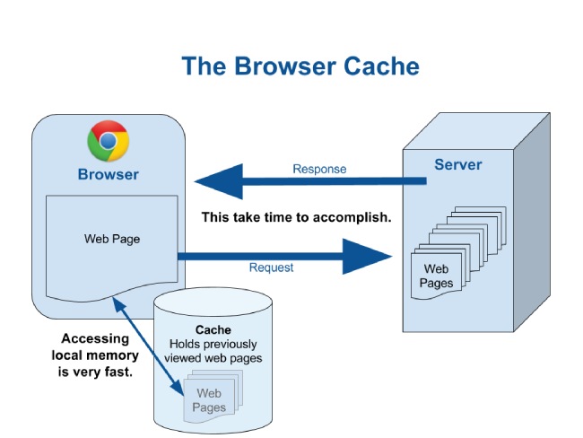
Implementing browser caching entails meticulous configuration of HTTP response headers, particularly the Cache-Control and Expires directives, to specify caching policies for different types of resources. Through judicious utilisation of cache-control directives, developers can define the duration for which browsers should cache specific resources, optimising performance while ensuring timely updates when necessary.
Furthermore, coupling cache-control directives with conditional requests enables efficient cache validation mechanisms, allowing browsers to ascertain resource freshness and fetch updated content only when warranted. In essence, by harnessing the power of browser caching, developers can forge a symbiotic relationship between client-side caching mechanisms and server-side optimisations, resulting in faster page loads and increased user satisfaction.
5. Not Prioritising Content Above the Fold:
For web development, the strategic placement of content above the fold represents a pivotal facet in crafting a compelling user interface. Ignoring this can create a less than ideal user experience with reduced ease of finding information and navigating the site effectively.
Prioritising the positioning of critical content elements above the fold entails a nuanced understanding of user behaviour and interface design principles, necessitating a meticulous approach to information architecture and layout optimisation.
By judiciously prioritising content above the fold, web developers can use visual hierarchy to guide user attention and streamline interaction pathways. Employing techniques such as strategic content segmentation and focal point analysis enables developers to distil key messaging and functionalities into concise, readily accessible components.
Moreover, leveraging responsive design paradigms ensures seamless adaptability across diverse viewport dimensions, safeguarding content visibility across an array of devices and screen sizes. Through these concerted efforts, developers can forge an intuitive user experience that not only enhances accessibility but also augments engagement metrics, ultimately, strengthening the website’s digital presence and effectiveness.
6. Neglecting to Minimise Server Response Time:
The ramifications of overlooking server response time optimisation extend far beyond mere inconvenience, seriously impacting a website’s performance and user satisfaction. Recognising its crucial role in determining page loading times, highlights the importance of carefully refining server infrastructure. This entails a multifaceted approach encompassing architectural enhancements, strategic utilisation of content delivery networks (CDNs), and the implementation of judicious caching mechanisms.
Improving server infrastructure requires careful coordination of hardware and software setups aimed at streamlining data processing and transmission pathways. Embracing advanced server technologies and load balancing strategies can mitigate bottlenecks, ensuring swift response times even under peak traffic conditions. Concurrently, the strategic deployment of CDNs represents a cornerstone strategy in the quest for optimal server performance.
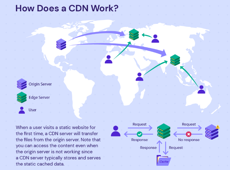
By leveraging a distributed network of servers strategically positioned across geographic regions, CDNs facilitate the expedited delivery of content to end-users, avoiding latency issues associated with long-distance data transfers. Moreover, judicious caching strategies, ranging from browser caching directives to server-side caching mechanisms, enable the retention and swift retrieval of frequently accessed resources, further bolstering response time efficiency.
Thus, through a comprehensive amalgamation of architectural refinement and strategic deployment of auxiliary technologies, web developers can effectively minimise server response time, engendering an enhanced browsing experience and fortifying a website’s competitive edge in the digital sphere.
7. Overlooking CSS Performance:
Ignoring the performance impact of CSS inefficiencies can lead to a series of rendering issues and disrupt the visual consistency of web interfaces. The meticulous optimization of Cascading Style Sheets (CSS) emerges as a pivotal undertaking in contemporary web development, warranting judicious attention to mitigate rendering delays and uphold visual stability across diverse browser environments and device configurations.
To avoid the pitfalls of inefficient CSS, developers must adopt a multifaceted strategy encompassing several best practices and advanced techniques. Central to this approach is the imperative to streamline stylesheets, a process entailing the consolidation and rationalisation of CSS rules to minimise redundancy and enhance parsing efficiency. Concurrently, the judicious elimination of unused styles represents a fundamental optimization step, effectively decluttering stylesheets and expediting rendering processes.

Moreover, the integration of preprocessors affords developers a robust toolset for modularising stylesheets, harnessing features such as variables, and nested rules to foster code maintainability and facilitate systematic optimization efforts.
Lastly, the strategic implementation of critical CSS techniques emerges as a linchpin in performance optimisation endeavours, facilitating the prioritised rendering of essential styles critical to above-the-fold content presentation, thereby improving perceived loading times and strengthening user engagement. Thus, a holistic approach to CSS optimisation stands as an indispensable prerequisite for performant and visually cohesive web experiences.
8. Failing to Address Cumulative Layout Shift:
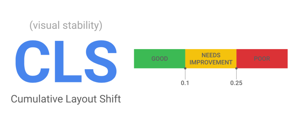
Cumulative Layout Shift (CLS) the abrupt and unanticipated shifts in layout that occur during the loading process, often disorienting visitors. Addressing CLS necessitates a meticulous approach grounded in preemptive measures aimed at stabilising the rendering of page elements, thereby fostering a fluid and coherent browsing experience.
To effectively mitigate CLS, developers must adopt a multifaceted strategy that includes both structural and procedural considerations. At its core, this approach entails ensuring that all elements within the webpage possess predefined dimensions, removing the risk of sudden layout adjustments upon content loading.
Moreover, proactive allocation of space for dynamically generated or asynchronous content emerges as a pivotal safeguard against disruptive shifts, facilitating smooth transitions and preserving visual continuity. By carefully auditing and optimising the layout construction process, developers can mitigate the negative effects of CLS, fortifying the foundation of user-centric design principles and elevating the overall quality of the digital experience.
9. Disregarding Interaction to Next Paint:
Disregarding INP directly reflects the efficiency and agility of a website in responding to user actions. This metric serves as a pivotal indicator of user experience, delineating the temporal gap between user input and subsequent visual updates on the webpage. To optimise INP and enhance website responsiveness, web developers must undertake a multifaceted approach rooted in meticulous JavaScript optimisation strategies.

Central to preventing INP is the reduction of JavaScript execution time, which necessitates a comprehensive audit and refinement of script functionalities. Prioritising critical tasks through techniques like code splitting and lazy loading ensures faster processing of essential functionalities, increasing the website’s responsiveness.
Additionally, strategic delay of non-essential JavaScript operations until after the initial page load markedly lessens rendering bottlenecks, fostering a smoother user experience. Employing modern JavaScript optimisation tools, such as minification, further streamlines code execution, minimising parse and compile times to bolster INP metrics significantly. By intricately managing JavaScript execution flow, developers can orchestrate a harmonious interplay between user interaction and visual feedback, thereby elevating the website’s responsiveness.
10. Forgetting to Monitor Core Web Vitals Regularly:
Neglecting to regularly check Core Web Vitals can seriously hurt how users experience a website and even make it harder for the site to compete with others. Core Web Vitals are important measures like how fast a page loads, how quickly users can interact with it, and how stable the visuals are.
These metrics tell developers a lot about how well a website performs overall. To keep users engaged and coming back, it’s crucial for developers to regularly check and review these metrics. Using tools like Google PageSpeed Insights, Lighthouse, and Chrome DevTools gives developers valuable information about how a website is doing. These tools help them look closely at important details, allowing them to spot any problems accurately.
By paying attention to metrics such as Largest Contentful Paint (LCP), Cumulative Layout Shift (CLS), and Interaction to Next Paint (INP) developers can identify areas where the website might be slowing down or behaving unexpectedly. It’s essential for developers to stay vigilant and use the insights they get from these tools to make continuous improvements. This ongoing effort is key to keeping a website competitive in today’s ever-changing digital landscape.
In conclusion, the optimisation of Core Web Vitals is an indispensable facet of contemporary web development, warranting meticulous attention and proactive remediation strategies. Addressing the common pitfalls outlined in this article represents a pivotal step towards enhancing user experience and fortifying a website’s competitive standing in the digital arena.

By diligently rectifying issues such as excessive page loading times, unresponsive interactions, and visual instability, developers can forge a path towards heightened performance and heightened user satisfaction. Leveraging an arsenal of tools and techniques, including but not limited to lazy loading images, minimising render-blocking resources, and optimising server response times, empowers developers to navigate the intricacies of Core Web Vitals with finesse.
Moreover, fostering a culture of continuous monitoring and refinement, underpinned by robust analytics and data-driven insights, serves as a linchpin in the perpetual quest for digital excellence. Embracing best practices and staying abreast of emerging trends and technologies are imperative to remain at the vanguard of web development prowess.
In essence, by acknowledging and remedying the common pitfalls surrounding Core Web Vitals, developers can chart a course towards a more seamless and gratifying online experience, underscoring their commitment to excellence and user-centric design principles.

