Mobile page speed is paramount for user experience and search engine rankings. With the majority of web traffic originating from mobile devices, optimising your website’s mobile performance is not just a good practice but a necessity. In this article, we’ll delve into actionable strategies and best practices to boost your mobile page speed and enhance overall user satisfaction.

1. Optimise Images:
Images are often the largest elements on a webpage and can significantly slow down loading times. To optimise images for mobile, consider the following techniques:
- Compress images without compromising quality using tools like ImageOptim or TinyPNG.
- Utilise responsive images to deliver appropriately sized images based on the user’s device resolution.
- Leverage modern image formats such as WebP, which offer superior compression compared to JPEG and PNG.
In addition to compressing images and utilising responsive images, there are a few more strategies to optimise images for mobile devices. One effective approach is to implement lazy loading, a technique where images are only loaded as they come into view, reducing initial page load times. By deferring the loading of off-screen images until they are needed, lazy loading minimises the amount of data transferred over the network during the initial page load, resulting in faster rendering times and improved overall performance.
Moreover, consider employing image sprites for frequently used icons or small images across your website. Image sprites combine multiple images into a single file, reducing the number of HTTP requests required to load them individually. This consolidation not only speeds up page loading times but also helps conserve bandwidth, especially on mobile networks where data usage may be limited. By optimising images through techniques like lazy loading and image sprites, web developers can ensure smoother and more efficient user experiences on mobile devices, ultimately leading to higher engagement and satisfaction.

2. Minify and Concatenate CSS and JavaScript:
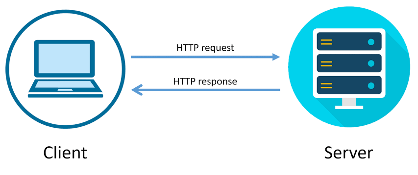
Minification reduces the size of CSS and JavaScript files by removing unnecessary characters like whitespace and comments. Concatenation combines multiple files into a single file, reducing the number of HTTP requests required to load a page.
- Use build tools like Webpack or Gulp to automate minification and concatenation processes.
- Consider using HTTP/2 protocol, which allows for parallel loading of multiple resources, mitigating the need for concatenation to some extent.
In addition to minification and concatenation, optimising the delivery of CSS and JavaScript resources can further enhance website performance. Utilising techniques such as code splitting, where large bundles are divided into smaller, more manageable chunks, can improve loading times by only delivering the necessary code for each specific page or component. This approach reduces the initial payload size and allows for more efficient caching strategies.
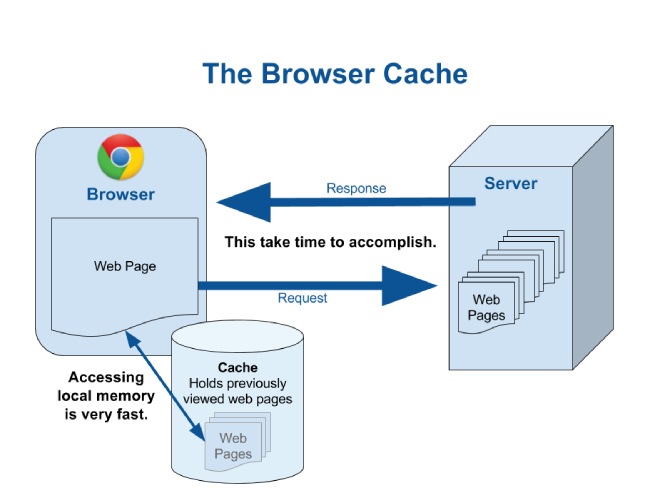
3. Implement Browser Caching:
Leveraging browser caching instructs browsers to store static assets locally, reducing the need to fetch resources repeatedly.
- Set appropriate cache-control headers for static assets to specify how long they should be cached.
- Utilise tools like Cache-Control and ETags to manage caching behaviour effectively.

Additionally, implementing versioning or fingerprinting techniques for static assets can aid in cache invalidation. By appending a unique identifier to the filename of each asset based on its content (e.g., hash or version number), browsers can detect when a file has been updated and fetch the latest version accordingly. This ensures that users receive the most up-to-date content while still benefiting from browser caching for unchanged assets, striking a balance between performance and freshness.
Moreover, optimising cache-control directives based on the nature of the content can further refine caching strategies. For instance, frequently updated resources like dynamic content or user-specific data may require shorter cache durations to ensure users receive the latest information. On the other hand, static assets such as images, stylesheets, and JavaScript files can typically be cached for longer periods without impacting content freshness. Tailoring cache-control settings based on the specific characteristics of each asset type optimises resource delivery and enhances overall website performance.
4. Enable Gzip Compression:
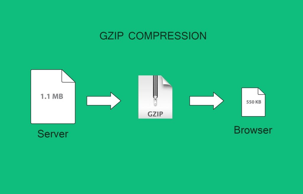
Gzip compression reduces the size of web page resources by compressing them before transmitting over the network.
- Configure your web server to enable Gzip compression for HTML, CSS, JavaScript, and other compatible file types.
- Verify compression effectiveness using tools like Google PageSpeed Insights or GTmetrix.

Implementing Gzip compression is a fundamental technique for optimising website performance and reducing bandwidth usage. By compressing HTML, CSS, JavaScript, and other compatible file types before transmitting them over the network, Gzip significantly reduces the size of these resources. This reduction in file size leads to faster load times for website visitors, as the smaller compressed files can be downloaded more quickly, especially on slower network connections or mobile devices.
In addition to enabling Gzip compression at the server level, it’s crucial to monitor and evaluate its effectiveness regularly. Tools like Google PageSpeed Insights or GTmetrix can provide insights into the compression ratio achieved and its impact on overall page speed. Continuous monitoring allows web developers to fine-tune compression settings and ensure optimal performance across different browsers and devices. Additionally, staying updated with best practices and advancements in compression algorithms can help maximise the benefits of Gzip compression and maintain a fast and responsive web experience for users.
5. Prioritise Above-the-Fold Content:
Delivering critical content to users as quickly as possible improves perceived performance and user engagement.
- Identify above-the-fold content (visible portion of the page without scrolling) and prioritise its loading by inlining critical CSS and deferring non-essential JavaScript.
- Utilise techniques like lazy loading for below-the-fold images and resources to improve initial page load times.
To enhance the prioritisation of above-the-fold content, implementing server-side rendering (SSR) or static site generation (SSG) can be highly effective. SSR generates the initial HTML content on the server, including the above-the-fold content, and sends it to the client’s browser, enabling users to view critical information almost instantly. Similarly, SSG pre-renders pages during the build process, ensuring that above-the-fold content is readily available upon the user’s request. These approaches minimise the time-to-interactivity, providing users with a faster and more engaging browsing experience.

Moreover, optimising the perceived loading experience through skeleton screens or placeholders can further improve user perception of performance. Skeleton screens display a simplified version of the page layout, resembling the structure of the content to be loaded, while placeholders reserve space for content elements yet to be rendered. By offering visual cues that signify content is loading, users perceive a smoother transition between page states, reducing frustration and improving overall satisfaction. These techniques not only prioritise above-the-fold content but also contribute to a more seamless and user-friendly browsing experience.
6. Optimise Server Response Time:
Server response time directly impacts page speed, particularly on mobile devices with varying network conditions.
- Optimise database queries, server-side code, and infrastructure to minimise response times.
- Utilise content delivery networks (CDNs) to cache and serve content from geographically distributed servers closer to the user.

In addition to optimising server response time through database query and server-side code optimisations, implementing effective load balancing strategies can further enhance performance. Load balancing distributes incoming network traffic across multiple servers, ensuring that no single server becomes a bottleneck. This not only improves response times but also enhances the overall reliability and availability of the website. Load balancing can be achieved through various techniques, including round-robin, least connections, or even more advanced algorithms that consider server health and performance metrics.
Another crucial aspect of server response time optimisation involves thorough monitoring and analysis. Utilising performance monitoring tools can help identify potential bottlenecks, track server health metrics, and provide insights into areas that require further optimisation. Continuous monitoring allows for proactive identification and resolution of performance issues before they impact the user experience. Additionally, employing techniques like server-side caching for dynamic content or utilising in-memory caching mechanisms can further reduce the time required for server processing, leading to faster response times and improved overall website performance.
7. Monitor and Continuously Optimise Performance:
Regular performance monitoring and optimisation are crucial for maintaining optimal mobile page speed.
- Utilise tools like Google PageSpeed Insights, Lighthouse, and WebPageTest to identify performance bottlenecks and opportunities for improvement.
- Implement performance budgets to set thresholds for key performance metrics and track deviations over time.
In addition to utilising tools like Google PageSpeed Insights, Lighthouse, and WebPageTest, implementing real-user monitoring (RUM) solutions can provide valuable insights into how actual users experience your website’s performance. RUM tools collect data on page load times, interactions, and other performance metrics directly from users’ browsers, offering a more accurate representation of the end-user experience across different devices and network conditions. Analysing RUM data allows for targeted optimisation efforts aimed at addressing specific issues that impact user satisfaction and engagement.
Furthermore, conducting regular performance audits and reviews can help identify emerging performance issues before they become significant problems. By periodically reviewing and analysing performance metrics, code changes, and website architecture, development teams can proactively address potential bottlenecks and ensure that performance remains a priority throughout the development lifecycle. Continuous integration and continuous deployment (CI/CD) pipelines can be augmented with automated performance tests to catch performance regressions early in the development process, preventing the introduction of performance issues into production environments.

In conclusion, optimising mobile page speed is a multifaceted endeavour that requires a combination of technical expertise, strategic implementation, and ongoing refinement. By following the aforementioned best practices and staying abreast of emerging technologies and techniques, web developers can deliver fast and seamless mobile experiences that delight users and drive business success. Prioritising performance optimisation not only improves user satisfaction and engagement but also positively impacts key business metrics such as conversion rates, retention, and overall brand perception.
Continued investment in mobile performance optimisation is essential in today’s digital landscape, where users expect instant access to information and smooth interactions across all devices. By adopting a holistic approach to mobile optimisation, incorporating best practices in coding, asset delivery, and performance monitoring, organisations can maintain a competitive edge in the ever-evolving online marketplace. Ultimately, the pursuit of mobile page speed optimisation is not just about meeting technical benchmarks but about creating meaningful and impactful experiences that enhance user satisfaction and contribute to long-term business growth.


Recent Comments