Tag: page speed

5 Essential Tools for Analysing and Enhancing Page Speed Performance

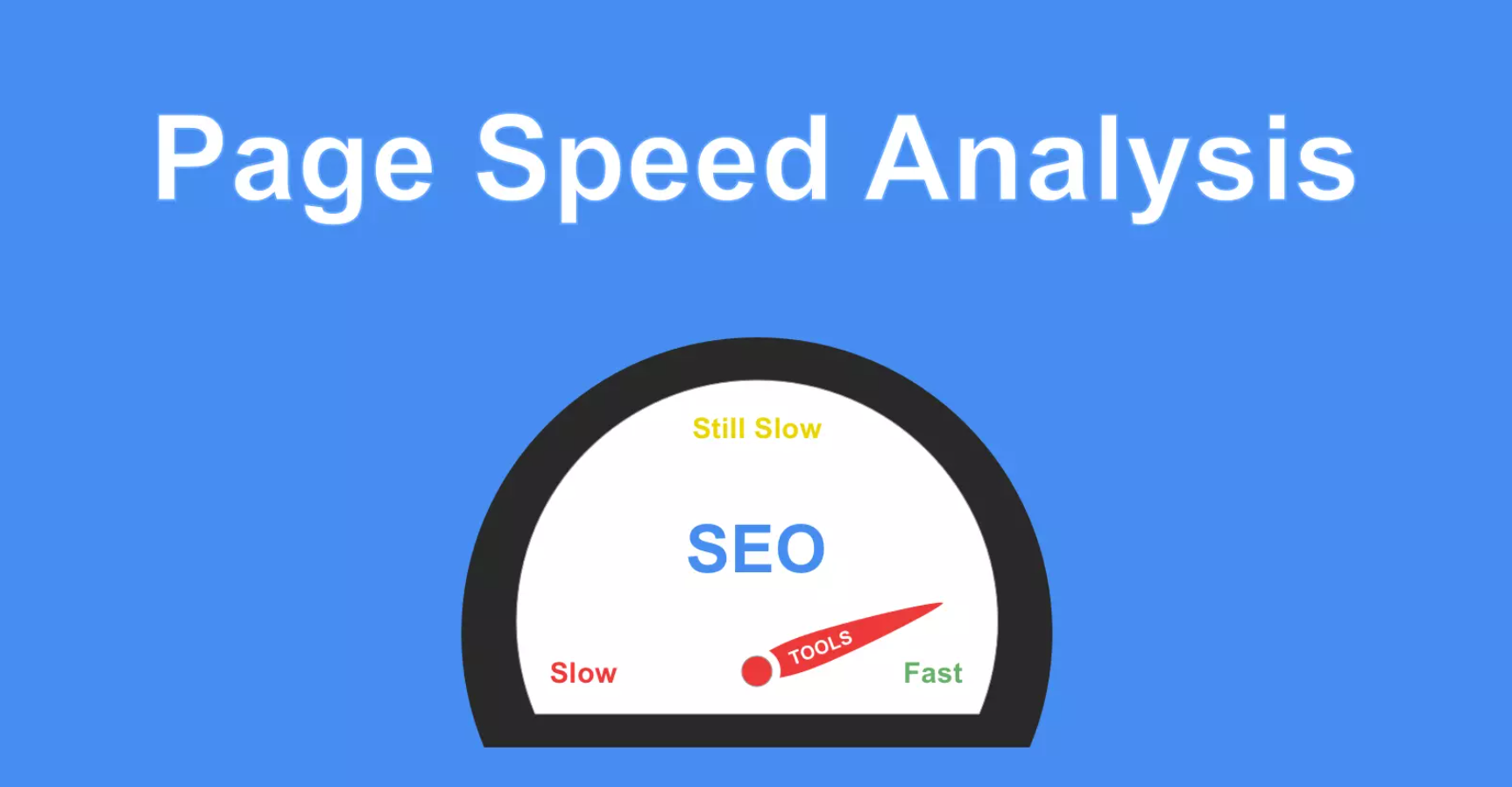
Page speed is a critical factor in determining the success of a website. Users demand instant access to information, and search engines prioritise fast-loading websites in their rankings. As a result, web developers are constantly seeking ways to optimise page speed performance to enhance user experience and improve search engine visibility.

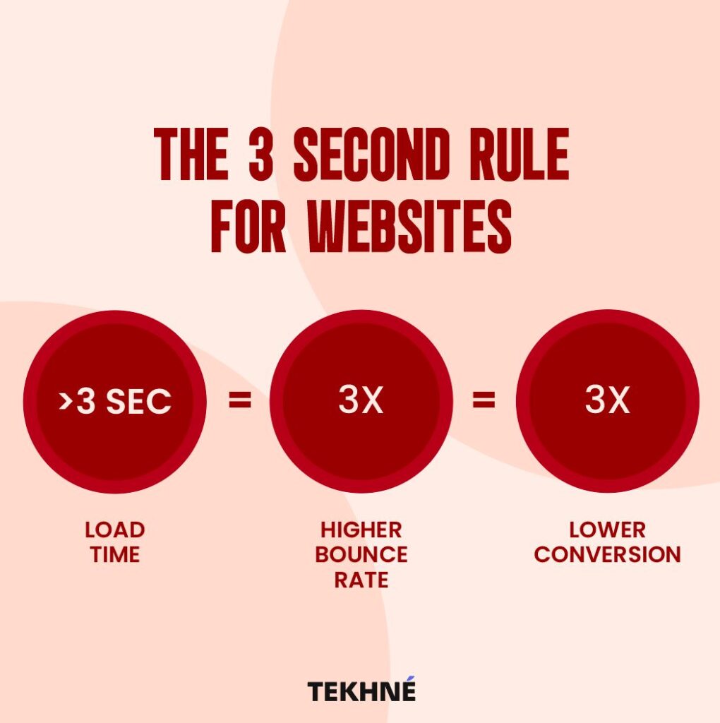
In addition to enhancing user experience and search engine visibility, optimising page speed performance can also have significant business implications. Researches have shown that faster-loading websites experience lower bounce rates and higher conversion rates, leading to increased revenue and customer satisfaction. Therefore, investing in tools and strategies to improve page speed is not only a matter of technical optimisation but also a strategic decision that directly impacts the bottom line of businesses operating in the digital realm.

In this article, we will delve into five essential tools that empower web developers to analyse and enhance page speed performance, equipping them with the necessary insights and techniques to drive superior user experiences, boost search engine rankings, and ultimately achieve business success in the competitive online landscape.

1. Google PageSpeed Insights:

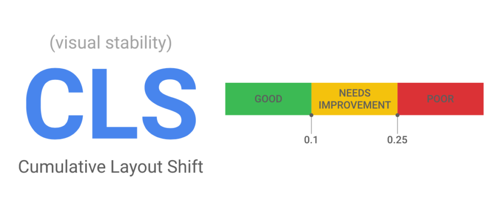
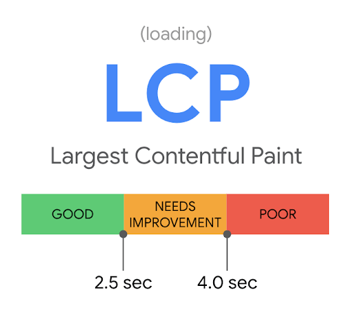
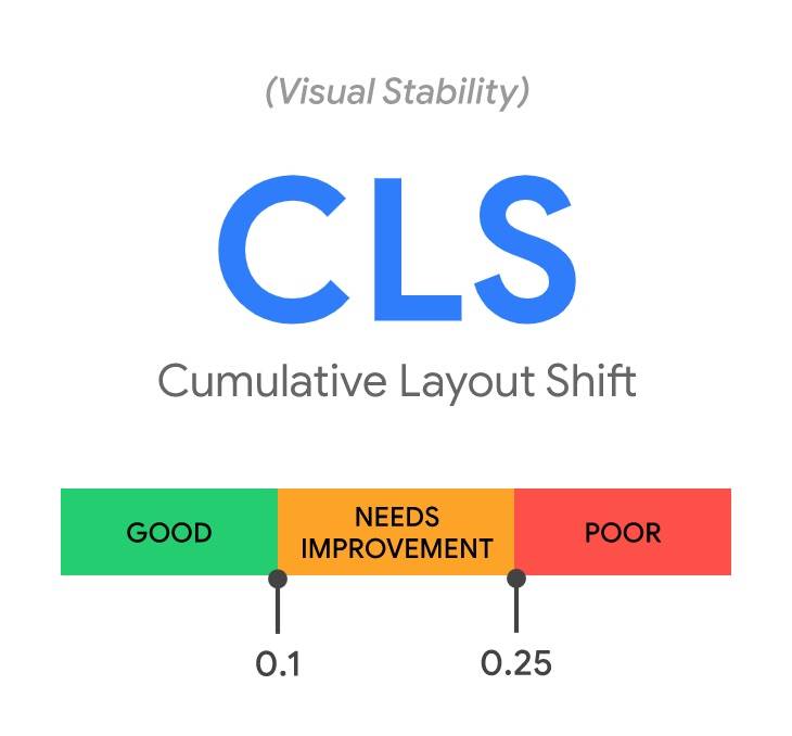
Google PageSpeed Insights is a widely used tool for evaluating the performance of web pages on both desktop and mobile devices. It provides a comprehensive analysis of various performance metrics such as First Contentful Paint (FCP), Largest Contentful Paint (LCP), and Cumulative Layout Shift (CLS). Additionally, PageSpeed Insights offers actionable recommendations for optimising performance, ranging from image compression and script minification to server response time improvements.

By leveraging Google PageSpeed Insights, developers can gain valuable insights into the factors affecting their website’s speed and prioritise optimisations to achieve significant performance gains.

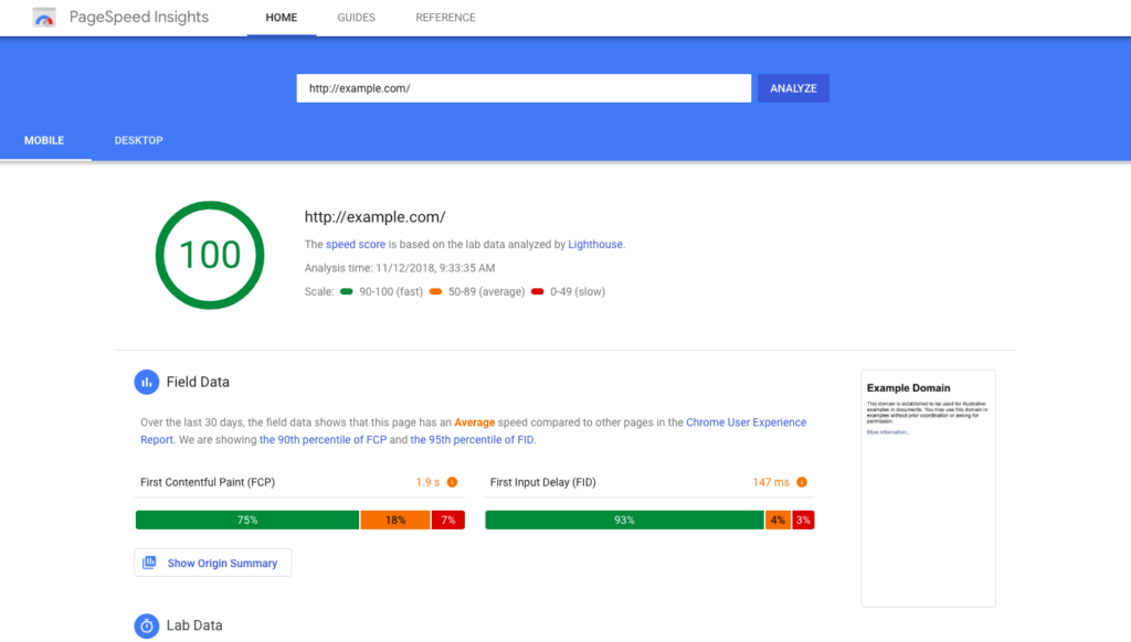
Google PageSpeed Insights stands out not only for its ability to assess page speed performance but also for its integration with Google’s search algorithms. Websites that score well on PageSpeed Insights are more likely to rank higher in Google search results, making it an indispensable tool for improving both user experience and search engine visibility. Furthermore, Google continuously updates its algorithms to prioritise fast-loading websites, emphasising the importance of optimising performance metrics measured by tools like PageSpeed Insights.

Moreover, Google PageSpeed Insights provides developers with a platform for ongoing performance monitoring and optimisation. By regularly testing their websites using PageSpeed Insights, developers can track changes in performance over time and identify any regressions or areas for improvement. This iterative approach to performance optimisation ensures that websites remain responsive and competitive in an ever-evolving digital landscape. Ultimately, Google PageSpeed Insights serves as a catalyst for continuous improvement, empowering developers to deliver faster, more efficient web experiences to users across all devices.

2. GTmetrix:

GTmetrix is another powerful tool for analysing page speed performance, offering detailed reports on loading times, page size, and other key metrics. One of the standout features of GTmetrix is its waterfall chart, which provides a visual representation of the loading process, highlighting the time taken by each resource to load.

In addition to performance metrics, GTmetrix also offers recommendations for optimising various aspects of website performance, including image optimisation, browser caching, and server configuration. By following these recommendations, developers can fine-tune their websites for optimal speed and performance.

Furthermore, GTmetrix allows users to compare their website’s performance against competitors or industry benchmarks, providing valuable insights into areas for improvement. Through side-by-side comparisons, developers can identify areas where their website may be lagging behind and implement targeted optimisations to gain a competitive edge.

Moreover, GTmetrix offers historical data tracking, allowing developers to monitor the impact of optimisations over time. By tracking performance trends and analysing historical data, developers can make informed decisions about future optimisations and ensure consistent improvements in page speed performance. This feature enables developers to establish a continuous optimisation cycle, wherein they can iteratively refine their website’s performance to meet evolving user expectations and stay ahead of the curve.

3. WebPageTest:

WebPageTest is a highly customisable tool that allows developers to conduct detailed performance tests from multiple locations around the world. It offers a wealth of performance metrics, including Speed Index, Time to First Byte (TTFB), and Time to Interactive (TTI), enabling developers to identify performance bottlenecks and assess the impact of optimisations in real-world scenarios.

WebPageTest also provides advanced features such as filmstrip view, which visualises the loading process frame by frame, and HTTP/2 prioritisation, which evaluates the efficiency of resource loading over HTTP/2 connections. By utilising WebPageTest, developers can gain deeper insights into their website’s performance and implement targeted optimisations to enhance speed and responsiveness.

Moreover, WebPageTest offers developers the ability to simulate various network conditions, such as 4G or 5G connections, to assess how their website performs under different bandwidth constraints. This feature is invaluable for understanding how users with slower internet connections experience the site and for optimising content delivery strategies accordingly. Additionally, developers can configure custom scripts to interact with their website during the test, enabling them to measure the performance of dynamic content and user interactions.

Furthermore, WebPageTest provides detailed diagnostic information, including a breakdown of resource loading times and dependencies. Developers can use this information to identify specific elements of their website that contribute to slow loading times and prioritise optimisation efforts accordingly. With its robust set of features and comprehensive performance analysis capabilities, WebPageTest is an indispensable tool for web developers seeking to deliver fast, reliable, and responsive websites to their users across the globe.

4. Pingdom Website Speed Test:

Pingdom Website Speed Test is a user-friendly tool that offers a quick and easy way to assess page speed performance. It provides a comprehensive overview of performance metrics, including page size, load time, and requests made, along with grades for various performance aspects such as compression, caching, and minification.

One of the key advantages of Pingdom Website Speed Test is its intuitive interface, which makes it accessible to developers of all skill levels. Additionally, Pingdom offers monitoring services that allow developers to track their website’s performance over time and receive alerts for any performance issues that arise.

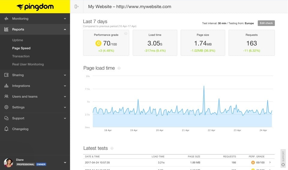
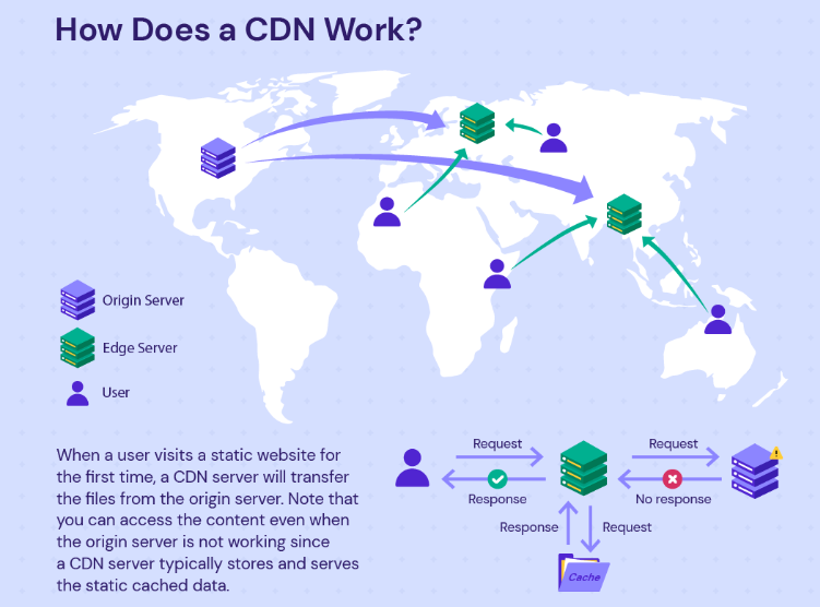
Furthermore, Pingdom Website Speed Test stands out for its ability to simulate page load times from various locations worldwide. This feature is invaluable for developers who cater to a global audience, as it allows them to assess performance across different geographical regions and identify areas for improvement. By understanding how their website performs in different locations, developers can optimise content delivery networks (CDNs) and server configurations to ensure consistent and fast loading times for users worldwide.

In addition to its performance analysis capabilities, Pingdom Website Speed Test offers insights into specific optimisation opportunities through its recommendations. By highlighting areas such as image optimisation, script minification, and leveraging browser caching, Pingdom empowers developers to make informed decisions to enhance their website’s speed and performance. 

5. Lighthouse:

Lighthouse is an open-source tool developed by Google that is integrated into the Chrome DevTools and available as a standalone command-line tool. It performs audits on web pages, generating reports on various aspects of performance, accessibility, and best practices.

Lighthouse evaluates performance metrics such as FCP, LCP, and CLS, along with recommendations for optimising performance, accessibility, and SEO. It also offers guidance on implementing progressive web app (PWA) features and ensuring compliance with web standards.

Moreover, Lighthouse provides developers with the capability to simulate various network conditions and device types, allowing them to assess how their website performs under different circumstances. By simulating slower network speeds or using different device emulations, developers can identify potential performance bottlenecks and address them proactively, ensuring a consistent user experience across a wide range of devices and network conditions.

Additionally, Lighthouse offers integrations with continuous integration (CI) tools and platforms such as GitHub Actions, allowing developers to automate performance testing as part of their development workflow. By incorporating Lighthouse audits into their CI/CD pipelines, developers can catch performance regressions early in the development process and ensure that their website maintains optimal performance with each code change. This integration facilitates a proactive approach to performance optimisation, enabling developers to deliver high-performance web experiences consistently.

Conclusion:

In conclusion, optimising page speed performance is crucial for ensuring a positive user experience and improving search engine visibility. By utilising the aforementioned tools, web developers can gain valuable insights into their website’s performance and implement targeted optimisations to achieve faster loading times.

Whether it’s analysing performance metrics, identifying bottlenecks, or implementing best practices, these tools provide the necessary resources for enhancing page speed performance and staying ahead in the competitive landscape of the web. By incorporating these tools into their workflow, developers can create websites that deliver optimal performance and exceed user expectations.

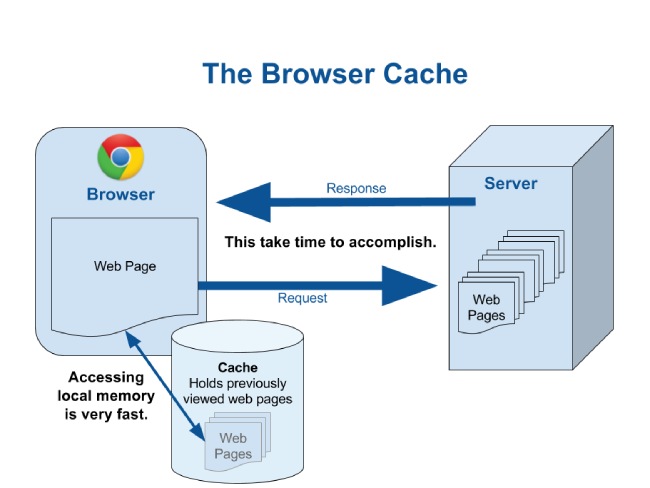
It’s crucial to recognize that page speed optimisation is an ongoing process. Regular analysis and enhancements are necessary to address emerging bottlenecks and adapt to evolving technologies and user expectations. Additionally, employing strategies like image compression, browser caching, content delivery networks (CDNs), and mobile-first design principles contribute to maintaining healthy page speed.

In essence, a comprehensive approach that combines regular performance assessments with diverse optimisation strategies enables developers to create websites that exceed user expectations and thrive in the competitive digital landscape.

10 Common Core Web Vital Mistakes and How to Fix Them

Creating a seamless user experience is key to the success of any website. Core Web Vitals are metrics used by Google to evaluate the performance and user experience of websites. In this comprehensive guide, we will delve into the 10 most common mistakes made in relation to Core Web Vitals and provide in-depth solutions to fix them.

1. Ignoring Mobile Optimization:

In the contemporary digital landscape dominated by mobile usage, the imperative of mobile optimisation exceeds mere usability concerns; it directly impacts a website’s performance, user engagement, and ultimately, its success. 

Neglecting this crucial facet of web development invariably invites suboptimal loading times and compromised user experiences, impeding not only accessibility but also deterring potential conversions and diminishing overall site credibility. Web developers must embrace responsive design methodologies as their cornerstone approach. 

By integrating sophisticated techniques such as media queries and fluid grid systems, developers can ensure seamless adaptability across a myriad of devices and screen sizes. Leveraging media queries empowers developers to tailor CSS rules based on device characteristics, thereby optimising content presentation and layout for various viewport dimensions. 

Meanwhile, flexible grid layouts afford dynamic scaling and repositioning of elements, facilitating a harmonious user experience irrespective of the viewing context. Consequently, a meticulously crafted responsive design not only mitigates performance bottlenecks but also fosters a user-centric ethos, underpinning a website’s efficacy and relevance in an increasingly mobile-centric ecosystem.

2. Overloading the Page with Large Images:

Incorporating large, high-resolution images poses a major threat to the efficiency and fluidity of web page rendering. The burden on network bandwidth and client-side resources by these data-intensive assets can manifest as prolonged loading times, deterring user engagement and reducing retention rates. 

Consequently, web developers are compelled to adopt a judicious approach to image management, balancing visual fidelity with performance imperatives to safeguard optimal user experiences.

To minimise the negative effects of large images, it’s essential to use a detailed strategy based on careful image optimisation techniques. Integral to this strategy is the utilisation of compression algorithms tailored to preserve visual integrity while reduced file sizes. Employing industry-standard tools and plugins, developers can systematically reduce image payloads without perceptible loss of quality, thereby mitigating bandwidth congestion and expediting content delivery. 

Furthermore, the adoption of responsive image solutions, such as picture elements, enables the seamless adaptation of image assets to diverse viewport dimensions, ensuring an optimal balance between visual richness and performance efficiency across a spectrum of devices and network conditions. By integrating these methodologies into the development workflow, fostering a harmonious synthesis of aesthetic appeal and functional efficacy.

3. Using Excessive JavaScript:

The judicious management of JavaScript constitutes a pivotal aspect in optimising performance and enhancing user experience. The incorporation of excessive JavaScript code can cause harmful effects primarily in suboptimal loading times and compromised runtime efficiency. 

Mitigating these adverse effects needs a meticulous approach, starting with a thorough check to identify and eliminate redundant or unused JavaScript files. This strategic pruning not only streamlines the codebase but also mitigates the potential for compatibility issues and runtime errors, fostering a leaner, more agile web application architecture.

Moreover, to further increase performance gains, developers should also try code minification and bundling. Code minification entails the deliberate reduction of JavaScript file size through the elimination of whitespace, comments, and other non-essential characters, thereby facilitating faster transmission and parsing by the client’s browser. 

Concurrently, bundling amalgamates disparate JavaScript modules into cohesive bundles, minimising HTTP requests and network latency while optimising caching mechanisms. By embracing these refined practices, developers can efficiently mitigate the deleterious impact of excessive JavaScript, ensuring a streamlined, performant web application primed for optimal user engagement.

4. Not Leveraging Browser Caching:

Failure to leverage browser caching represents a missed opportunity to optimise website performance and enhance user experience. Browser caching empowers web developers to dictate how long browsers retain static resources, such as images, CSS files, and scripts, locally on a user’s device. 

By strategically configuring cache-control headers, developers can dictate caching policies, thus enabling browsers to fetch and render cached resources swiftly upon subsequent visits, mitigating unnecessary network requests and minimising page load times for returning visitors.

Implementing browser caching entails meticulous configuration of HTTP response headers, particularly the Cache-Control and Expires directives, to specify caching policies for different types of resources. Through judicious utilisation of cache-control directives, developers can define the duration for which browsers should cache specific resources, optimising performance while ensuring timely updates when necessary. 

Furthermore, coupling cache-control directives with conditional requests enables efficient cache validation mechanisms, allowing browsers to ascertain resource freshness and fetch updated content only when warranted. In essence, by harnessing the power of browser caching, developers can forge a symbiotic relationship between client-side caching mechanisms and server-side optimisations, resulting in faster page loads and increased user satisfaction.

5. Not Prioritising Content Above the Fold:

For web development, the strategic placement of content above the fold represents a pivotal facet in crafting a compelling user interface. Ignoring this can create a less than ideal user experience with reduced ease of finding information and navigating the site effectively. 

Prioritising the positioning of critical content elements above the fold entails a nuanced understanding of user behaviour and interface design principles, necessitating a meticulous approach to information architecture and layout optimisation.

By judiciously prioritising content above the fold, web developers can use visual hierarchy to guide user attention and streamline interaction pathways. Employing techniques such as strategic content segmentation and focal point analysis enables developers to distil key messaging and functionalities into concise, readily accessible components. 

Moreover, leveraging responsive design paradigms ensures seamless adaptability across diverse viewport dimensions, safeguarding content visibility across an array of devices and screen sizes. Through these concerted efforts, developers can forge an intuitive user experience that not only enhances accessibility but also augments engagement metrics, ultimately, strengthening the website’s digital presence and effectiveness.

6. Neglecting to Minimise Server Response Time:

The ramifications of overlooking server response time optimisation extend far beyond mere inconvenience, seriously impacting a website’s performance and user satisfaction. Recognising its crucial role in determining page loading times, highlights the importance of carefully refining server infrastructure. This entails a multifaceted approach encompassing architectural enhancements, strategic utilisation of content delivery networks (CDNs), and the implementation of judicious caching mechanisms.

Improving server infrastructure requires careful coordination of hardware and software setups aimed at streamlining data processing and transmission pathways. Embracing advanced server technologies and load balancing strategies can mitigate bottlenecks, ensuring swift response times even under peak traffic conditions. Concurrently, the strategic deployment of CDNs represents a cornerstone strategy in the quest for optimal server performance. 

By leveraging a distributed network of servers strategically positioned across geographic regions, CDNs facilitate the expedited delivery of content to end-users, avoiding latency issues associated with long-distance data transfers. Moreover, judicious caching strategies, ranging from browser caching directives to server-side caching mechanisms, enable the retention and swift retrieval of frequently accessed resources, further bolstering response time efficiency. 

Thus, through a comprehensive amalgamation of architectural refinement and strategic deployment of auxiliary technologies, web developers can effectively minimise server response time, engendering an enhanced browsing experience and fortifying a website’s competitive edge in the digital sphere.

7. Overlooking CSS Performance:

Ignoring the performance impact of CSS inefficiencies can lead to a series of rendering issues and disrupt the visual consistency of web interfaces. The meticulous optimization of Cascading Style Sheets (CSS) emerges as a pivotal undertaking in contemporary web development, warranting judicious attention to mitigate rendering delays and uphold visual stability across diverse browser environments and device configurations.

To avoid the pitfalls of inefficient CSS, developers must adopt a multifaceted strategy encompassing several best practices and advanced techniques. Central to this approach is the imperative to streamline stylesheets, a process entailing the consolidation and rationalisation of CSS rules to minimise redundancy and enhance parsing efficiency. Concurrently, the judicious elimination of unused styles represents a fundamental optimization step, effectively decluttering stylesheets and expediting rendering processes. 

Moreover, the integration of preprocessors affords developers a robust toolset for modularising stylesheets, harnessing features such as variables, and nested rules to foster code maintainability and facilitate systematic optimization efforts. 

Lastly, the strategic implementation of critical CSS techniques emerges as a linchpin in performance optimisation endeavours, facilitating the prioritised rendering of essential styles critical to above-the-fold content presentation, thereby improving perceived loading times and strengthening user engagement. Thus, a holistic approach to CSS optimisation stands as an indispensable prerequisite for performant and visually cohesive web experiences. 

8. Failing to Address Cumulative Layout Shift:

Cumulative Layout Shift (CLS) the abrupt and unanticipated shifts in layout that occur during the loading process, often disorienting visitors. Addressing CLS necessitates a meticulous approach grounded in preemptive measures aimed at stabilising the rendering of page elements, thereby fostering a fluid and coherent browsing experience.

To effectively mitigate CLS, developers must adopt a multifaceted strategy that includes both structural and procedural considerations. At its core, this approach entails ensuring that all elements within the webpage possess predefined dimensions, removing the risk of sudden layout adjustments upon content loading. 

Moreover, proactive allocation of space for dynamically generated or asynchronous content emerges as a pivotal safeguard against disruptive shifts, facilitating smooth transitions and preserving visual continuity. By carefully auditing and optimising the layout construction process, developers can mitigate the negative effects of CLS, fortifying the foundation of user-centric design principles and elevating the overall quality of the digital experience.

9. Disregarding Interaction to Next Paint:

Disregarding INP directly reflects the efficiency and agility of a website in responding to user actions. This metric serves as a pivotal indicator of user experience, delineating the temporal gap between user input and subsequent visual updates on the webpage. To optimise INP and enhance website responsiveness, web developers must undertake a multifaceted approach rooted in meticulous JavaScript optimisation strategies.

Central to preventing INP is the reduction of JavaScript execution time, which necessitates a comprehensive audit and refinement of script functionalities. Prioritising critical tasks through techniques like code splitting and lazy loading ensures faster processing of essential functionalities, increasing the website’s responsiveness. 

Additionally, strategic delay of non-essential JavaScript operations until after the initial page load markedly lessens rendering bottlenecks, fostering a smoother user experience. Employing modern JavaScript optimisation tools, such as minification, further streamlines code execution, minimising parse and compile times to bolster INP metrics significantly. By intricately managing JavaScript execution flow, developers can orchestrate a harmonious interplay between user interaction and visual feedback, thereby elevating the website’s responsiveness. 

10. Forgetting to Monitor Core Web Vitals Regularly:

Neglecting to regularly check Core Web Vitals can seriously hurt how users experience a website and even make it harder for the site to compete with others. Core Web Vitals are important measures like how fast a page loads, how quickly users can interact with it, and how stable the visuals are. 

These metrics tell developers a lot about how well a website performs overall. To keep users engaged and coming back, it’s crucial for developers to regularly check and review these metrics. Using tools like Google PageSpeed Insights, Lighthouse, and Chrome DevTools gives developers valuable information about how a website is doing. These tools help them look closely at important details, allowing them to spot any problems accurately. 

By paying attention to metrics such as Largest Contentful Paint (LCP), Cumulative Layout Shift (CLS), and Interaction to Next Paint (INP) developers can identify areas where the website might be slowing down or behaving unexpectedly. It’s essential for developers to stay vigilant and use the insights they get from these tools to make continuous improvements. This ongoing effort is key to keeping a website competitive in today’s ever-changing digital landscape.

In conclusion, the optimisation of Core Web Vitals is an indispensable facet of contemporary web development, warranting meticulous attention and proactive remediation strategies. Addressing the common pitfalls outlined in this article represents a pivotal step towards enhancing user experience and fortifying a website’s competitive standing in the digital arena.

By diligently rectifying issues such as excessive page loading times, unresponsive interactions, and visual instability, developers can forge a path towards heightened performance and heightened user satisfaction. Leveraging an arsenal of tools and techniques, including but not limited to lazy loading images, minimising render-blocking resources, and optimising server response times, empowers developers to navigate the intricacies of Core Web Vitals with finesse.

Moreover, fostering a culture of continuous monitoring and refinement, underpinned by robust analytics and data-driven insights, serves as a linchpin in the perpetual quest for digital excellence. Embracing best practices and staying abreast of emerging trends and technologies are imperative to remain at the vanguard of web development prowess.

In essence, by acknowledging and remedying the common pitfalls surrounding Core Web Vitals, developers can chart a course towards a more seamless and gratifying online experience, underscoring their commitment to excellence and user-centric design principles.

Optimising UI for B2B Website Speed and Success

The speed at which your website loads can make or break your success. With an astounding 82% of B2B pages loading in 5 seconds or less, as a business, you need to pay careful attention to this critical aspect of their online presence. 

Did you know that a B2B site loading in just 1 second can enjoy a conversion rate three times higher than its 5-second counterpart? Let’s talk about the relationship between ecommerce success and page speed, exploring the reasons behind these statistics and offering actionable insights for businesses looking to stay ahead in the digital race.

The 82% Benchmark

The statistic that 82% of B2B pages load in 5 seconds or less reflects the industry’s commitment to providing a reasonably swift online experience. This benchmark suggests that the majority of businesses understand the importance of page speed in catering to the modern digital consumer’s expectations. However, it also implies that merely meeting this industry average might not be sufficient to gain a competitive edge.

To truly stand out, businesses should aim not just for an acceptable loading time but for an exceptional one. Users are increasingly intolerant of delays, and exceeding their expectations can lead to increased engagement, prolonged time spent on the site, and, ultimately, higher conversion rates.

The 1-Second Advantage

The revelation that a B2B site loading in 1 second has a conversion rate three times higher than its 5-second counterpart is a game-changer. This stark difference underscores the critical role of page speed in influencing user behaviour and, consequently, a website’s success.

The 1-second advantage is not merely about speed but about user experience and satisfaction. Businesses need to delve deeper into understanding why this tiny timeframe has such a significant impact. It goes beyond the surface level and involves the psychology of user interaction, establishing trust, and creating a seamless journey that encourages users to take the desired actions.

UI and Page Speed

he user interface (UI) of an e-commerce website plays a crucial role in both page speed and audience engagement. A well-designed UI optimises the user experience by streamlining navigation, minimising friction, and presenting information in a clear and intuitive manner. From a page speed perspective, a lightweight and efficient UI reduces the amount of data that needs to be transferred between the server and the user’s device, resulting in faster load times. Additionally, an engaging UI captivates the audience’s attention, encourages exploration, and fosters trust, thereby increasing the likelihood of prolonged interaction and conversions. Conversely, a cluttered or poorly optimized UI can slow down page load times, frustrate users, and lead to high bounce rates. Thus, the synergy between UI design and page speed is paramount, as it directly impacts audience engagement and ultimately influences the success of an e-commerce platform.

Crafting a high-performing and efficient UI requires a delicate balance of technical prowess and user-centric design principles.

Understanding UI Performance

1. Critical Rendering Path Optimisation: The critical rendering path encompasses the sequence of steps required to render a webpage, from fetching resources to rendering pixels on the screen. By minimising render-blocking resources, optimising CSS and JavaScript delivery, and prioritising above-the-fold content, e-commerce sites can expedite initial rendering, reducing perceived load times and enhancing user experience.

2. Responsive Design and Fluid Layouts: Responsive design ensures that e-commerce UIs adapt seamlessly to various screen sizes and devices, offering a consistent experience across desktops, tablets, and smartphones. Fluid layouts, powered by CSS frameworks like Bootstrap or Foundation, facilitate dynamic resizing and flexible content presentation, enhancing usability and accessibility.

3. Asynchronous Loading and Code Splitting: Leveraging asynchronous loading techniques and code splitting enables e-commerce sites to load non-critical resources asynchronously, prioritise essential content, and reduce time-to-interactivity. Implementing JavaScript bundling tools such as Webpack or Rollup optimises code delivery, minimising network overhead and accelerating page load times.

Efficiency Through Performance Enhancements

1. Lazy Loading and Image Optimisation: Employing lazy loading techniques defers the loading of below-the-fold content until it enters the viewport, conserving bandwidth and improving perceived performance. Image optimisation strategies, including compression, responsive image formats (e.g., WebP), and lazy loading, mitigate the impact of large image files on page load times, without compromising visual fidelity.

2. Efficient Data Fetching with GraphQL: GraphQL, a query language for APIs, empowers e-commerce UIs to retrieve precisely the data they need, eliminating over-fetching and under-fetching inefficiencies associated with traditional RESTful APIs. By consolidating multiple API calls into a single request and fetching only required data fields, GraphQL minimises network latency and enhances data loading efficiency.

3. Client-side Caching and State Management: Implementing client-side caching mechanisms, such as browser storage (e.g., localStorage, sessionStorage) and state management libraries (e.g., Redux, Vuex), optimises data retrieval and persistence, reducing round-trip server requests and enhancing UI responsiveness. Utilising techniques like memoisation and selective data fetching further enhances caching efficiency, ensuring optimal performance under varying usage scenarios.

Continuous Optimisation and Performance Monitoring

1. Performance Budgeting: Establishing performance budgets sets clear constraints on key performance metrics, such as page load time and time-to-interactivity, guiding development efforts and prioritising performance optimisations. Continuous monitoring using tools like Lighthouse, WebPageTest, or Chrome DevTools enables real-time performance analysis, identifies bottlenecks, and informs iterative improvements.

2. A/B Testing and User Feedback: Conducting A/B tests and soliciting user feedback provide invaluable insights into the efficacy of UI optimisations and user preferences. Iteratively refining UI elements based on empirical data and user sentiment ensures that e-commerce sites evolve in alignment with user expectations and technological advancements.

Engineering high-performing and efficient UIs for e-commerce sites demands a multidimensional approach that harmonises technical sophistication with user-centric design principles. By prioritising UI performance optimisation strategies, e-commerce enterprises can deliver unparalleled user experiences, drive engagement and conversion, and position themselves as industry leaders in the fiercely competitive digital landscape. In a realm where microseconds matter, mastering the art and science of UI engineering isn’t just a pursuit of excellence; it’s a strategic imperative that propels e-commerce ventures towards sustained growth and prosperity.

Tips for Improving UI for Speed:

Improving the user interface (UI) for ecommerce websites to enhance page speed requires a strategic approach that involves both technical optimisations and thoughtful design considerations. Let’s delve into the technical aspects and best practices to achieve a seamless and high-performing UI.

  1. Image Optimisation:

Technical Details:

  • Utilise modern image formats like WebP, which provides better compression without sacrificing quality.
  • Implement responsive image techniques to serve appropriately sized images based on the user’s device and screen size.
  • Leverage image compression tools to reduce file sizes without compromising visual quality.

Design Considerations:

  • Prioritise visually impactful images for key product pages and use more compressed versions for secondary content.
  • Consider lazy loading images, loading them only when they come into the user’s viewport, reducing initial page load time.
  1. Minimise HTTP Requests:

Technical Details:

  • Concatenate and minify CSS and JavaScript files to reduce the number of HTTP requests required for page rendering.
  • Employ server-side techniques like HTTP/2 to parallelise multiple requests, further optimising loading times.

Design Considerations:

  • Limit the use of external resources and third-party scripts, only incorporating those essential for the user experience.
  • Use asynchronous loading for non-essential scripts to avoid blocking critical rendering paths.

  1. Browser Caching:

Technical Details:

  • Set appropriate cache headers to instruct the browser to store static resources locally for a specified period.
  • Utilise versioning or fingerprinting techniques to ensure that users receive updated resources when changes are made.

Design Considerations:

  • Prioritise caching for static elements like images, stylesheets, and scripts that do not change frequently.
  • Implement cache purging strategies for dynamic content to maintain accuracy while benefiting from caching.

4. Efficient Code:

Technical Details:

  • Optimise code by removing unused CSS, JavaScript, and HTML elements.
  • Minimise the use of unnecessary plugins or third-party libraries, selecting lightweight alternatives where possible.

Design Considerations:

  • Collaborate closely with developers to ensure design elements are implemented efficiently and do not introduce unnecessary complexities.
  • Prioritise a clean and modular codebase that facilitates ongoing maintenance and updates.

5. Responsive Design:

Technical Details:

  • Implement a responsive design approach using media queries to adapt layouts based on different devices and screen sizes.
  • Consider using a mobile-first design strategy to ensure optimal performance on smaller screens.

Design Considerations:

  • Collaborate between designers and developers to create a seamless transition between desktop and mobile experiences.
  • Prioritise critical content and features for mobile users, ensuring a fast and focused experience.

Achieving a high-performing UI for ecommerce websites involves a collaborative effort between designers and developers. By combining technical optimisations with thoughtful design considerations, businesses can create a seamless and fast user experience, ultimately improving page speed and positively impacting conversion rates. The continuous monitoring and refinement of these strategies ensure that ecommerce websites remain at the forefront of user expectations and industry standards.

Understanding Core Web Vitals for SEO Growth: Strategies and Insights

One aspect that has consistently proven to be a pivotal factor in determining a website’s success is page speed. As search engines continually refine their algorithms to provide users with the best possible experience, the impact of page speed on SEO has become more pronounced than ever. In this article, we will delve into the intricacies of page speed, focusing particularly on Core Web Vitals and their influence on search engine optimization.

Understanding Page Speed

Page speed refers to the time it takes for a web page to fully load its content, including text, images, scripts, and other resources. It is not merely a user-centric metric but also holds immense significance in the eyes of search engines, especially Google. Research has consistently shown that users are more likely to abandon a website if it takes too long to load, leading to higher bounce rates and diminished user satisfaction.

The Metrics that Matter

Core Web Vitals are a set of specific factors that Google considers essential in assessing a website’s user experience. Introduced as part of Google’s broader initiative to improve the quality of web pages, these vitals focus on three key aspects – loading performance, interactivity, and visual stability.

This article delves deep into the world of Core Web Vitals, exploring their significance, individual components, and the transformative impact they wield on both user satisfaction and search engine optimization (SEO).

Core Web Vitals

Core Web Vitals represent a subset of essential metrics that encapsulate critical aspects of user experience on the web. Comprising three key elements – Largest Contentful Paint (LCP), Interaction to Next Paint (INP), and Cumulative Layout Shift (CLS) – these metrics provide a comprehensive framework for assessing a website’s loading performance, interactivity, and visual stability.

  1. Largest Contentful Paint (LCP)

Largest Contentful Paint serves as a pivotal metric in gauging the loading performance of a web page. It measures the time it takes for the largest content element, be it an image, video, or other prominent feature, to become fully visible to the user. LCP is crucial because it directly correlates with the perceived speed of a website. Google recommends achieving an LCP of 2.5 seconds or less for optimal user experience.

How does LCP work?

LCP kicks in as soon as a user initiates the loading of a web page. The browser starts rendering the page’s content, and LCP is triggered when the largest content element is painted on the user’s viewport. LCP provides a tangible representation of how quickly a user can access the primary content of a page.

Strategies for Optimising LCP:

Optimise Critical Rendering Path:
Prioritise loading and rendering of critical resources. Optimise server response times, leverage browser caching, and use asynchronous loading for non-essential scripts to ensure that the largest contentful paint occurs as quickly as possible.

Compress and Deliver Images Efficiently:
Compress and deliver images in modern formats like WebP to reduce their file size without compromising quality. Use responsive image techniques to ensure that the appropriate image size is loaded based on the user’s device and screen size.

Leverage Content Delivery Networks (CDNs):
Implement a Content Delivery Network (CDN) to distribute content across geographically distributed servers. This reduces the physical distance between the user and the server, leading to faster content delivery and improved LCP.

  1. Cumulative Layout Shift (CLS)

Cumulative Layout Shift shines a spotlight on visual stability, measuring the amount of unexpected layout shifts that occur during a page’s loading process. CLS ensures that users are not disrupted by sudden changes in the page layout, promoting a smoother and more predictable browsing experience. A CLS score of 0.1 or less is deemed excellent.

How does CLS work?

CLS tracks the movement of elements on a page during its loading process. It calculates the impact of layout shifts by considering the area of the viewport affected and the distance the elements move. A lower CLS score indicates a more stable and user-friendly visual experience.

Strategies for Optimising CLS:

Set Dimensions for Media Elements:
Ensure that images, videos, and other media elements on your page have specified dimensions in the HTML. This helps the browser allocate the required space during rendering, reducing the chances of layout shifts when these elements load.

Prefer CSS Transforms for Animations:
When using animations, prefer CSS transforms over properties that can cause layout changes. Transforms, like translate and scale, typically don’t trigger layout shifts, providing smoother and more predictable user experiences.

Use Font Display Swap:
Implement the “font-display: swap;” CSS property for web fonts. This ensures that text remains visible during font loading, preventing sudden layout shifts when fonts are applied.

  1. Interaction to Next Paint (INP)

Interaction to Next Paint (INP) is a web performance metric designed to assess the responsiveness of a user interface, gauging how promptly a website reacts to user interactions such as clicks or key presses. This metric specifically quantifies the duration between a user-initiated interaction, like a click or key press, and the subsequent visual update that the user perceives on the page.

How does INP work?

INP comes into play when a user engages with a web page, measuring the duration between the user’s action and the website’s response. This metric is calculated when the user leaves the page, producing a singular value that represents the overall responsiveness of the page throughout its entire lifecycle.

Strategies for Optimising INP:

Optimise JavaScript Execution:
Minimise and defer the loading of non-essential JavaScript to prevent it from blocking the main thread. Prioritise critical scripts and load others asynchronously. Utilise code-splitting techniques to only load the JavaScript necessary for the current user interaction.

Efficiently Manage Third-Party Scripts:
Limit the use of third-party scripts and only integrate those essential for core functionality. Evaluate the impact of each third-party script on input delay and consider loading them asynchronously or using techniques like sub-resource integrity (SRI) to ensure script integrity.

Implement Predictive Prefetching:
Anticipate user actions and prefetch or preload resources that might be required during subsequent interactions. This can be achieved by strategically prefetching content or utilising browser features like prefetch to load resources in the background.

Last year, Google announced that INP would be replacing First Input Delay (FID) as a Core Web Vital from March 2024 onwards.

Let us understand what FID was and how INP is different from it.

First Input Delay (FID):

First Input Delay (FID) measured the responsiveness of a webpage to user interactions. Specifically, FID quantifies the delay between a user’s first interaction, such as clicking a button or tapping on a link, and the browser’s response to that input. A good FID score indicates that the webpage responds promptly to user actions, contributing to an overall positive user experience. Slow FID scores can lead to frustration as users perceive unresponsiveness, negatively impacting user engagement and satisfaction.

Contrast between FID and Input Delay (INP):

While FID and Input Delay (INP) both focus on measuring user interactions, they differ in their scope and application. FID specifically captures the delay associated with the first user input, providing insights into the initial interactivity of a webpage. On the other hand, INP is a broader metric that considers delays throughout the entire user interaction process. INP includes the delay for subsequent user inputs beyond the first, offering a more comprehensive view of the overall responsiveness of the webpage during a user’s entire session.

Table of Main Differences between FID and INP:

INP over FID as a metric:

Input Delay (INP) offers a more efficient and comprehensive measurement of user interaction delays compared to FID. While FID focuses on the first interaction, INP considers delays throughout the entire user session, giving developers and website owners a broader perspective on how responsive their site is across various interactions. This comprehensive view allows for a more accurate assessment of the overall user experience, helping to identify and address potential bottlenecks and areas for improvement. In essence, INP provides a more holistic understanding of a website’s interactivity, making it a valuable metric for optimising user engagement and satisfaction.

The SEO Nexus

While Core Web Vitals are intrinsically tied to enhancing user experience, their impact on SEO is equally significant. Google, the dominant force in search engines, has explicitly stated that these metrics are crucial ranking factors. Websites that prioritise and optimise for Core Web Vitals are more likely to ascend the ranks in search engine results, reaping the benefits of increased visibility and organic traffic.

Enhanced Search Rankings

Google’s algorithms are designed to reward websites that deliver exceptional user experiences. Core Web Vitals, with their focus on loading performance, interactivity, and visual stability, provide a tangible measure of user satisfaction. Websites that consistently meet or exceed the recommended thresholds for these metrics are aptly rewarded with higher search rankings.

Improved User Experience

Beyond its SEO implications, prioritising Core Web Vitals contributes significantly to an enriched user experience. Users are more likely to engage with websites that load swiftly, respond promptly to interactions, and maintain visual stability throughout their visit. A positive user experience not only reduces bounce rates but also fosters a sense of trust and satisfaction, encouraging users to explore further.

Mobile-Centric Optimization

As mobile devices continue to dominate the digital landscape, Google has shifted its emphasis to mobile-first indexing. Core Web Vitals, with their emphasis on responsive design and efficient loading on various devices, become paramount for success in the mobile-centric era. Websites that prioritise mobile-friendly experiences are well-positioned to thrive in the digital ecosystem.

In conclusion, Core Web Vitals represent a paradigm shift in the evaluation of web page performance. These metrics, encompassing Largest Contentful Paint, First Input Delay, and Cumulative Layout Shift, encapsulate the essence of user-centric design and efficient website development. As digital landscapes evolve and user expectations continue to rise, the importance of optimising for Core Web Vitals becomes increasingly evident.

By embracing strategies to enhance loading performance, interactivity, and visual stability, web developers and SEO practitioners pave the way for websites that not only meet the rigorous standards set by search engines but also captivate and retain the attention of users. In the ever-evolving journey of digital excellence, Core Web Vitals emerge as beacons guiding the way toward a future where user experience and SEO success converge seamlessly.

Mastering the Art of Website Speed: Accelerate and Elevate

In today’s fast-paced digital landscape, users demand instantaneous results. A delay of mere seconds can shoo away potential visitors and buyers. Optimising your page speed is the first step of retaining visitors on your website. Did you know that the probability of bounce nearly triples if your webpage takes longer than three seconds to load? You risk losing your potential customers even before they have seen your offerings.

So, how can you ensure your website doesn’t fall victim to the dreaded slow-loading? Let’s dive into the realm of page speed optimisation and explore strategies that not only retain visitors but also enhance their browsing experience.

How to Test your Website Speed:

1. Choose a Page Speed Testing Tool:

Begin by selecting a reliable page speed testing tool. Google PageSpeed Insights and  GTmetrix are popular choices. Each tool provides valuable insights into various aspects of your website’s performance.

Google Pagespeed stands as the foremost benchmark for optimising site speed. Despite alternative tools like GTmetrix, prioritising results from Google PageSpeed aligns with the dominance of the search engine giant. 

Our recommendation comes from this inherent authority and relevance that Google holds in the online landscape. Relying on Google PageSpeed ensures a comprehensive approach to performance optimization. Embracing this de facto measuring tool strengthens your website’s alignment with industry standards and search engine expectations.

2. Enter Your Website URL

Open the selected tool in your web browser and enter your website’s URL into the provided field. Click on the “Analyse” or “Test” button to initiate the page speed analysis.

3. Analyse the Results

Once the test is complete, the tool will generate a detailed report outlining your website’s performance. Pay attention to metrics such as page load time, time to first byte (TTFB), and the number of requests.

4. Identify Opportunities for Improvement

Review the tool’s recommendations and suggestions for improvement. Common areas include optimising images, leveraging browser caching, and minimising CSS and JavaScript files. Addressing these issues can significantly enhance your page speed.

5. Check Mobile Performance

Many tools offer insights into both desktop and mobile performance. Given the prevalence of mobile users, it’s crucial to assess and optimise your website’s speed for various devices.

6. Utilise Google Chrome DevTools

For a more hands-on approach, open your website in Google Chrome, right-click, and select “Inspect.” Navigate to the “Lighthouse” tab in Chrome DevTools, and run an audit for performance. This built-in tool provides a comprehensive report and actionable insights.

7. Monitor Server Response Time

Evaluate your server response time, also known as TTFB. A slow TTFB can indicate server-related issues. Optimise server settings, consider upgrading your hosting plan, or explore Content Delivery Networks (CDNs) to improve this aspect.

8. Regularly Test and Benchmark

Page speed is not a one-time concern; it evolves over time. Regularly test your website’s speed using the chosen tool and benchmark the results. This ensures you stay on top of performance and can address issues promptly.

9. Implement Recommendations

Act on the recommendations provided by the testing tool. Whether it’s compressing images, enabling browser caching, or optimising code, implementation is key to realising improvements in your website’s speed.

10. Monitor User Experience

Beyond the technical metrics, consider user experience. A fast website not only improves metrics but also enhances user satisfaction. Regularly monitor user feedback and behaviour to ensure your optimizations align with a positive browsing experience.

By following this step-by-step guide, you can systematically measure and improve your website’s page speed, fostering a better user experience and potentially boosting your site’s performance in search engine rankings.

Proven step-by-step process to Mastering your Page Speed:

Multiple factors can contribute to sluggish page speeds. Bloated images, unoptimized code, excessive plugins, and server-related issues are often the villains behind the scenes. Identifying these factors is the initial step toward rectifying the issue. Let us take a quick look at the top ten things you can do to ensure your website is properly fine-tuned:

1. Compress Images: 

Unoptimized images slow down page load speeds due to their large file sizes, increasing data transfer time and bandwidth usage. This strains servers, leading to slower responses, and delays image rendering in browsers, particularly affecting users on slower devices. Additionally, caching inefficiencies may arise, requiring redundant image downloads. Optimising images by compressing and using appropriate formats improves overall website performance. 

2. Reduce HTTP Requests: 

With fewer requests, the browser can retrieve and render the necessary assets quicker. By optimising and combining elements like images, stylesheets or scripts, websites can achieve a leaner structure, resulting in an overall improvement in page speed and a more responsive user experience. Decreasing HTTP requests accelerates page load speed by reducing network latency and enabling faster rendering. This optimisation conserves bandwidth, particularly benefiting users with limited internet connections. Handling fewer simultaneous requests results in improved server performance. 

3. Clean Up Your Code: 

Cleaning up code improves page load speed by reducing unnecessary elements and enhancing code efficiency. Eliminating redundant or unused scripts and stylesheets minimises file sizes, accelerating download times. Well-organised and optimised code ensures faster parsing and rendering in the browser, enhancing overall performance. Regular code maintenance and removal of unused features contribute to a leaner, faster-loading website.

4. Leverage Browser Caching: 

Leveraging browser caching significantly improves page speed by instructing web browsers to store static assets locally. When a user revisits the site, these assets are retrieved from the local cache rather than being reloaded from the server, reducing latency. This caching strategy effectively minimises the need for repeated downloads, resulting in faster load times for returning visitors. By storing assets closer to the user, leveraging browser caching contributes to a seamless and expedited browsing experience.

5. Content Delivery Networks (CDNs): 

Content Delivery Networks (CDNs) are distributed networks of servers strategically located around the globe. This reduces the physical distance between users and servers, minimising latency. They are designed to deliver web content, including images, videos, stylesheets, scripts, and other assets, to users more efficiently. CDNs also cache static assets, delivering them faster as they are stored closer to the user. By offloading server requests, CDNs alleviate server congestion, leading to quicker response times. 

6. Enable Compression:

Enabling compression reduces the size of web files before transmission. This significantly minimises the data that needs to be transferred over the network, decreasing page load times. Smaller file sizes lead to quicker downloads, particularly benefiting users on slower internet connections. Compression also eases the strain on server resources, optimising overall performance. In essence, it’s an efficient way to enhance page speed by streamlining data transfer and improving user experience.

7. Optimise Server Performance:

This is vital for page speed as it ensures that the web hosting server is finely tuned and adequately resourced. A well-configured server swiftly responds to user requests, reducing latency and speeding up page loading times. Upgrading hosting plans or exploring efficient server options enhances the server’s capacity to handle website traffic, preventing slowdowns during peak periods. This optimisation minimises server-related delays, contributing to an overall improved user experience. In essence, a high-performing server is the backbone of swift and seamless page loading.

8. Implement Lazy Loading:

Lazy loading accelerates page speed by deferring the loading of non-essential elements until users are about to view them. This prioritisation of critical content enhances the user experience, conserves bandwidth, and optimises overall performance. Particularly beneficial for content-heavy pages, lazy loading efficiently balances content delivery and resource efficiency, ensuring a swift and smooth browsing experience.

9. Reduce External Scripts:

Reducing external scripts significantly improves page speed by minimising additional HTTP requests, which can otherwise slow down the loading process. Each external script introduces a potential bottleneck, impacting overall load times. Decreasing the reliance on non-essential scripts streamlines the rendering of a webpage, prompting faster access to crucial content. By minimising the load on the server and decreasing the number of elements fetching external resources, the webpage becomes more responsive. 

10. Prioritise Critical Rendering Path:

Prioritising critical rendering paths focus on loading essential elements first during the initial page request. By identifying and delivering crucial content swiftly, this strategy ensures users encounter meaningful information without unnecessary delays. The prioritisation of the critical rendering path optimises the overall user experience, facilitating quicker loading times and a seamless interaction. This approach is particularly beneficial for engaging visitors promptly and reducing bounce rates, contributing to an overall improved website performance.

Why Website Speed is Pivotal for your Business’ Success:

  • First Impressions Matter 

Your website is often the first interaction a potential customer has with your brand. A fast-loading site ensures that this initial encounter is seamless, leaving an indelible positive impression. In a world where attention spans are fleeting, capturing and retaining user interest from the first click is paramount.

  • User Experience Reigns Supreme

User experience is the cornerstone of online success. Fast-loading websites contribute to a frictionless browsing experience, fostering user satisfaction and loyalty. A streamlined and responsive site engages visitors, encouraging exploration and interaction, ultimately translating into higher conversion rates.

  • Search Engine Optimization (SEO) Advantage

Google, the gatekeeper of online visibility, prioritises fast-loading websites in its search rankings. By investing in page speed optimization, businesses not only cater to user preferences but also ascend the ranks of search engine results, driving organic traffic and boosting online visibility.

  • Mobile-Friendly Accessibility

In an era dominated by mobile devices, the need for mobile-friendly websites is non-negotiable. Fast-loading websites are inherently more mobile-friendly, catering to the on-the-go lifestyles of your target audience. This adaptability is not just a luxury; it’s a necessity for reaching and captivating a broader audience.

  • Competitive Edge

In a crowded digital landscape, a faster website provides a competitive edge. Users are more likely to choose a site that loads quickly over a slower counterpart, influencing their perception of your brand’s efficiency and reliability.

  • Brand Image

Your website is an extension of your brand. A fast and responsive site conveys professionalism, trustworthiness, and a commitment to providing a positive user experience, bolstering your overall brand image.

  • Conversion Catalyst

The speed of your website directly influences conversion rates. Studies consistently show that even a one-second delay can lead to a significant drop in conversions. For marketing managers and business leaders, this underscores the direct impact of page speed on the bottom line. A fast website equals more conversions, revenue, and business growth.

First impressions are vital for everyone. A quick loading website sets the tone for a good user experience. In a world where attention spans are fleeting, a slow-loading website is almost like a closed door. By prioritising page speed optimisation, you not only invite visitors in but also ensure they stay and explore. It keeps visitors engaged, encourages exploration, and thus, increases the likelihood of conversions. 

Thus, you must embrace the need for speed, keep optimising your website regularly and watch your business grow. Prioritising website speed gives you a competitive edge. Your online presence is an extension of your brand, and a fast-loading website is a strategic investment that pays dividends in user satisfaction, search engine visibility, and ultimately, the success of your business in the digital arena. After all, in the digital race, speed is indeed your winning advantage.