


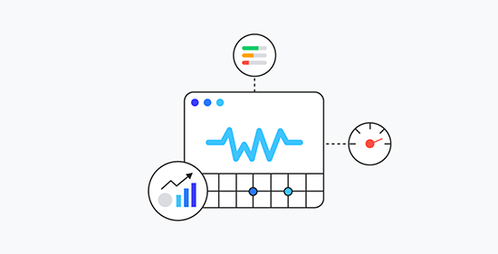
Mobile devices have become the primary gateway to the online world for a vast majority of consumers. Whether it’s browsing social media, researching products, or making purchases, mobile devices play a pivotal role in the consumer journey. As such, optimising your mobile conversion rate is essential for driving sales and maximising revenue. In this blog post, we’ll explore effective strategies to enhance Conversion Rate Optimisation (CRO) on mobile platforms.
Understanding the Importance of Mobile Conversion Rate Optimisation
Mobile optimisation is no longer just a nice-to-have; it’s a must-have for businesses looking to thrive in the digital age. Here’s why optimising for mobile conversion rates is crucial:
- Consumer Preference: With the increasing prevalence of smartphones, consumers prefer the convenience of shopping on mobile devices.
- Search Engine Rankings: Search engines prioritise mobile-friendly websites, making mobile optimisation critical for SEO and visibility.
- Competitive Advantage: Businesses that offer a seamless mobile experience gain a competitive edge and are more likely to convert mobile users into customers.
Effective Strategies for Enhancing Mobile Conversion Rate Optimisation
Responsive Website Design
Ensure your website is responsive and adapts seamlessly to various screen sizes. A responsive design provides users with a consistent and optimised experience across all devices, improving usability and encouraging conversions.
In addition to providing a seamless experience across different screen sizes, responsive website design also plays a crucial role in search engine optimisation (SEO). Search engines like Google prioritise mobile-friendly websites in their rankings, meaning that responsive design can directly impact your site’s visibility and organic traffic. With the majority of internet searches now conducted on mobile devices, having a responsive website is essential for maintaining a competitive edge and reaching your target audience effectively.

By investing in responsive design, businesses not only enhance user experience but also improve their chances of ranking higher in search results, ultimately driving more traffic and conversions to their mobile platform.
Streamlined Checkout Process
Simplify the checkout process on your mobile platform to minimise friction and reduce cart abandonment. Implement features such as guest checkout, autofill forms, and multiple payment options to streamline the purchasing journey and boost conversions.
Furthermore, optimising the checkout process for mobile users requires a keen focus on user experience. Utilising a single-page checkout format can significantly reduce friction and streamline the purchasing journey, as it minimises the number of steps required to complete a transaction.

Additionally, integrating secure and convenient payment methods, such as digital wallets like Apple Pay and Google Pay, can enhance the overall checkout experience for mobile shoppers. By offering a seamless and user-friendly checkout process, businesses can not only reduce cart abandonment rates but also increase customer satisfaction and loyalty.
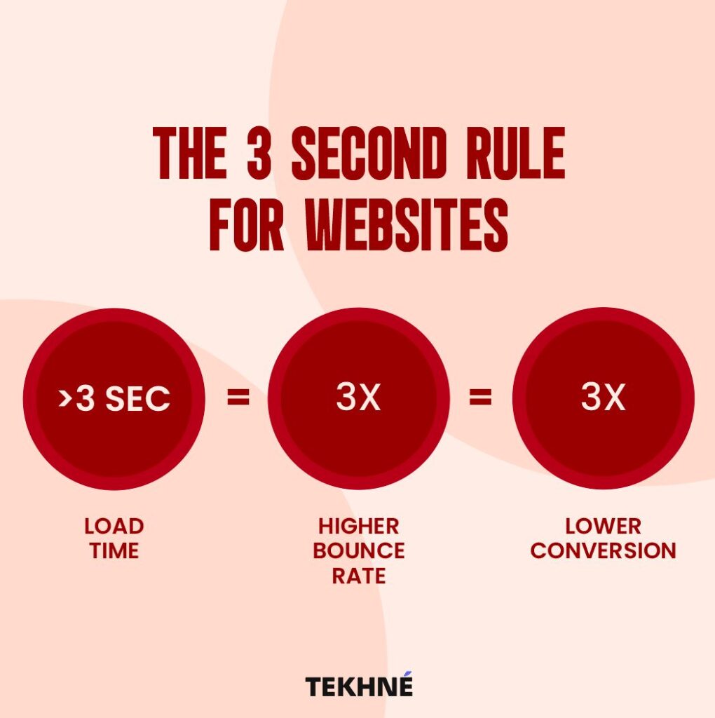
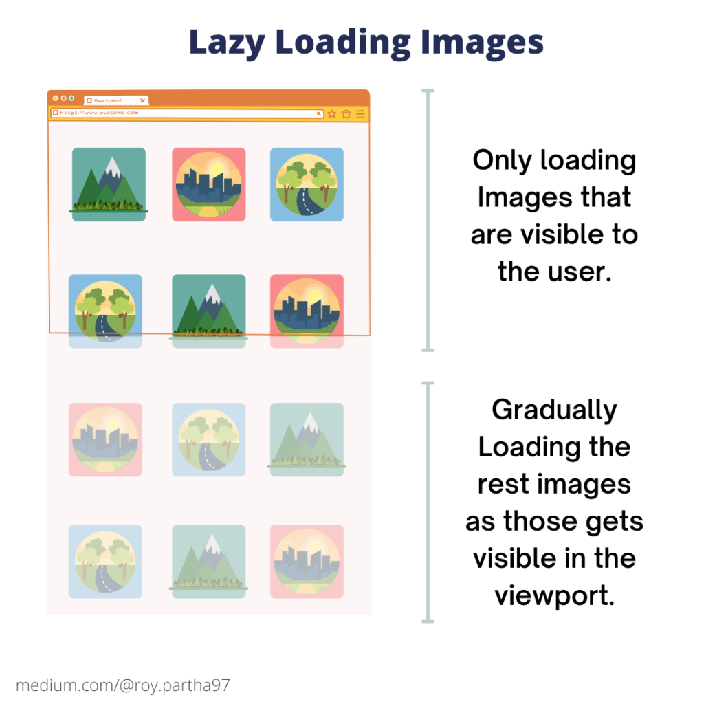
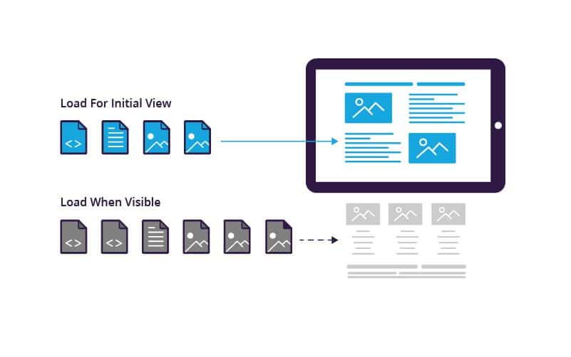
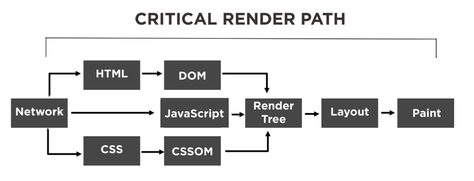
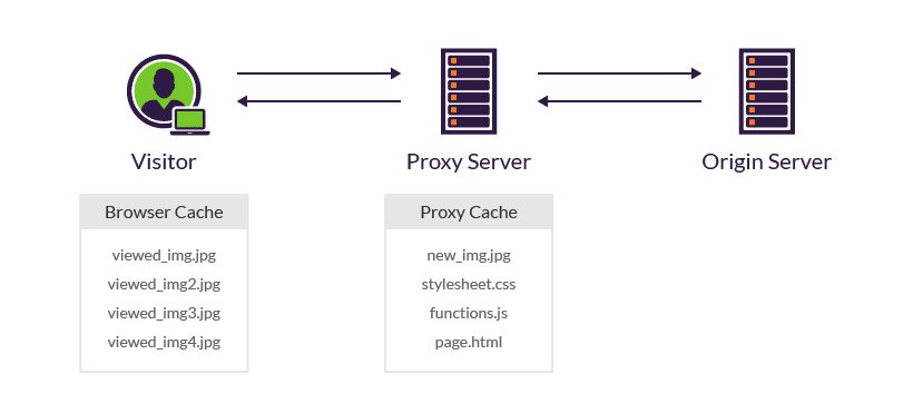
Optimise Page Load Speed
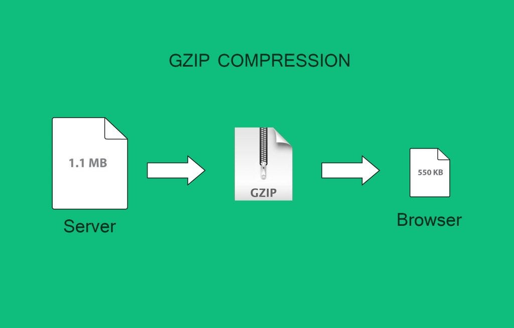
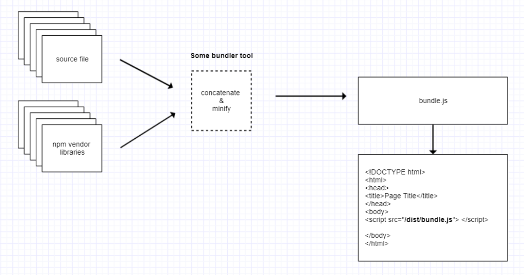
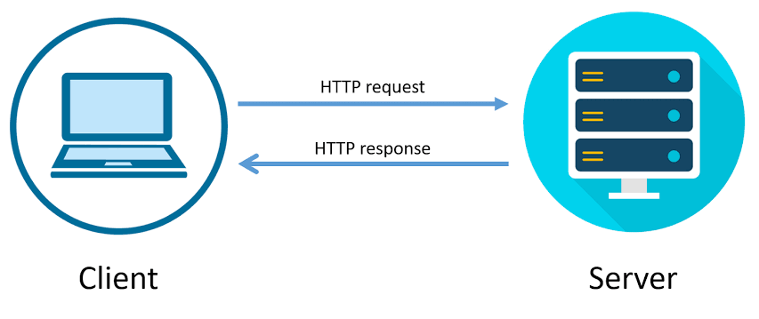
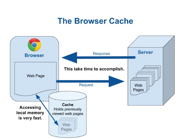
Mobile users expect fast-loading websites. Optimise your site’s performance by minimising image sizes, leveraging browser caching, and eliminating unnecessary scripts. A faster page load speed not only improves user experience but also positively impacts conversion rates.
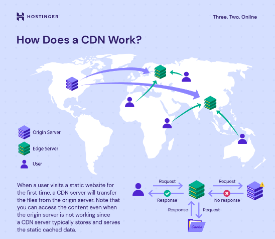
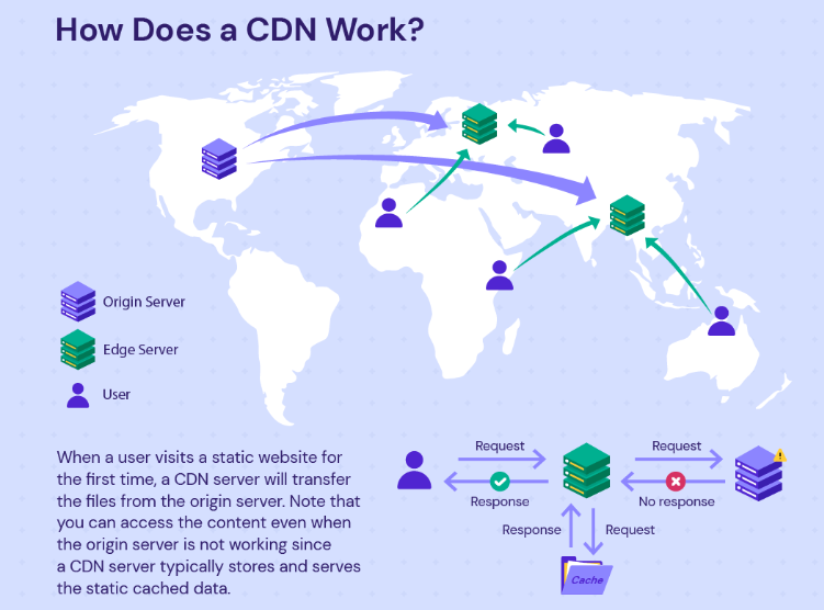
In addition to minimising image sizes, leveraging browser caching, and eliminating unnecessary scripts, optimising page load speed for mobile devices involves prioritising content delivery and reducing server response times. Implementing content delivery networks (CDNs) can distribute website content across multiple servers globally, reducing the distance between users and servers and accelerating page load times.
Furthermore, optimising server response times by upgrading hosting infrastructure or implementing performance-enhancing technologies such as server-side caching can significantly improve mobile site performance. By prioritising these aspects of page load speed optimisation, businesses can ensure a smoother and faster browsing experience for mobile users, leading to higher engagement and conversion rates.
Mobile-Friendly Content
Craft engaging and visually appealing content tailored specifically for mobile users. Use concise headlines, clear calls-to-action (CTAs), and high-quality images to capture users’ attention and guide them towards conversion.
In addition to concise headlines, clear CTAs, and high-quality images, it’s crucial to consider the unique characteristics of mobile browsing behaviour when crafting content. Mobile users often have shorter attention spans and may be accessing your website while on the go or in a distracting environment.
Therefore, prioritise scannable content that is easy to digest at a glance. Break up text into shorter paragraphs, utilise bullet points and numbered lists, and employ bold or italicised text to emphasise key points. By presenting information in a digestible format, you can effectively engage mobile users and keep them focused on your message, ultimately increasing the likelihood of conversion.
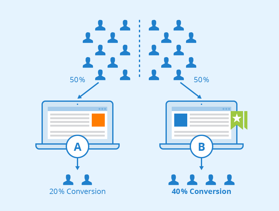
Implement A/B Testing

Regularly conduct A/B tests to identify the most effective strategies for mobile conversion optimisation. Test different elements such as CTA buttons, page layouts, and product descriptions to determine what resonates best with your mobile audience and drives higher conversion rates.
In addition to testing various elements of the mobile user experience, it’s essential to analyse and interpret the results of A/B tests effectively. By leveraging analytics tools and performance metrics, businesses can gain valuable insights into user behaviour and preferences.
For instance, heatmaps and click-tracking software can reveal which areas of the mobile website attract the most engagement, allowing for targeted optimisation efforts. Additionally, cohort analysis can help identify patterns and trends among different segments of mobile users, enabling marketers to tailor their strategies accordingly.
By continuously refining and iterating based on A/B test results and data-driven insights, businesses can optimise their mobile conversion rates and stay ahead of the competition.
Leverage Social Proof

Incorporate social proof elements such as customer reviews, ratings, and testimonials to build trust and credibility with mobile users. Positive feedback and endorsements can significantly influence purchase decisions and increase conversion rates on mobile devices.
Additionally, studies have shown the powerful impact of social proof on consumer behaviour. According to research conducted by BrightLocal, 88% of consumers trust online reviews as much as personal recommendations. Furthermore, data from Spiegel Research Center indicates that displaying reviews can increase conversion rates by up to 270%. These statistics underscore the importance of leveraging social proof elements effectively on mobile platforms.
By prominently showcasing customer reviews, ratings, and testimonials throughout the mobile shopping journey, businesses can instil confidence in potential buyers and alleviate any doubts they may have about making a purchase. Moreover, actively encouraging satisfied customers to share their experiences on social media platforms can amplify the reach of social proof, further enhancing brand credibility and driving mobile conversions.
Personalisation and Targeted Marketing:

Utilise data analytics and user insights to deliver personalised experiences to mobile users. Tailor product recommendations, promotions, and messaging based on individual preferences and behaviours to enhance engagement and drive conversions.
Personalisation and targeted marketing have become indispensable tools for businesses seeking to optimise conversion rates on mobile platforms. By leveraging data analytics and user insights, companies can gain a deeper understanding of their mobile audience’s preferences, behaviours, and purchase history. This wealth of information enables them to deliver hyper-personalised experiences that resonate with individual users.

For instance, by analysing past purchase patterns and browsing behaviour, businesses can recommend relevant products to mobile users, increasing the likelihood of conversion. Additionally, personalised promotions and messages tailored to specific user segments can enhance engagement and foster a sense of connection with the brand.
As consumers increasingly expect personalised experiences in their online interactions, integrating personalisation into mobile marketing strategies is essential for driving conversions and building long-term customer loyalty.
Conclusion
Optimising your mobile conversion rate is essential for driving sales and maximising revenue in today’s mobile-centric world. By implementing the strategies outlined above, businesses can create a seamless and engaging mobile experience that encourages users to convert. Remember, continuous monitoring, testing, and refinement are key to maintaining a high conversion rate on mobile devices. Embrace mobile optimisation as a fundamental aspect of your digital marketing strategy, and watch your mobile conversion rates soar.


Recent Comments