


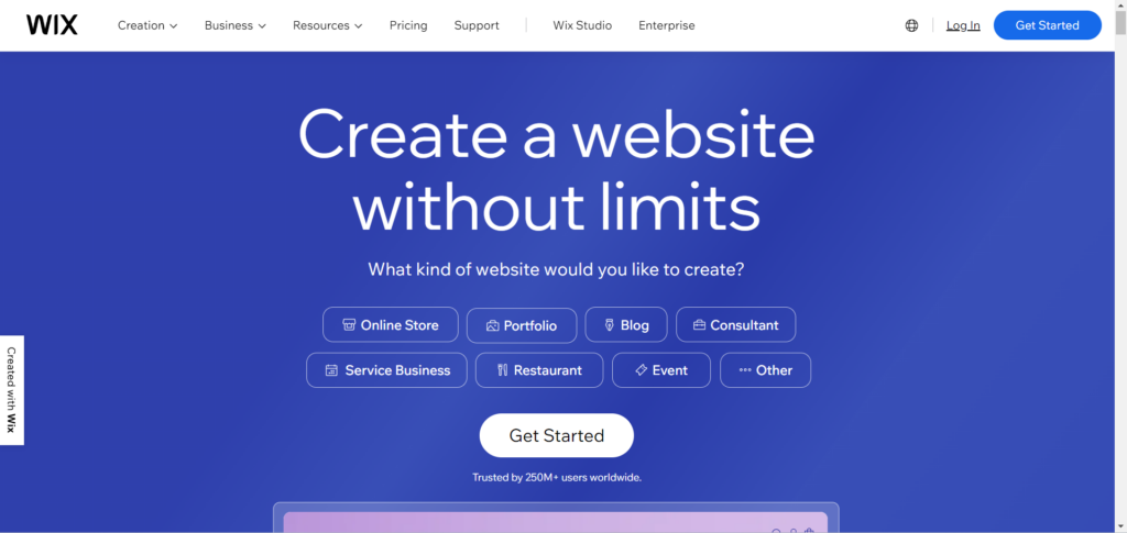
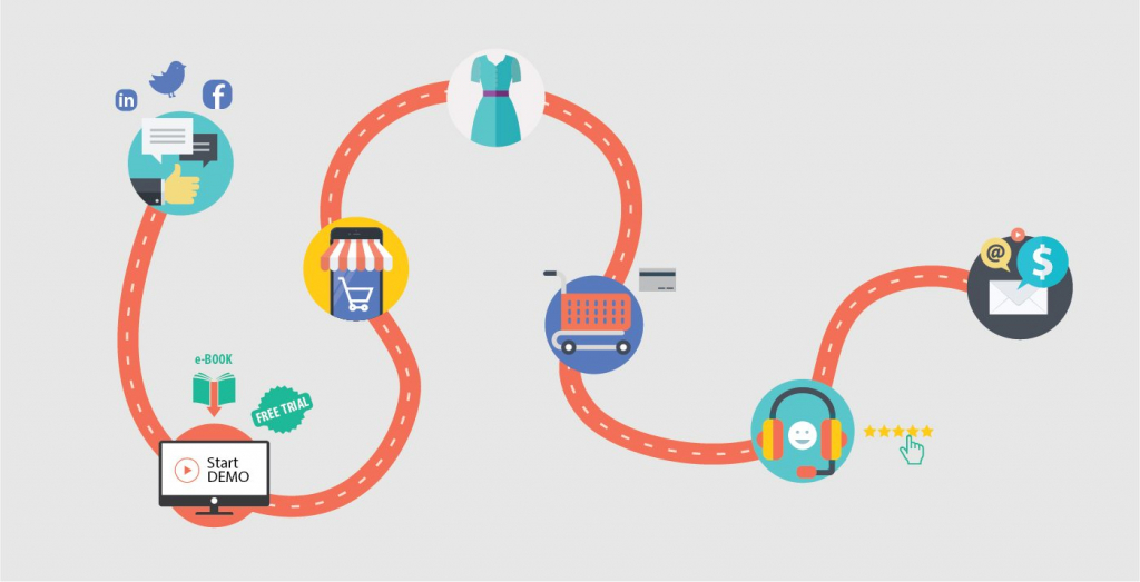
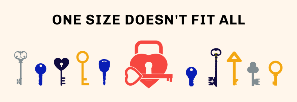
A landing page serves as the gateway to conversions, making its optimisation a critical aspect of any online marketing strategy. A well-optimised landing page can significantly boost conversion rates, driving more leads, sales, and revenue. To achieve this goal, it’s essential to implement effective strategies that resonate with both search engines and users. In this guide, we’ll delve into the intricacies of landing page optimisation, uncovering key strategies to maximise conversion rates.
Understanding Landing Pages:
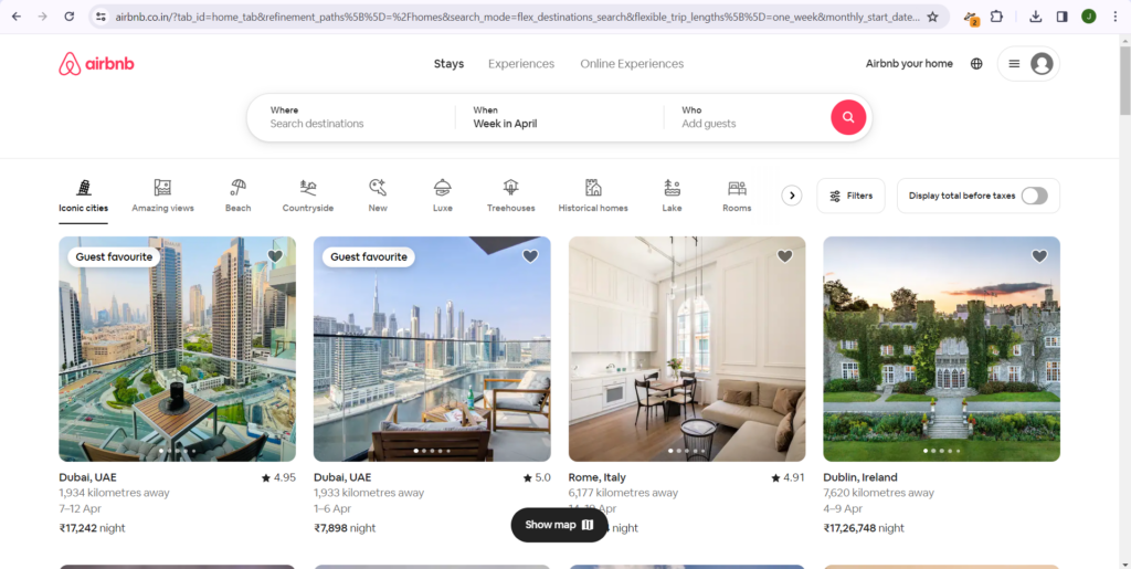
Before diving into optimisation tactics, let’s clarify what a landing page is. In simple terms, a landing page is a standalone web page specifically designed to capture visitor information or prompt a specific action. It could be anything from signing up for a newsletter, downloading a resource, or making a purchase.
Key Elements of Landing Page Optimisation:
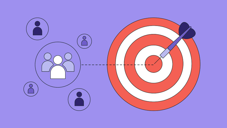
1. Clear Value Proposition:
– Your landing page’s headline and subheadline should succinctly convey the unique value proposition of your product or service.
– Use language that resonates with your target audience and clearly articulates the benefits they’ll receive by engaging with your offering.
– Avoid jargon or overly technical language that may confuse or alienate visitors.
Example:
Headline – “Unlock Your Financial Potential with Our Investment Platform”
Subheadline – “Start Investing Today and Watch Your Money Grow with Our Expert Guidance”
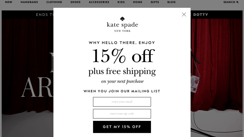
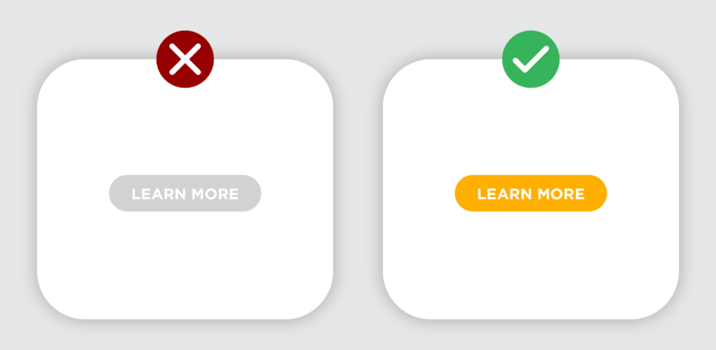
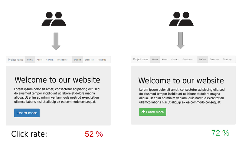
2. Compelling Call-to-Action (CTA):
– Your CTA should be visually prominent, using contrasting colours or bold styling to grab the user’s attention.
– Craft persuasive copy that encourages immediate action.
– Test different variations of CTAs to determine which ones generate the highest conversion rates.
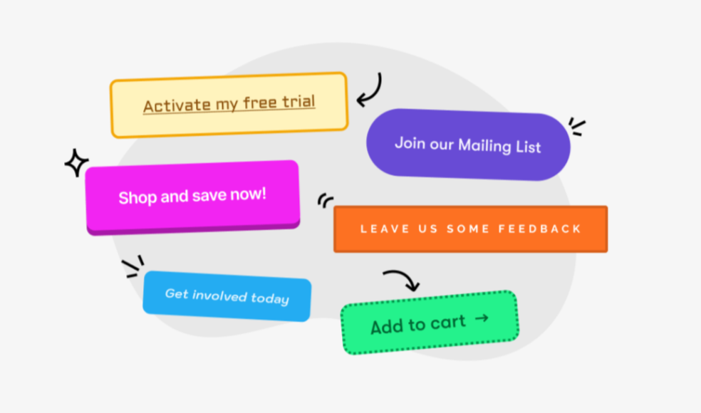
Example:
CTA Button – “Start Your Free Trial Now”
Supporting Text – “No Credit Card Required. Get Instant Access to Premium Features!”
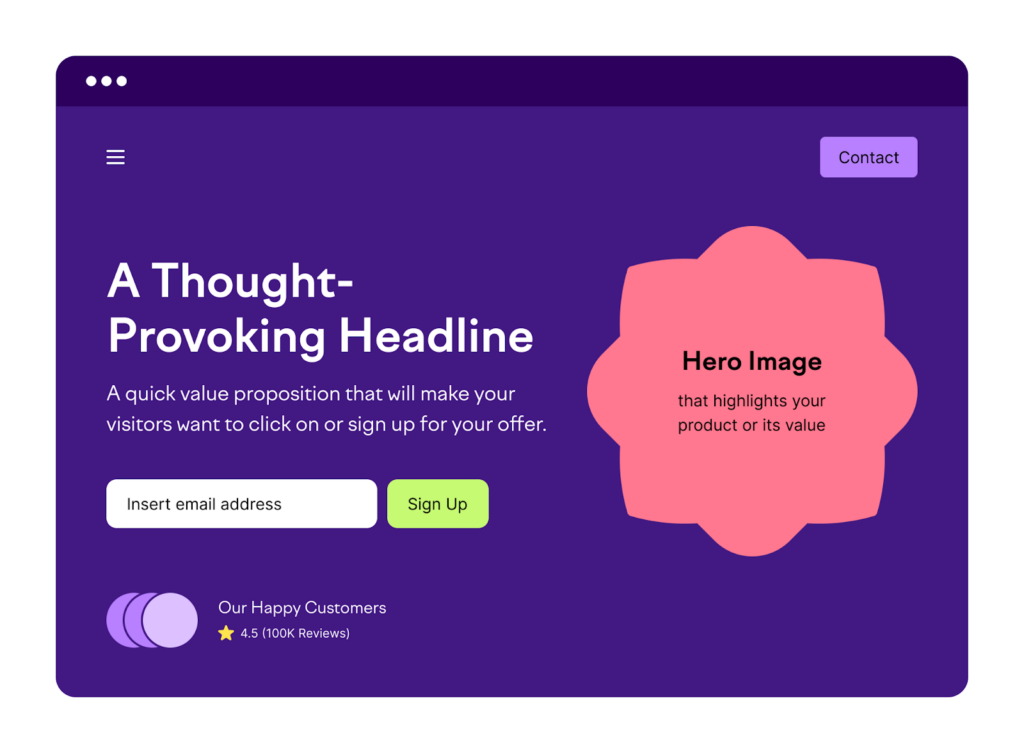
3. Streamlined Design and Layout:
– Maintain a clean and intuitive layout that guides users towards the primary CTA without distractions.
– Organise content logically, with a clear hierarchy that highlights key information and benefits.
– Minimise the number of form fields or steps required to complete the desired action, reducing friction and increasing conversions.
Example:
Clean layout with a single-column design, featuring a prominent headline, concise copy, and a visually striking CTA button above the fold.
Clear navigation menu with minimal distractions and a focus on guiding users towards the primary conversion goal.
4. Mobile Optimisation:
– Prioritise mobile responsiveness to ensure a seamless user experience across devices of all screen sizes.
– Optimise font sizes, button sizes, and spacing to accommodate touch interactions on mobile devices.
– Test your landing page on various mobile devices and browsers to identify and address any compatibility issues.
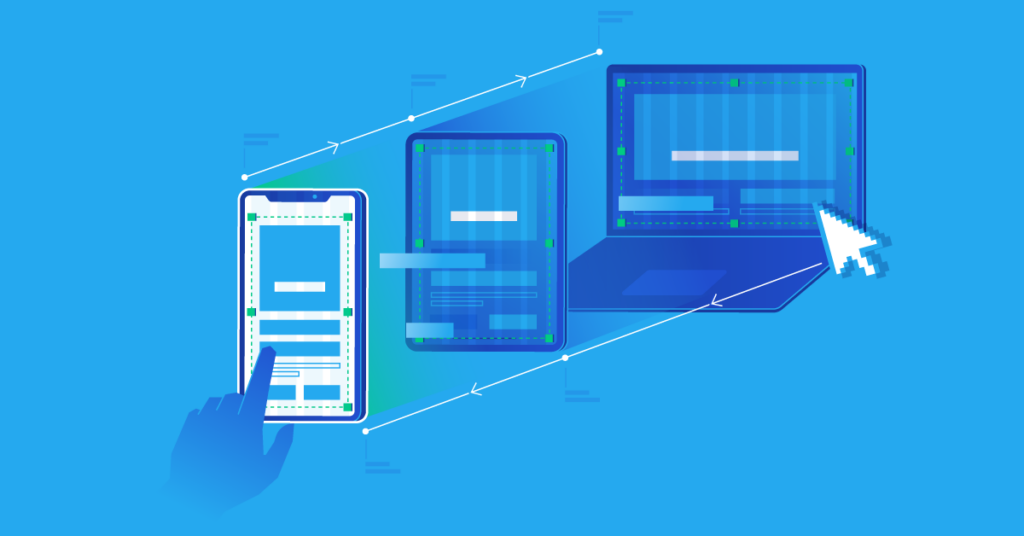
Example:
Responsive design that seamlessly adapts to various screen sizes and orientations.
Optimised touch targets and form fields for easy interaction on mobile devices.
Condensed menu options or collapsible navigation to conserve screen space on smaller screens.
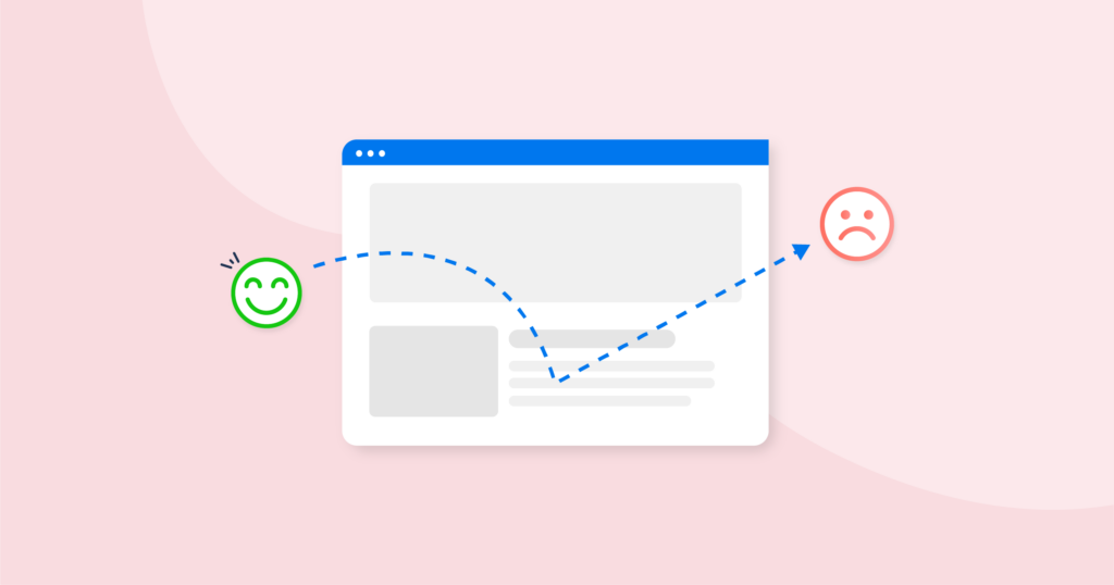
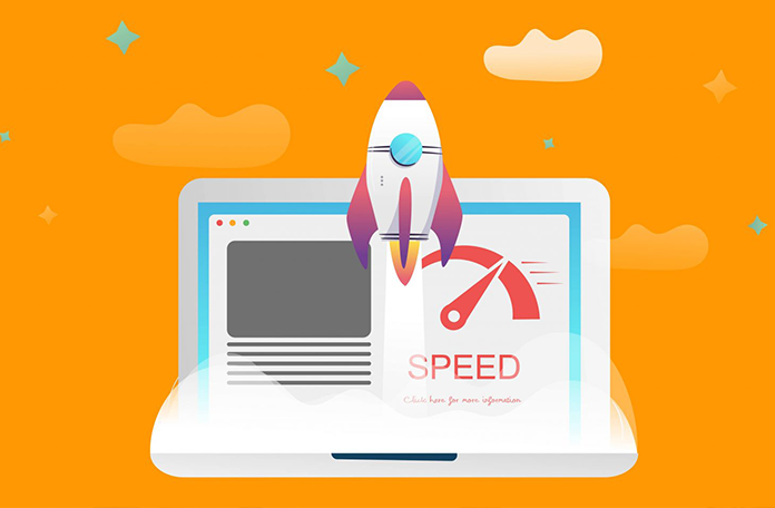
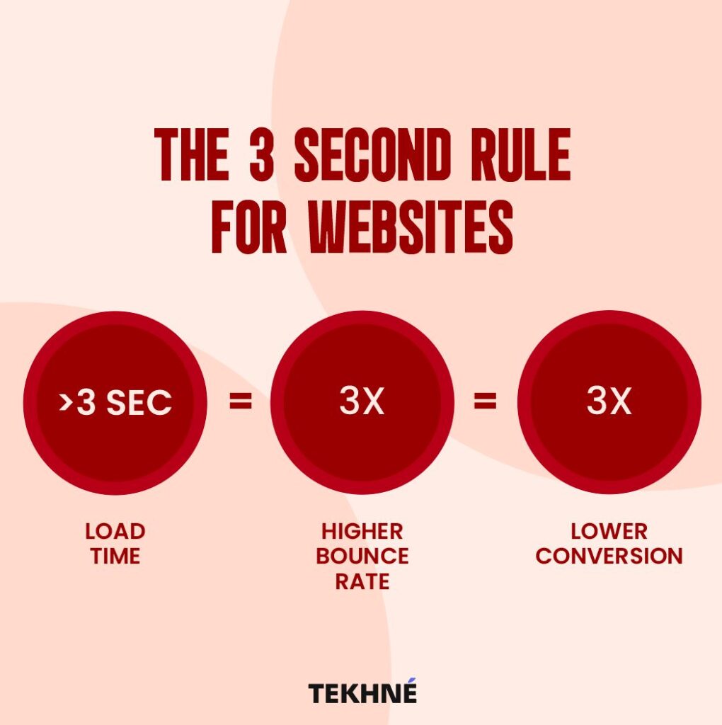
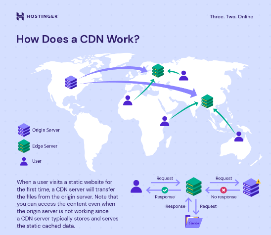
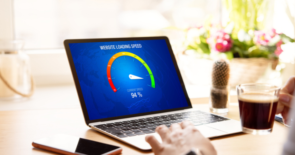
5. Page Load Speed:
– Optimise images and multimedia elements to reduce file sizes and improve loading times.
– Minimise HTTP requests by combining CSS and JavaScript files and leveraging browser caching.
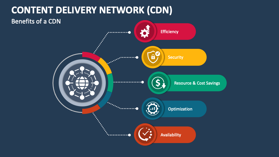
– Utilise content delivery networks (CDNs) to distribute assets geographically and accelerate load times for users worldwide.
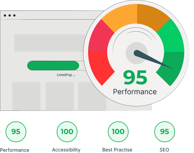
Example:
Optimised image assets with compressed file sizes and efficient loading techniques.
Minimised use of JavaScript and CSS to reduce render-blocking resources.
Utilisation of a content delivery network (CDN) to deliver content quickly to users across different geographic locations.
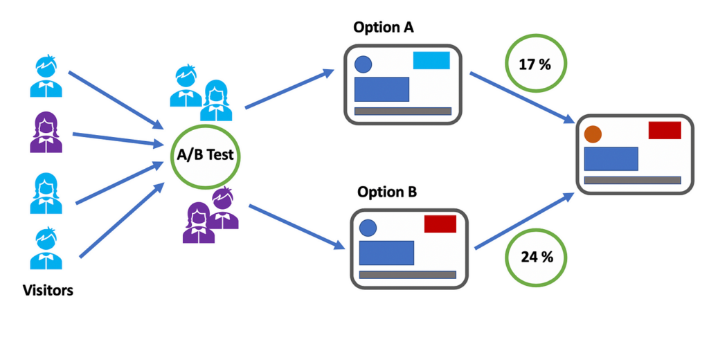
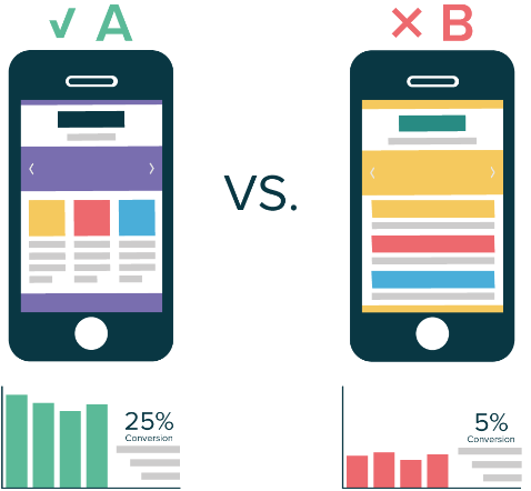
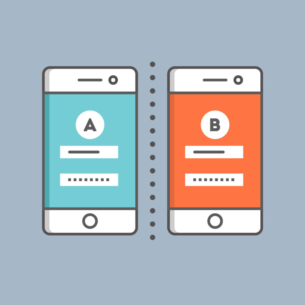
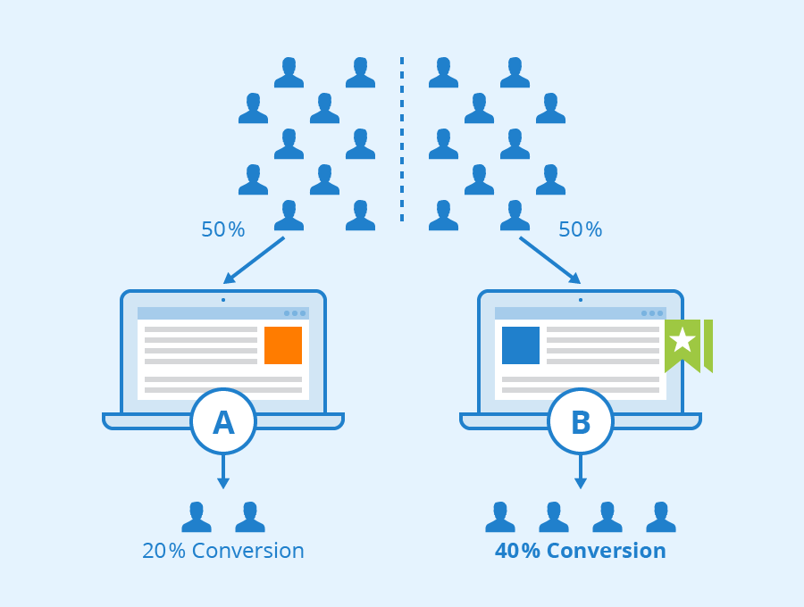
6. A/B Testing:
– Experiment with different elements of your landing page, such as headlines, CTAs, images, colours, and layouts.
– Use A/B testing tools to compare the performance of different variants and identify which combinations drive the highest conversion rates.
– Iterate on successful elements and continue testing to refine and optimise your landing page over time.

Example:
Testing two variations of a headline.
Analysing conversion rates and engagement metrics to determine which headline resonates better with the target audience.
Implementing the winning variation as the new default and iterating further with additional tests.
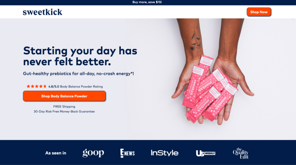
7. Compelling Visuals:
– Incorporate high-quality images, videos, and graphics that align with your brand identity and resonate with your target audience.
– Use visuals to illustrate key benefits or features of your offering and capture the user’s attention.
– Optimise image file sizes and formats to ensure fast loading times without sacrificing quality.
Example:
High-quality images showcasing the product or service in action, accompanied by descriptive captions or overlays.
Explainer videos demonstrating key features or benefits in an engaging and visually appealing manner.
Infographics or charts summarising complex information or statistics in a digestible format.
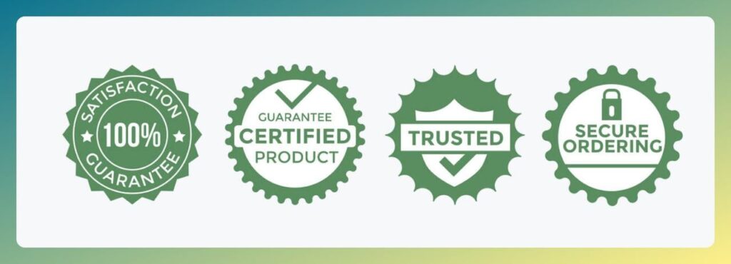
8. Social Proof:
– Showcase customer testimonials, reviews, ratings, or endorsements to build trust and credibility with potential customers.
– Highlight specific success stories or case studies that demonstrate the tangible benefits of your product or service.
– Incorporate trust badges or certifications to reassure users of your reliability and security.

Example:
Customer testimonials featuring quotes or video testimonials from satisfied users, highlighting their positive experiences with the product or service.
User reviews and ratings prominently displayed alongside product listings or service offerings.
Logos or badges indicating partnerships, certifications, or affiliations with reputable organisations or industry leaders.
9. Optimised Meta Tags and Descriptions:
– Write compelling meta titles and descriptions that accurately summarise the content and purpose of your landing page.
– Include relevant keywords in meta tags to improve visibility and attract organic traffic from search engines.
– Craft meta tags that entice users to click through from SERPs by highlighting key benefits or unique selling points.
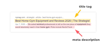
Example:
Meta Title – “Ease Your Workflow with Our Project Management Software | Free Trial”
Meta Description – “Boost Productivity and Collaboration with Our Intuitive Project Management Tool. Sign Up Now for a 30-Day Free Trial!”
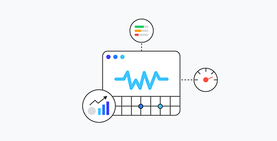
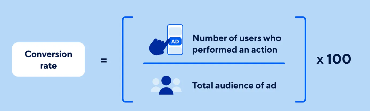
10. Analytical Tracking:
– Implement tracking tools such as Google Analytics to monitor key metrics, including traffic sources, bounce rates, and conversion rates.
– Set up goal tracking to measure specific actions or outcomes on your landing page, such as form submissions or purchases.
– Use data insights to identify areas for improvement and inform ongoing optimization efforts.
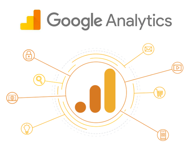
Example:
Tracking conversions with Google Analytics to measure the number of sign-ups or purchases generated by the landing page.
Monitoring traffic sources to identify the most effective channels for driving visitors to the landing page.
Analysing user behavior and engagement metrics to pinpoint areas for improvement and refine the landing page for better performance.
By focusing on these key elements and continuously refining your landing page based on data-driven insights, you can maximise conversion rates and drive greater success with your online marketing campaigns.
Conclusion
Optimising your landing page is a multifaceted endeavour that requires a strategic blend of design, copywriting, and technical implementation. By focusing on clear messaging, persuasive CTAs, user-friendly design, and ongoing experimentation, you can enhance conversion rates and maximise the ROI of your marketing efforts. Remember, landing page optimization is an iterative process, so be prepared to iterate, test, and refine your approach based on real-world data and user feedback. With diligence and strategic implementation, you can unlock the full potential of your landing page and drive sustainable business growth.


Recent Comments