Tag: user experience

Boosting Mobile Sales: Conversion Rate Optimisation Strategies

Mobile devices have become the primary gateway to the online world for a vast majority of consumers. Whether it’s browsing social media, researching products, or making purchases, mobile devices play a pivotal role in the consumer journey. As such, optimising your mobile conversion rate is essential for driving sales and maximising revenue. In this blog post, we’ll explore effective strategies to enhance Conversion Rate Optimisation (CRO) on mobile platforms.

Understanding the Importance of Mobile Conversion Rate Optimisation

Mobile optimisation is no longer just a nice-to-have; it’s a must-have for businesses looking to thrive in the digital age. Here’s why optimising for mobile conversion rates is crucial:

  1. Consumer Preference: With the increasing prevalence of smartphones, consumers prefer the convenience of shopping on mobile devices.
  1. Search Engine Rankings: Search engines prioritise mobile-friendly websites, making mobile optimisation critical for SEO and visibility.
  1. Competitive Advantage: Businesses that offer a seamless mobile experience gain a competitive edge and are more likely to convert mobile users into customers.

Effective Strategies for Enhancing Mobile Conversion Rate Optimisation

 Responsive Website Design

Ensure your website is responsive and adapts seamlessly to various screen sizes. A responsive design provides users with a consistent and optimised experience across all devices, improving usability and encouraging conversions.

In addition to providing a seamless experience across different screen sizes, responsive website design also plays a crucial role in search engine optimisation (SEO). Search engines like Google prioritise mobile-friendly websites in their rankings, meaning that responsive design can directly impact your site’s visibility and organic traffic. With the majority of internet searches now conducted on mobile devices, having a responsive website is essential for maintaining a competitive edge and reaching your target audience effectively. 

By investing in responsive design, businesses not only enhance user experience but also improve their chances of ranking higher in search results, ultimately driving more traffic and conversions to their mobile platform. 

Streamlined Checkout Process

Simplify the checkout process on your mobile platform to minimise friction and reduce cart abandonment. Implement features such as guest checkout, autofill forms, and multiple payment options to streamline the purchasing journey and boost conversions.

Furthermore, optimising the checkout process for mobile users requires a keen focus on user experience. Utilising a single-page checkout format can significantly reduce friction and streamline the purchasing journey, as it minimises the number of steps required to complete a transaction. 

Additionally, integrating secure and convenient payment methods, such as digital wallets like Apple Pay and Google Pay, can enhance the overall checkout experience for mobile shoppers. By offering a seamless and user-friendly checkout process, businesses can not only reduce cart abandonment rates but also increase customer satisfaction and loyalty.

Optimise Page Load Speed

Mobile users expect fast-loading websites. Optimise your site’s performance by minimising image sizes, leveraging browser caching, and eliminating unnecessary scripts. A faster page load speed not only improves user experience but also positively impacts conversion rates.

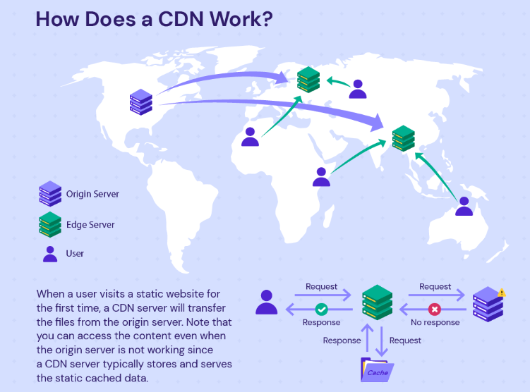
In addition to minimising image sizes, leveraging browser caching, and eliminating unnecessary scripts, optimising page load speed for mobile devices involves prioritising content delivery and reducing server response times. Implementing content delivery networks (CDNs) can distribute website content across multiple servers globally, reducing the distance between users and servers and accelerating page load times. 
Furthermore, optimising server response times by upgrading hosting infrastructure or implementing performance-enhancing technologies such as server-side caching can significantly improve mobile site performance. By prioritising these aspects of page load speed optimisation, businesses can ensure a smoother and faster browsing experience for mobile users, leading to higher engagement and conversion rates.

Mobile-Friendly Content

Craft engaging and visually appealing content tailored specifically for mobile users. Use concise headlines, clear calls-to-action (CTAs), and high-quality images to capture users’ attention and guide them towards conversion.

In addition to concise headlines, clear CTAs, and high-quality images, it’s crucial to consider the unique characteristics of mobile browsing behaviour when crafting content. Mobile users often have shorter attention spans and may be accessing your website while on the go or in a distracting environment. 

Therefore, prioritise scannable content that is easy to digest at a glance. Break up text into shorter paragraphs, utilise bullet points and numbered lists, and employ bold or italicised text to emphasise key points. By presenting information in a digestible format, you can effectively engage mobile users and keep them focused on your message, ultimately increasing the likelihood of conversion.

Implement A/B Testing

Regularly conduct A/B tests to identify the most effective strategies for mobile conversion optimisation. Test different elements such as CTA buttons, page layouts, and product descriptions to determine what resonates best with your mobile audience and drives higher conversion rates.

In addition to testing various elements of the mobile user experience, it’s essential to analyse and interpret the results of A/B tests effectively. By leveraging analytics tools and performance metrics, businesses can gain valuable insights into user behaviour and preferences. 

For instance, heatmaps and click-tracking software can reveal which areas of the mobile website attract the most engagement, allowing for targeted optimisation efforts. Additionally, cohort analysis can help identify patterns and trends among different segments of mobile users, enabling marketers to tailor their strategies accordingly. 

By continuously refining and iterating based on A/B test results and data-driven insights, businesses can optimise their mobile conversion rates and stay ahead of the competition.

Leverage Social Proof

Incorporate social proof elements such as customer reviews, ratings, and testimonials to build trust and credibility with mobile users. Positive feedback and endorsements can significantly influence purchase decisions and increase conversion rates on mobile devices.

Additionally, studies have shown the powerful impact of social proof on consumer behaviour. According to research conducted by BrightLocal, 88% of consumers trust online reviews as much as personal recommendations. Furthermore, data from Spiegel Research Center indicates that displaying reviews can increase conversion rates by up to 270%. These statistics underscore the importance of leveraging social proof elements effectively on mobile platforms. 

By prominently showcasing customer reviews, ratings, and testimonials throughout the mobile shopping journey, businesses can instil confidence in potential buyers and alleviate any doubts they may have about making a purchase. Moreover, actively encouraging satisfied customers to share their experiences on social media platforms can amplify the reach of social proof, further enhancing brand credibility and driving mobile conversions.

Personalisation and Targeted Marketing:

Utilise data analytics and user insights to deliver personalised experiences to mobile users. Tailor product recommendations, promotions, and messaging based on individual preferences and behaviours to enhance engagement and drive conversions.

Personalisation and targeted marketing have become indispensable tools for businesses seeking to optimise conversion rates on mobile platforms. By leveraging data analytics and user insights, companies can gain a deeper understanding of their mobile audience’s preferences, behaviours, and purchase history. This wealth of information enables them to deliver hyper-personalised experiences that resonate with individual users. 

For instance, by analysing past purchase patterns and browsing behaviour, businesses can recommend relevant products to mobile users, increasing the likelihood of conversion. Additionally, personalised promotions and messages tailored to specific user segments can enhance engagement and foster a sense of connection with the brand.

As consumers increasingly expect personalised experiences in their online interactions, integrating personalisation into mobile marketing strategies is essential for driving conversions and building long-term customer loyalty.

Conclusion

Optimising your mobile conversion rate is essential for driving sales and maximising revenue in today’s mobile-centric world. By implementing the strategies outlined above, businesses can create a seamless and engaging mobile experience that encourages users to convert. Remember, continuous monitoring, testing, and refinement are key to maintaining a high conversion rate on mobile devices. Embrace mobile optimisation as a fundamental aspect of your digital marketing strategy, and watch your mobile conversion rates soar.

Page Speed and Customer Lifetime Value: Cultivating Loyalty through Performance

In the competitive digital landscape, where attention spans are fleeting and options abound, businesses must prioritise every aspect of their online presence to stand out and succeed. Page speed emerges as a silent yet powerful determinant of success in this arena. Beyond its technical implications, page speed embodies a promise to users – a promise of efficiency, reliability, and respect for their time. As web developers, recognizing this promise is crucial, as it forms the foundation upon which customer loyalty is built. When users encounter swift-loading pages that effortlessly deliver the information or services they seek, they are more likely to perceive the brand positively and return for future interactions. Therefore, optimising page speed isn’t just about meeting technical benchmarks; it’s about delivering on a fundamental aspect of customer experience that directly influences their perceptions, behaviours, and ultimately, their lifetime value to the business.

The Importance of Page Speed

Page speed, a critical aspect of web performance, denotes the duration required for a web page to fully load and display its content. Various studies underscore the pivotal role of rapid page loading in user satisfaction and retention rates. Research indicates that modern internet users anticipate swift access to website content, with expectations often set at mere seconds. Any delay in loading time can substantially elevate bounce rates, as impatient users are quick to abandon sites that fail to meet their speed expectations. Moreover, leading search engines such as Google prioritise fast-loading websites in their ranking algorithms. This underscores the significance of page speed optimization not only for enhancing user experience but also for bolstering search engine visibility and SEO performance. Consequently, website owners and developers must meticulously focus on optimising page speed to align with user expectations and stay competitive in the digital landscape.

Impact on User Experience

The correlation between page speed and user experience is paramount. A sluggish website can swiftly turn off visitors, causing them to abandon the site and seek faster alternatives. This frustration stems from the modern expectation of instant access to information and services online. Conversely, a fast and responsive website not only meets but exceeds user expectations, fostering a positive experience that encourages prolonged engagement and repeat visits. Prioritising page speed optimization enables web developers to craft a seamless browsing experience that resonates with users, ultimately contributing to higher retention rates and increased satisfaction. In today’s digital landscape, where attention spans are short and competition is fierce, delivering swift and efficient web experiences is imperative for retaining and attracting users. 

Influence on Conversion Rates

Beyond just improving user experience, optimising page speed has a tangible impact on conversion rates. Studies consistently reveal that even a slight delay in page load time can lead to a substantial decrease in conversions. This is because users are more likely to abandon a website if it takes too long to load, resulting in lost opportunities for sales, sign-ups, or other desired actions.

By prioritising page speed optimization, websites can effectively reduce friction in the user journey, creating a smoother and more efficient browsing experience. Faster load times not only satisfy user expectations but also make it easier for visitors to navigate through the website and complete desired actions. This reduction in friction directly correlates with improved conversion rates, as users are more inclined to engage with a site that responds quickly to their interactions.

Ultimately, the direct link between page speed optimization and conversion rates underscores the significance of speed in driving business outcomes. Websites that invest in optimising their page speed stand to benefit from increased conversions, leading to higher revenue generation and overall business success.

Enhancing Search Engine Visibility

Indeed, search engines such as Google incorporate page speed as a crucial ranking factor in their algorithms. Websites that load swiftly are often favoured in search engine results pages (SERPs), enjoying higher visibility and greater organic traffic. This emphasis on page speed underscores its significance not only in enhancing user experience but also in improving a website’s search engine performance.

By optimising page speed, web developers can significantly enhance their website’s chances of being discovered by potential customers. Faster-loading websites are more likely to rank higher in search results, attracting more clicks and visits from users actively seeking relevant information or products. This increased visibility not only amplifies organic traffic but also boosts the overall performance and reach of the website.

In essence, prioritising page speed optimization aligns with the goals of both user satisfaction and search engine visibility, making it a crucial aspect of comprehensive web development and digital marketing strategies. Websites that invest in optimising their page speed stand to benefit from improved search rankings, increased organic traffic, and ultimately, greater success in achieving their online objectives.

Building Customer Loyalty

Page speed optimization plays a crucial role in both attracting new visitors and retaining existing ones. A website that loads quickly not only attracts attention but also instils confidence in users. The speed at which a website loads can signal professionalism, reliability, and a commitment to user satisfaction.

Consistently providing a superior browsing experience by prioritising page speed can help businesses cultivate loyalty among their customer base. When users encounter a fast-loading website, they are more likely to trust the brand and feel positive about their overall experience. This positive perception can lead to increased engagement, repeat purchases, and referrals.

In essence, page speed optimisation becomes a cornerstone of building long-term relationships with customers. By consistently delivering exceptional performance and ensuring that users can access content quickly and efficiently, businesses can strengthen their reputation and foster loyalty among their audience. In today’s competitive digital landscape, where customer experience is paramount, investing in page speed optimization is essential for sustaining success and driving growth.

Maximising Customer Lifetime Value

Absolutely, the ultimate goal of page speed optimization extends beyond immediate benefits like improved user experience and search engine visibility. It directly impacts the metric of Customer Lifetime Value (CLV), which quantifies the total revenue a customer generates over the duration of their relationship with a business.

By prioritising page speed and consistently delivering exceptional user experiences, businesses can prolong customer relationships, increase repeat purchases, and ultimately maximise CLV. When users encounter fast-loading websites that provide seamless navigation and a hassle-free experience, they are more likely to engage with the brand repeatedly, leading to higher CLV.

In this way, page speed optimization emerges as a strategic imperative for sustainable growth and profitability. It not only enhances short-term metrics like conversion rates and revenue but also contributes to the long-term success of the business by fostering loyal customer relationships and maximising CLV. By investing in page speed optimization, businesses can position themselves for sustained growth and competitive advantage in the digital landscape.

Conclusion

In conclusion, it’s evident that page speed is far more than just a technical detail in web development—it’s a cornerstone with significant implications for Customer Lifetime Value (CLV). By placing emphasis on performance and user experience, businesses can nurture loyalty, boost conversions, and ultimately flourish in the digital realm. As web developers, it’s imperative to acknowledge the pivotal role that page speed plays in fostering enduring customer relationships and achieving sustained success in the long run. By prioritising page speed optimization, businesses can not only meet but exceed user expectations, driving growth and maximising their potential in today’s competitive landscape.

Minifying and Bundling: Streamlining Code for Maximum Page Speed

The pursuit of optimal website performance is an ongoing challenge. As websites become more complex and feature-rich, ensuring speedy loading times becomes paramount for providing an exceptional user experience. Among the myriad strategies aimed at enhancing page speed, minifying and bundling stand out as indispensable techniques for streamlining code and reducing latency.

Understanding Minification and Bundling

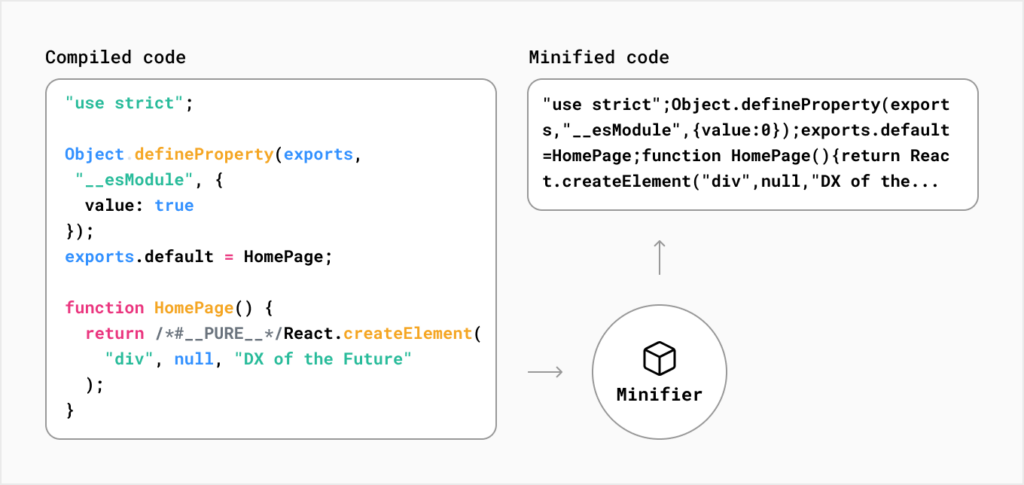
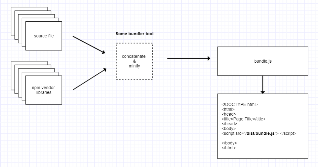
At its core, minification refers to the process of removing unnecessary characters from source code without altering its functionality. These extraneous elements include whitespace, comments, and other non-essential characters. By eliminating these components, minification reduces the size of files, resulting in faster downloads and improved loading times.

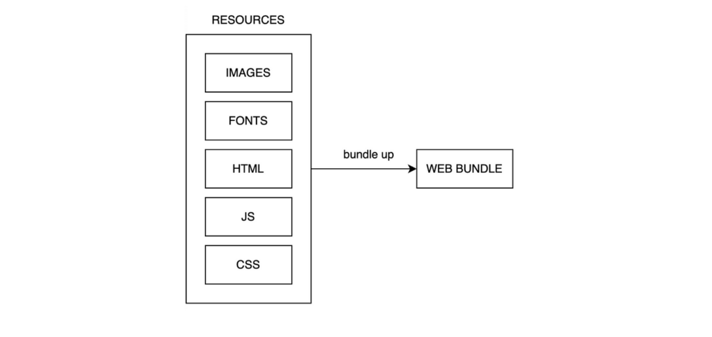
Bundling, on the other hand, involves combining multiple files into a single entity. This consolidation reduces the number of HTTP requests required to fetch resources, thereby reducing latency and improving page speed. Bundling is particularly beneficial for large-scale web applications comprising numerous JavaScript, CSS, and other files.

The Importance of Page Speed

Before delving deeper into minifying and bundling, it’s crucial to understand why page speed matters. Studies have consistently shown that users expect websites to load quickly, with even minor delays leading to increased bounce rates and diminished user engagement. Moreover, search engines like Google factor page speed into their ranking algorithms, meaning faster-loading sites are more likely to appear higher in search results.

From a technical standpoint, numerous factors influence page speed, including server response times, network latency, and client-side processing. While optimising each of these elements is essential, efficient code management through minification and bundling can yield significant performance improvements with relatively minimal effort.

Minification in Practice

Minification typically involves the use of specialised tools or build processes to automate the removal of unnecessary characters from code files. For JavaScript, popular minification tools include UglifyJS, Closure Compiler, and Terser, each offering various optimisation techniques to reduce file size while preserving functionality.

Similarly, CSS minification tools such as CleanCSS and cssnano strip out whitespace, comments, and other redundant elements to produce compact stylesheets. HTML minification can be accomplished using tools like HTMLMinifier, which compresses markup by removing whitespace, comments, and optional tags.

Benefits of Minification

The benefits of minification extend beyond reduced file sizes. Smaller files require less bandwidth to transfer, leading to faster downloads and improved rendering times. Additionally, minified code can enhance client-side performance by reducing parsing and execution times, particularly on resource-constrained devices like smartphones and tablets.

Moreover, minification indirectly contributes to improved SEO performance by facilitating faster page loading, which is a key ranking factor for search engines. Websites that deliver content swiftly are more likely to satisfy users and search engine algorithms alike, resulting in higher visibility and increased traffic.

Bundling for Efficiency

While minification addresses file size at the individual level, bundling tackles the broader challenge of reducing the number of HTTP requests required to fetch resources. By combining multiple files into a single bundle, bundling minimises the overhead associated with establishing and managing connections, resulting in faster page loads and improved performance.

For JavaScript applications, bundling tools like Webpack, Rollup, and Parcel have become indispensable assets for optimising code delivery. These tools analyse project dependencies, bundle modules together, and apply optimisations such as tree shaking and code splitting to generate efficient bundles tailored to specific use cases.

Similarly, CSS preprocessing tools like Sass and Less support bundling through features like file imports and mixins, enabling developers to organise stylesheets into modular components and generate optimised bundles for deployment.

The Synergy of Minification and Bundling:

While minification and bundling offer distinct benefits individually, their true power is realised when combined synergistically. By minifying individual files before bundling them together, developers can maximise the efficiency of their codebase while minimising overhead.

This combined approach ensures that bundled resources are as lightweight as possible, further reducing latency and accelerating page load times. Moreover, by optimising both file size and network performance, developers can deliver snappy, responsive web experiences across a variety of devices and network conditions.

Advanced Techniques for Minification and Bundling:

Achieving optimal page speed requires more than just basic minification and bundling techniques. To truly unlock the full potential of these strategies, developers can employ advanced techniques and tools to further streamline their codebase and enhance performance.

1. Code Splitting:

While bundling is effective for reducing the number of HTTP requests, it’s essential to consider the trade-off between initial page load time and subsequent interactions. Code splitting addresses this challenge by breaking down bundles into smaller, more manageable chunks that can be loaded asynchronously as needed.

Frameworks like React, Vue.js, and Angular offer built-in support for code splitting, allowing developers to define dynamic import points within their applications. This enables the loading of critical resources upfront while deferring the retrieval of non-essential components until they’re required, resulting in faster initial page loads and improved interactivity.

2. Dynamic Bundle Loading:

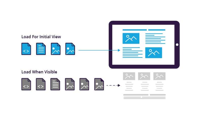
In addition to code splitting, dynamic bundle loading techniques further enhance performance by tailoring resource delivery based on user interactions and preferences. Lazy loading, for instance, delays the loading of non-critical resources until they’re needed, reducing the burden on the initial page load and improving perceived performance.

By leveraging features like Intersection Observer or scroll events, developers can dynamically load bundles as users scroll down a page or interact with specific elements, ensuring that resources are fetched only when they’re likely to be accessed. This granular approach to bundle loading minimises unnecessary overhead and maximises resource utilisation, resulting in a smoother, more responsive user experience.

3. Tree Shaking:

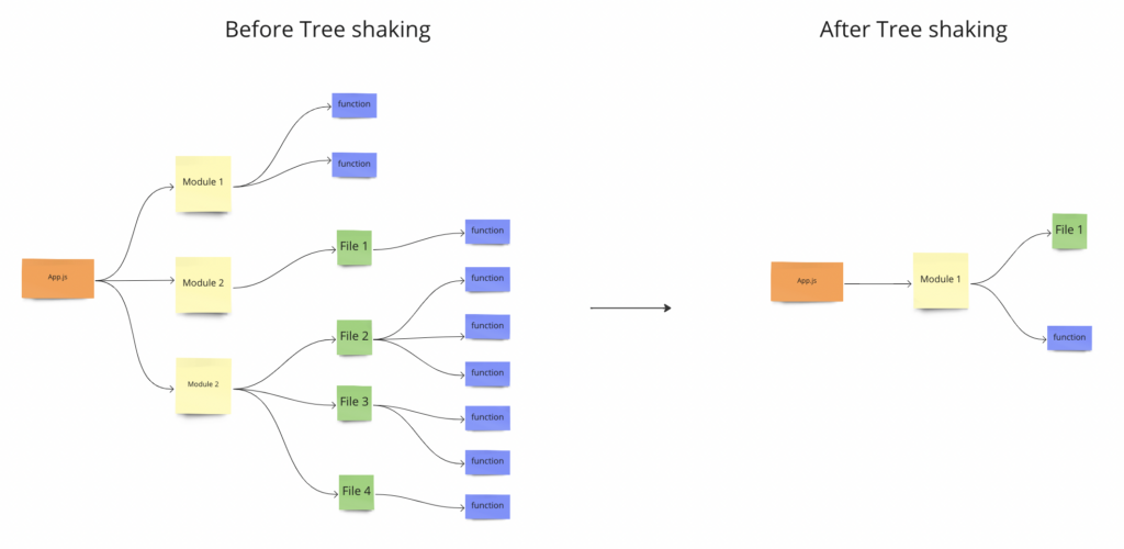
Another powerful optimisation technique is tree shaking, which eliminates dead code from bundled JavaScript files. By analysing the codebase and identifying unused dependencies and functions, tree shaking tools like Rollup and Webpack can drastically reduce bundle sizes without sacrificing functionality.

Tree shaking works by traversing the dependency tree of a module and excluding any code paths that aren’t explicitly referenced or executed. This allows developers to maintain a modular codebase while still benefiting from the performance gains associated with bundling, ensuring that only essential code is included in the final bundle.

4. Compression and Gzip:

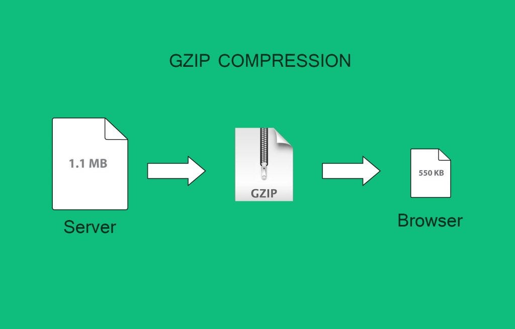
While minification reduces file sizes by removing unnecessary characters, compression techniques like Gzip further reduce the size of assets by encoding them in a more compact format for transmission over the network. By enabling Gzip compression on web servers, developers can achieve additional performance gains without modifying the underlying codebase.

Gzip works by replacing repeated sequences of characters with shorter representations, resulting in significant reductions in file size for text-based assets like HTML, CSS, and JavaScript. This compression technique is widely supported by modern web browsers and can be seamlessly integrated into existing infrastructure to improve page speed and user experience.

Conclusion

In the quest for maximum page speed, minification and bundling emerge as indispensable tools for optimising web performance. By removing unnecessary characters from code files and consolidating resources into efficient bundles, developers can significantly reduce latency, improve user experience, and enhance search engine visibility.

While the technical intricacies of minification and bundling may seem daunting, the benefits they offer are undeniable. Incorporating these practices into the development workflow not only yields immediate performance gains but also establishes a foundation for continued optimisation and scalability as web projects evolve.

In essence, minifying and bundling represent essential pillars of modern web development, enabling developers to deliver fast, responsive, and engaging user experiences in an increasingly competitive digital landscape.

In the competitive landscape of web development, where user expectations continue to rise, optimising page speed is no longer optional—it’s essential for success. By embracing advanced optimisation techniques and staying abreast of emerging best practices, developers can deliver fast, responsive, and engaging user experiences that set their websites apart from the competition.

By incorporating these advanced techniques into their development workflow, developers can elevate the performance of their web applications to new heights. These optimisations go beyond basic minification and bundling, offering granular control over resource delivery and ensuring that only essential code is delivered to end users.

10 Myths About Page Speed Debunked

Very few factors hold as much sway over user experience and overall performance as page speed. It’s the digital equivalent of a first impression – crucial for retaining visitors, enhancing engagement, and improving conversion rates. However, despite its paramount importance, misconceptions about page speed persist, leading to misguided strategies and missed opportunities for optimization. In this comprehensive guide, we’ll debunk 10 prevalent myths surrounding page speed to empower developers and businesses with accurate insights and actionable strategies.

Myth 1: Page Speed Doesn’t Impact User Experience Significantly

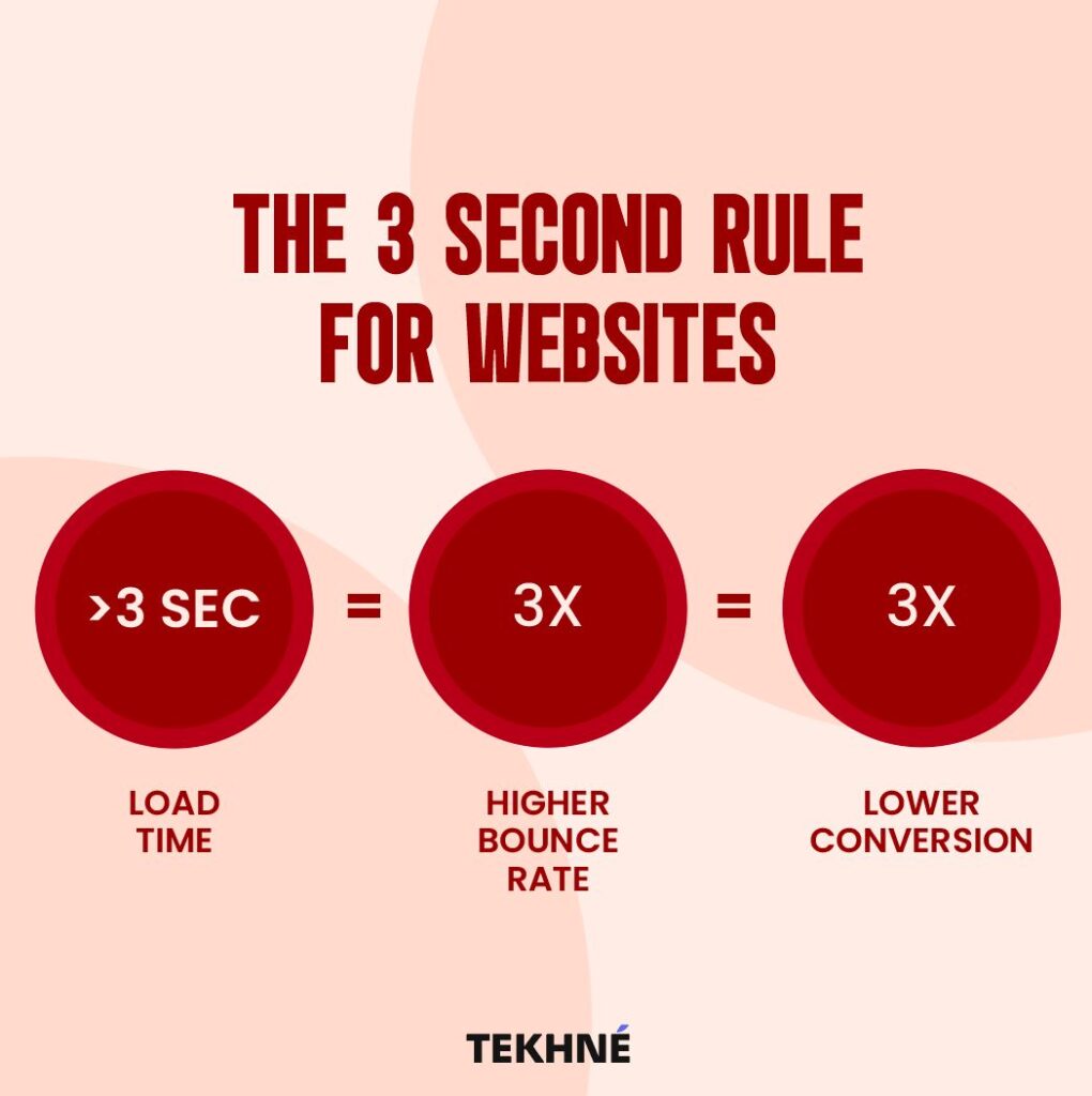
Reality: Page speed is a cornerstone of user experience. Numerous studies have shown that even small delays in page loading times can drastically increase bounce rates and deter users from returning. Research by Google indicates that if a page takes more than three seconds to load, over half of users will abandon it. Therefore, optimising page speed is essential for delivering a seamless and satisfying browsing experience.

Myth 2: Only Large Websites Need to Worry About Page Speed

Reality: Page speed affects websites of all sizes. While it’s true that larger websites with extensive content and functionalities may face more significant challenges, smaller sites are not exempt from the impact of slow loading times. Every website, regardless of its scale, should prioritise optimising page speed to enhance user satisfaction and achieve better search engine rankings.

Myth 3: Page Speed Is Solely Determined by Hosting Provider

Reality: While the quality of hosting plays a vital role in page speed, it’s only one piece of the puzzle. Factors such as image optimisation, code efficiency, browser caching, and content delivery networks (CDNs) also significantly influence loading times. Effective page speed optimisation requires a holistic approach that addresses various elements contributing to performance.

Myth 4: Page Speed Optimization Is a One-Time Effort

Reality: Page speed optimisation is an ongoing process. As websites evolve, new content is added, and technologies advance, optimising page speed becomes a continuous endeavour. Regular monitoring, testing, and refinement are necessary to ensure that a website maintains optimal performance levels over time.
Myth 5: Mobile Page Speed Is Less Important Than Desktop

Reality: With the proliferation of mobile devices, mobile page speed is just as critical – if not more so – than desktop page speed. Mobile users expect fast and responsive experiences, and search engines prioritise mobile-friendly websites in their rankings. Ignoring mobile page speed can lead to significant losses in traffic and engagement.

Myth 6: Page Speed Is Only Important for SEO

Reality: While page speed is indeed a crucial factor in search engine optimisation (SEO), its significance extends far beyond rankings. Faster loading times contribute to higher user satisfaction, lower bounce rates, increased conversions, and improved overall performance metrics. Prioritising page speed benefits both user experience and SEO efforts.

Myth 7: Content Rich Websites Can’t Achieve Fast Page Speed

Reality: While content-rich websites may face additional challenges in optimising page speed due to the volume of data they present, it’s entirely possible to achieve fast loading times through strategic optimisation techniques. Employing tactics such as lazy loading, minification of CSS and JavaScript, and asynchronous loading of resources can significantly enhance performance without compromising content richness.

Myth 8: Visitors Will Wait for Pages to Load If Content Is Compelling

Reality: In today’s fast-paced digital landscape, users have little patience for slow-loading websites, regardless of how compelling the content may be. Research shows that even a one-second delay in page load time can result in a significant drop in conversion rates. Compelling content can capture users’ interest, but it’s fast loading times that keep them engaged.

Myth 9: Page Speed Optimisation Is Too Technical for Non-Developers

Reality: While some aspects of page speed optimization may require technical expertise, many optimization techniques are accessible to non-developers. Content management systems (CMS) often offer plugins and tools for optimising images, caching, and minifying resources. Additionally, online resources and tutorials provide guidance for implementing basic optimisation strategies without advanced technical knowledge.

Myth 10: Achieving Perfect Page Speed Is Impossible

Reality: While achieving perfection in page speed may be elusive, significant improvements are attainable through diligent optimisation efforts. Even modest enhancements in loading times can yield substantial benefits in user experience and performance metrics. By adopting a proactive approach to optimization and continually refining their strategies, website owners can make meaningful progress toward maximising page speed.

In conclusion, dispelling these myths is crucial for understanding the importance of page speed optimization in modern website development. By recognising the significance of fast loading times, adopting a holistic approach to optimisation, and leveraging available tools and techniques, developers and businesses can create faster, more responsive websites that deliver superior user experiences and drive better results.

Optimising UI for B2B Website Speed and Success

The speed at which your website loads can make or break your success. With an astounding 82% of B2B pages loading in 5 seconds or less, as a business, you need to pay careful attention to this critical aspect of their online presence. 

Did you know that a B2B site loading in just 1 second can enjoy a conversion rate three times higher than its 5-second counterpart? Let’s talk about the relationship between ecommerce success and page speed, exploring the reasons behind these statistics and offering actionable insights for businesses looking to stay ahead in the digital race.

The 82% Benchmark

The statistic that 82% of B2B pages load in 5 seconds or less reflects the industry’s commitment to providing a reasonably swift online experience. This benchmark suggests that the majority of businesses understand the importance of page speed in catering to the modern digital consumer’s expectations. However, it also implies that merely meeting this industry average might not be sufficient to gain a competitive edge.

To truly stand out, businesses should aim not just for an acceptable loading time but for an exceptional one. Users are increasingly intolerant of delays, and exceeding their expectations can lead to increased engagement, prolonged time spent on the site, and, ultimately, higher conversion rates.

The 1-Second Advantage

The revelation that a B2B site loading in 1 second has a conversion rate three times higher than its 5-second counterpart is a game-changer. This stark difference underscores the critical role of page speed in influencing user behaviour and, consequently, a website’s success.

The 1-second advantage is not merely about speed but about user experience and satisfaction. Businesses need to delve deeper into understanding why this tiny timeframe has such a significant impact. It goes beyond the surface level and involves the psychology of user interaction, establishing trust, and creating a seamless journey that encourages users to take the desired actions.

UI and Page Speed

he user interface (UI) of an e-commerce website plays a crucial role in both page speed and audience engagement. A well-designed UI optimises the user experience by streamlining navigation, minimising friction, and presenting information in a clear and intuitive manner. From a page speed perspective, a lightweight and efficient UI reduces the amount of data that needs to be transferred between the server and the user’s device, resulting in faster load times. Additionally, an engaging UI captivates the audience’s attention, encourages exploration, and fosters trust, thereby increasing the likelihood of prolonged interaction and conversions. Conversely, a cluttered or poorly optimized UI can slow down page load times, frustrate users, and lead to high bounce rates. Thus, the synergy between UI design and page speed is paramount, as it directly impacts audience engagement and ultimately influences the success of an e-commerce platform.

Crafting a high-performing and efficient UI requires a delicate balance of technical prowess and user-centric design principles.

Understanding UI Performance

1. Critical Rendering Path Optimisation: The critical rendering path encompasses the sequence of steps required to render a webpage, from fetching resources to rendering pixels on the screen. By minimising render-blocking resources, optimising CSS and JavaScript delivery, and prioritising above-the-fold content, e-commerce sites can expedite initial rendering, reducing perceived load times and enhancing user experience.

2. Responsive Design and Fluid Layouts: Responsive design ensures that e-commerce UIs adapt seamlessly to various screen sizes and devices, offering a consistent experience across desktops, tablets, and smartphones. Fluid layouts, powered by CSS frameworks like Bootstrap or Foundation, facilitate dynamic resizing and flexible content presentation, enhancing usability and accessibility.

3. Asynchronous Loading and Code Splitting: Leveraging asynchronous loading techniques and code splitting enables e-commerce sites to load non-critical resources asynchronously, prioritise essential content, and reduce time-to-interactivity. Implementing JavaScript bundling tools such as Webpack or Rollup optimises code delivery, minimising network overhead and accelerating page load times.

Efficiency Through Performance Enhancements

1. Lazy Loading and Image Optimisation: Employing lazy loading techniques defers the loading of below-the-fold content until it enters the viewport, conserving bandwidth and improving perceived performance. Image optimisation strategies, including compression, responsive image formats (e.g., WebP), and lazy loading, mitigate the impact of large image files on page load times, without compromising visual fidelity.

2. Efficient Data Fetching with GraphQL: GraphQL, a query language for APIs, empowers e-commerce UIs to retrieve precisely the data they need, eliminating over-fetching and under-fetching inefficiencies associated with traditional RESTful APIs. By consolidating multiple API calls into a single request and fetching only required data fields, GraphQL minimises network latency and enhances data loading efficiency.

3. Client-side Caching and State Management: Implementing client-side caching mechanisms, such as browser storage (e.g., localStorage, sessionStorage) and state management libraries (e.g., Redux, Vuex), optimises data retrieval and persistence, reducing round-trip server requests and enhancing UI responsiveness. Utilising techniques like memoisation and selective data fetching further enhances caching efficiency, ensuring optimal performance under varying usage scenarios.

Continuous Optimisation and Performance Monitoring

1. Performance Budgeting: Establishing performance budgets sets clear constraints on key performance metrics, such as page load time and time-to-interactivity, guiding development efforts and prioritising performance optimisations. Continuous monitoring using tools like Lighthouse, WebPageTest, or Chrome DevTools enables real-time performance analysis, identifies bottlenecks, and informs iterative improvements.

2. A/B Testing and User Feedback: Conducting A/B tests and soliciting user feedback provide invaluable insights into the efficacy of UI optimisations and user preferences. Iteratively refining UI elements based on empirical data and user sentiment ensures that e-commerce sites evolve in alignment with user expectations and technological advancements.

Engineering high-performing and efficient UIs for e-commerce sites demands a multidimensional approach that harmonises technical sophistication with user-centric design principles. By prioritising UI performance optimisation strategies, e-commerce enterprises can deliver unparalleled user experiences, drive engagement and conversion, and position themselves as industry leaders in the fiercely competitive digital landscape. In a realm where microseconds matter, mastering the art and science of UI engineering isn’t just a pursuit of excellence; it’s a strategic imperative that propels e-commerce ventures towards sustained growth and prosperity.

Tips for Improving UI for Speed:

Improving the user interface (UI) for ecommerce websites to enhance page speed requires a strategic approach that involves both technical optimisations and thoughtful design considerations. Let’s delve into the technical aspects and best practices to achieve a seamless and high-performing UI.

  1. Image Optimisation:

Technical Details:

  • Utilise modern image formats like WebP, which provides better compression without sacrificing quality.
  • Implement responsive image techniques to serve appropriately sized images based on the user’s device and screen size.
  • Leverage image compression tools to reduce file sizes without compromising visual quality.

Design Considerations:

  • Prioritise visually impactful images for key product pages and use more compressed versions for secondary content.
  • Consider lazy loading images, loading them only when they come into the user’s viewport, reducing initial page load time.
  1. Minimise HTTP Requests:

Technical Details:

  • Concatenate and minify CSS and JavaScript files to reduce the number of HTTP requests required for page rendering.
  • Employ server-side techniques like HTTP/2 to parallelise multiple requests, further optimising loading times.

Design Considerations:

  • Limit the use of external resources and third-party scripts, only incorporating those essential for the user experience.
  • Use asynchronous loading for non-essential scripts to avoid blocking critical rendering paths.

  1. Browser Caching:

Technical Details:

  • Set appropriate cache headers to instruct the browser to store static resources locally for a specified period.
  • Utilise versioning or fingerprinting techniques to ensure that users receive updated resources when changes are made.

Design Considerations:

  • Prioritise caching for static elements like images, stylesheets, and scripts that do not change frequently.
  • Implement cache purging strategies for dynamic content to maintain accuracy while benefiting from caching.

4. Efficient Code:

Technical Details:

  • Optimise code by removing unused CSS, JavaScript, and HTML elements.
  • Minimise the use of unnecessary plugins or third-party libraries, selecting lightweight alternatives where possible.

Design Considerations:

  • Collaborate closely with developers to ensure design elements are implemented efficiently and do not introduce unnecessary complexities.
  • Prioritise a clean and modular codebase that facilitates ongoing maintenance and updates.

5. Responsive Design:

Technical Details:

  • Implement a responsive design approach using media queries to adapt layouts based on different devices and screen sizes.
  • Consider using a mobile-first design strategy to ensure optimal performance on smaller screens.

Design Considerations:

  • Collaborate between designers and developers to create a seamless transition between desktop and mobile experiences.
  • Prioritise critical content and features for mobile users, ensuring a fast and focused experience.

Achieving a high-performing UI for ecommerce websites involves a collaborative effort between designers and developers. By combining technical optimisations with thoughtful design considerations, businesses can create a seamless and fast user experience, ultimately improving page speed and positively impacting conversion rates. The continuous monitoring and refinement of these strategies ensure that ecommerce websites remain at the forefront of user expectations and industry standards.

Understanding Core Web Vitals for SEO Growth: Strategies and Insights

One aspect that has consistently proven to be a pivotal factor in determining a website’s success is page speed. As search engines continually refine their algorithms to provide users with the best possible experience, the impact of page speed on SEO has become more pronounced than ever. In this article, we will delve into the intricacies of page speed, focusing particularly on Core Web Vitals and their influence on search engine optimization.

Understanding Page Speed

Page speed refers to the time it takes for a web page to fully load its content, including text, images, scripts, and other resources. It is not merely a user-centric metric but also holds immense significance in the eyes of search engines, especially Google. Research has consistently shown that users are more likely to abandon a website if it takes too long to load, leading to higher bounce rates and diminished user satisfaction.

The Metrics that Matter

Core Web Vitals are a set of specific factors that Google considers essential in assessing a website’s user experience. Introduced as part of Google’s broader initiative to improve the quality of web pages, these vitals focus on three key aspects – loading performance, interactivity, and visual stability.

This article delves deep into the world of Core Web Vitals, exploring their significance, individual components, and the transformative impact they wield on both user satisfaction and search engine optimization (SEO).

Core Web Vitals

Core Web Vitals represent a subset of essential metrics that encapsulate critical aspects of user experience on the web. Comprising three key elements – Largest Contentful Paint (LCP), Interaction to Next Paint (INP), and Cumulative Layout Shift (CLS) – these metrics provide a comprehensive framework for assessing a website’s loading performance, interactivity, and visual stability.

  1. Largest Contentful Paint (LCP)

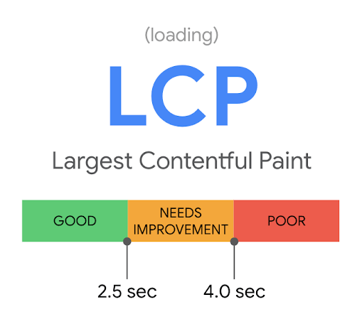
Largest Contentful Paint serves as a pivotal metric in gauging the loading performance of a web page. It measures the time it takes for the largest content element, be it an image, video, or other prominent feature, to become fully visible to the user. LCP is crucial because it directly correlates with the perceived speed of a website. Google recommends achieving an LCP of 2.5 seconds or less for optimal user experience.

How does LCP work?

LCP kicks in as soon as a user initiates the loading of a web page. The browser starts rendering the page’s content, and LCP is triggered when the largest content element is painted on the user’s viewport. LCP provides a tangible representation of how quickly a user can access the primary content of a page.

Strategies for Optimising LCP:

Optimise Critical Rendering Path:
Prioritise loading and rendering of critical resources. Optimise server response times, leverage browser caching, and use asynchronous loading for non-essential scripts to ensure that the largest contentful paint occurs as quickly as possible.

Compress and Deliver Images Efficiently:
Compress and deliver images in modern formats like WebP to reduce their file size without compromising quality. Use responsive image techniques to ensure that the appropriate image size is loaded based on the user’s device and screen size.

Leverage Content Delivery Networks (CDNs):
Implement a Content Delivery Network (CDN) to distribute content across geographically distributed servers. This reduces the physical distance between the user and the server, leading to faster content delivery and improved LCP.

  1. Cumulative Layout Shift (CLS)

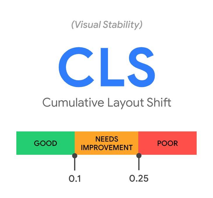
Cumulative Layout Shift shines a spotlight on visual stability, measuring the amount of unexpected layout shifts that occur during a page’s loading process. CLS ensures that users are not disrupted by sudden changes in the page layout, promoting a smoother and more predictable browsing experience. A CLS score of 0.1 or less is deemed excellent.

How does CLS work?

CLS tracks the movement of elements on a page during its loading process. It calculates the impact of layout shifts by considering the area of the viewport affected and the distance the elements move. A lower CLS score indicates a more stable and user-friendly visual experience.

Strategies for Optimising CLS:

Set Dimensions for Media Elements:
Ensure that images, videos, and other media elements on your page have specified dimensions in the HTML. This helps the browser allocate the required space during rendering, reducing the chances of layout shifts when these elements load.

Prefer CSS Transforms for Animations:
When using animations, prefer CSS transforms over properties that can cause layout changes. Transforms, like translate and scale, typically don’t trigger layout shifts, providing smoother and more predictable user experiences.

Use Font Display Swap:
Implement the “font-display: swap;” CSS property for web fonts. This ensures that text remains visible during font loading, preventing sudden layout shifts when fonts are applied.

  1. Interaction to Next Paint (INP)

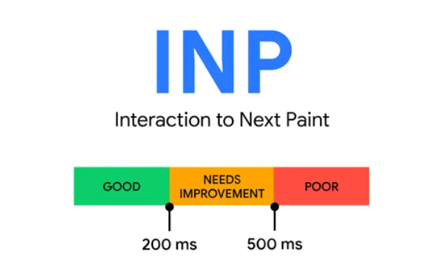
Interaction to Next Paint (INP) is a web performance metric designed to assess the responsiveness of a user interface, gauging how promptly a website reacts to user interactions such as clicks or key presses. This metric specifically quantifies the duration between a user-initiated interaction, like a click or key press, and the subsequent visual update that the user perceives on the page.

How does INP work?

INP comes into play when a user engages with a web page, measuring the duration between the user’s action and the website’s response. This metric is calculated when the user leaves the page, producing a singular value that represents the overall responsiveness of the page throughout its entire lifecycle.

Strategies for Optimising INP:

Optimise JavaScript Execution:
Minimise and defer the loading of non-essential JavaScript to prevent it from blocking the main thread. Prioritise critical scripts and load others asynchronously. Utilise code-splitting techniques to only load the JavaScript necessary for the current user interaction.

Efficiently Manage Third-Party Scripts:
Limit the use of third-party scripts and only integrate those essential for core functionality. Evaluate the impact of each third-party script on input delay and consider loading them asynchronously or using techniques like sub-resource integrity (SRI) to ensure script integrity.

Implement Predictive Prefetching:
Anticipate user actions and prefetch or preload resources that might be required during subsequent interactions. This can be achieved by strategically prefetching content or utilising browser features like prefetch to load resources in the background.

Last year, Google announced that INP would be replacing First Input Delay (FID) as a Core Web Vital from March 2024 onwards.

Let us understand what FID was and how INP is different from it.

First Input Delay (FID):

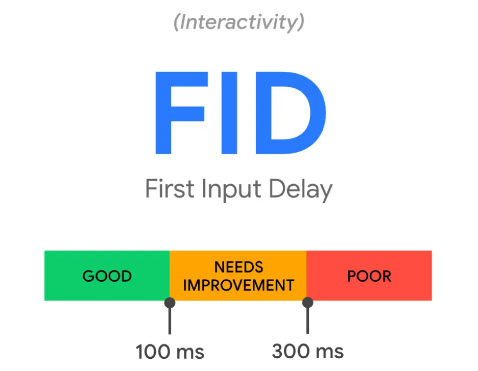
First Input Delay (FID) measured the responsiveness of a webpage to user interactions. Specifically, FID quantifies the delay between a user’s first interaction, such as clicking a button or tapping on a link, and the browser’s response to that input. A good FID score indicates that the webpage responds promptly to user actions, contributing to an overall positive user experience. Slow FID scores can lead to frustration as users perceive unresponsiveness, negatively impacting user engagement and satisfaction.

Contrast between FID and Input Delay (INP):

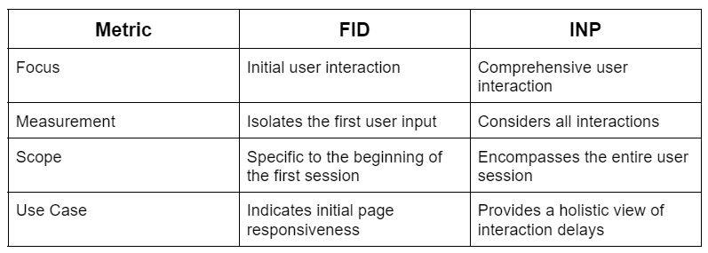
While FID and Input Delay (INP) both focus on measuring user interactions, they differ in their scope and application. FID specifically captures the delay associated with the first user input, providing insights into the initial interactivity of a webpage. On the other hand, INP is a broader metric that considers delays throughout the entire user interaction process. INP includes the delay for subsequent user inputs beyond the first, offering a more comprehensive view of the overall responsiveness of the webpage during a user’s entire session.

Table of Main Differences between FID and INP:

INP over FID as a metric:

Input Delay (INP) offers a more efficient and comprehensive measurement of user interaction delays compared to FID. While FID focuses on the first interaction, INP considers delays throughout the entire user session, giving developers and website owners a broader perspective on how responsive their site is across various interactions. This comprehensive view allows for a more accurate assessment of the overall user experience, helping to identify and address potential bottlenecks and areas for improvement. In essence, INP provides a more holistic understanding of a website’s interactivity, making it a valuable metric for optimising user engagement and satisfaction.

The SEO Nexus

While Core Web Vitals are intrinsically tied to enhancing user experience, their impact on SEO is equally significant. Google, the dominant force in search engines, has explicitly stated that these metrics are crucial ranking factors. Websites that prioritise and optimise for Core Web Vitals are more likely to ascend the ranks in search engine results, reaping the benefits of increased visibility and organic traffic.

Enhanced Search Rankings

Google’s algorithms are designed to reward websites that deliver exceptional user experiences. Core Web Vitals, with their focus on loading performance, interactivity, and visual stability, provide a tangible measure of user satisfaction. Websites that consistently meet or exceed the recommended thresholds for these metrics are aptly rewarded with higher search rankings.

Improved User Experience

Beyond its SEO implications, prioritising Core Web Vitals contributes significantly to an enriched user experience. Users are more likely to engage with websites that load swiftly, respond promptly to interactions, and maintain visual stability throughout their visit. A positive user experience not only reduces bounce rates but also fosters a sense of trust and satisfaction, encouraging users to explore further.

Mobile-Centric Optimization

As mobile devices continue to dominate the digital landscape, Google has shifted its emphasis to mobile-first indexing. Core Web Vitals, with their emphasis on responsive design and efficient loading on various devices, become paramount for success in the mobile-centric era. Websites that prioritise mobile-friendly experiences are well-positioned to thrive in the digital ecosystem.

In conclusion, Core Web Vitals represent a paradigm shift in the evaluation of web page performance. These metrics, encompassing Largest Contentful Paint, First Input Delay, and Cumulative Layout Shift, encapsulate the essence of user-centric design and efficient website development. As digital landscapes evolve and user expectations continue to rise, the importance of optimising for Core Web Vitals becomes increasingly evident.

By embracing strategies to enhance loading performance, interactivity, and visual stability, web developers and SEO practitioners pave the way for websites that not only meet the rigorous standards set by search engines but also captivate and retain the attention of users. In the ever-evolving journey of digital excellence, Core Web Vitals emerge as beacons guiding the way toward a future where user experience and SEO success converge seamlessly.